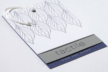
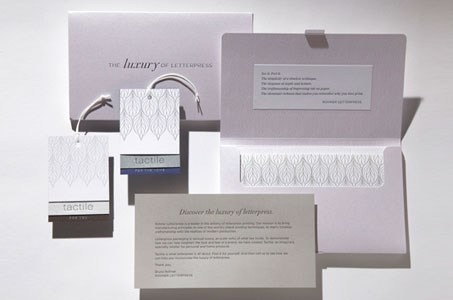
Creating an imaginary brand called Tactile, the designer and client take recipients of this self-promotion piece on a journey of what is possible with letterpress printing.
The theme – the Luxury of Letterpress – is richly illustrated on gorgeous toothy and shimmering stock from Reich Paper, FiberMark, Gmund and Neenah Paper. Combining the touches of sparkle with the neutral palette of silvery grey, slate blue, moss green and earthy brown lend a high-end sophistication.
All letterpress printing, diecutting and converting are done with the perfectionist eyes of the craftsmen at Rohner Letterpress (of course!).
The inside of the sparkling presentation box is adorned with a beautifully kissed leaf pattern. The contents are an array of components including hangtags, gift cards, gift card carriers, labels and customer membership cards that the make-believe specialty retailer of personal and home products would use.
The hangtags (akin to a mini swatch) were ingeniously constructed (a hole punch at the top of three stepped pieces of paper were secured with a white elastic thread, which was also used to suspend the tags from a backing sheet by wedging the thread between a diecut slit). And to be honest, I couldn’t stop touching the label example – even the backing paper felt luxurious!
I wish Tactile was a real company – I know there would be a lot of folks buying whatever it was selling.
Rohner Letterpress Self Promo was featured as a Paper Inspiration.
[youtube=https://www.youtube.com/watch?v=opzaCdSP36U]


very luxe look–nice work!