A good book of travel photography gives you not just a sense of a place and its people, but also the emotions the photographer experienced while there. But the designer of “The Road to Potosí” took it one step further by working with printer and bookbinder to actually give its audience the impression of walking through this wild Bolivian landscape.
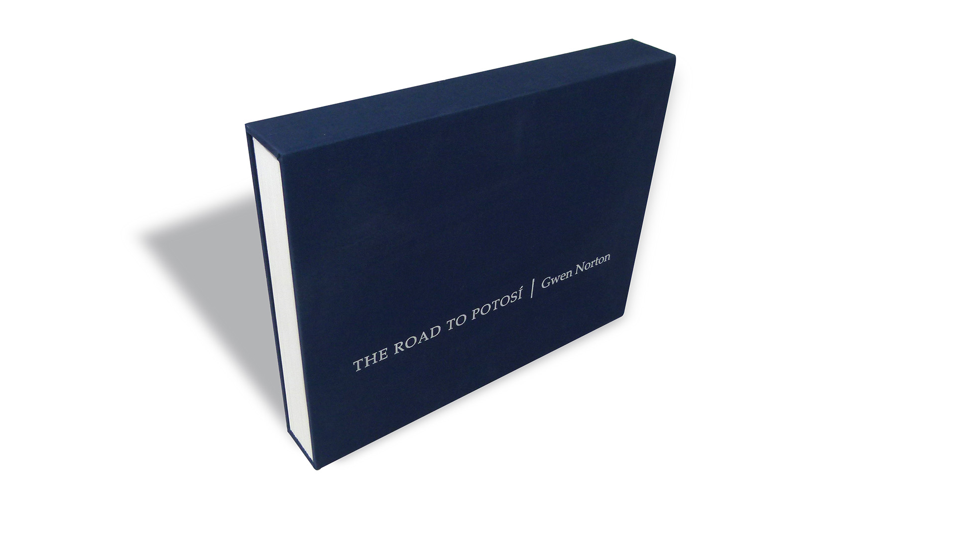
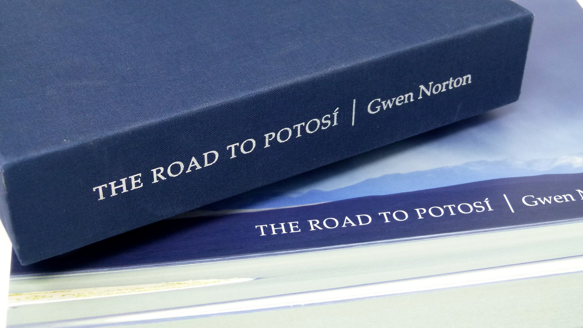
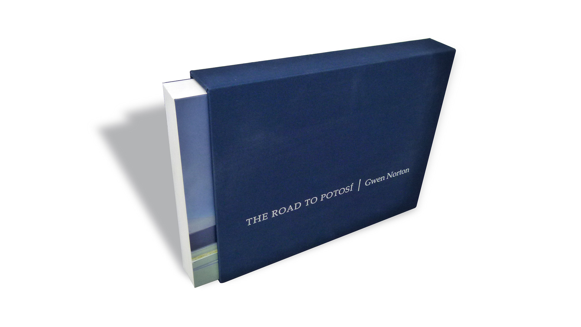
Designed by Yuko Uchikawa to accompany an exhibition of Gwen Norton’s photographs from Bolivia’s high desert region, this book was digitally printed CMYK by Panoramic Press. It comes tucked inside a slipcase produced by BindTech-Roswell – Brillianta Blue cloth over 118 pt. board, the book’s title printed in Silver foil on the front and spine. Removing the volume begins a journey both unexpected and inspiring.
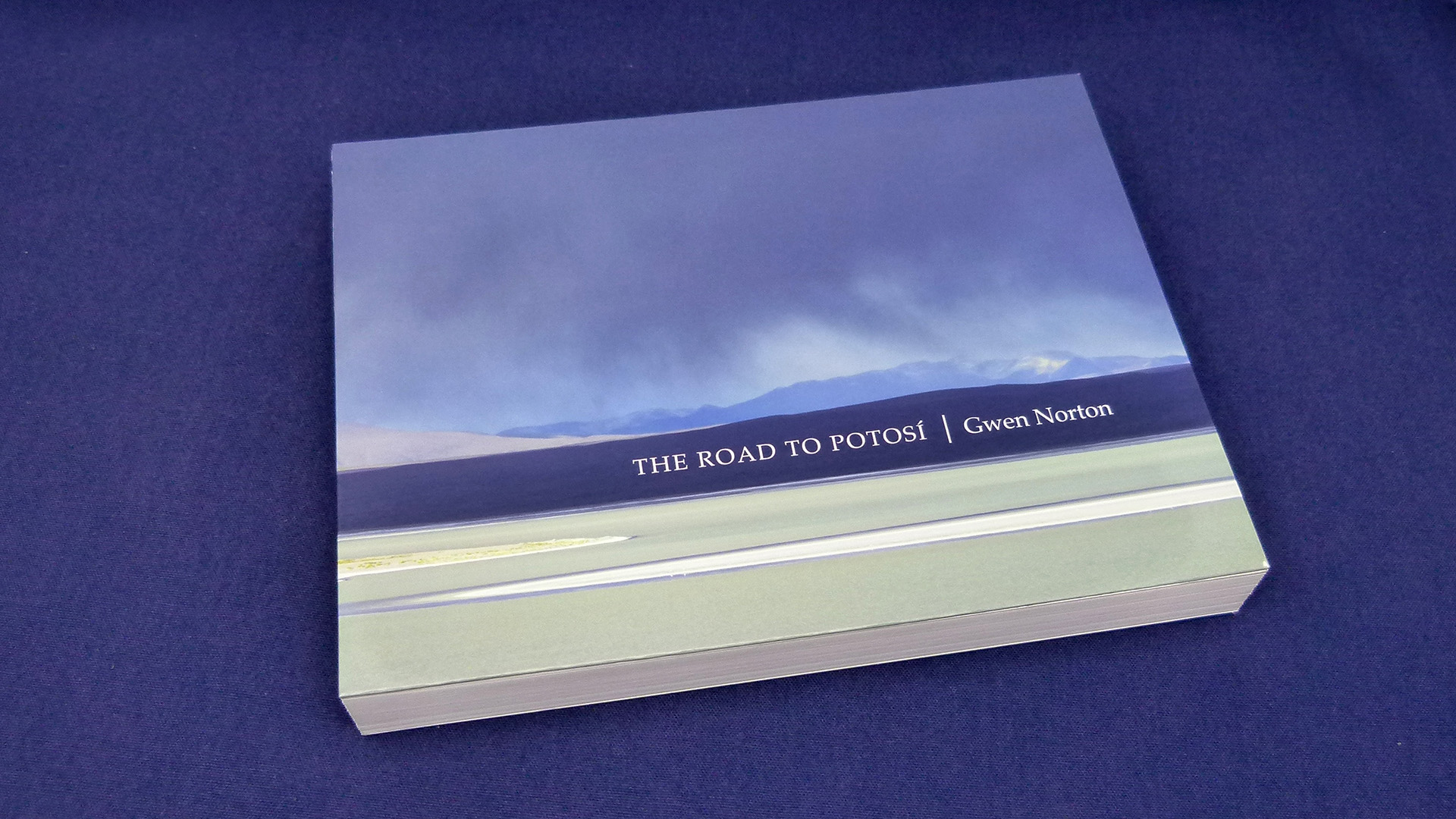
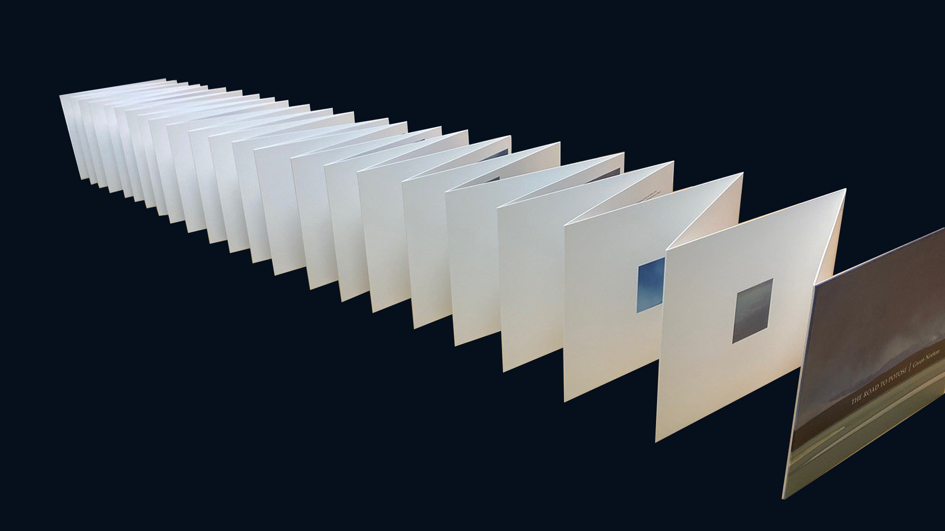
We begin with a cover featuring a panoramic view of land and sky, the title and photographer’s name knocked out in White from the dark mountain range that divides them, giving the appearance of a natural bellyband. Opening the cover quickly reveals that this journey is going to be something special.
That’s because each page was laminated to the next to create one long sheet, folded down accordion style into a single 11.875-x-9 inch book. Turning a page, therefore, pulls the next page forward. (Longtime Paper Inspiration viewers might recall a similar photography book design – you can find it here.) Not only does this create a pleasantly hefty double-thick sheet, but it also allows each spread to lay completely flat.
Panoramic Press worked closely with Roswell and the designer to generate multiple test prints using a variety of paper weights, first and foremost to see if the idea would even work. They finally chose Neenah Classic Crest Cover Solar White.
Size and placement of the photographs were also well thought out, starting with a small full-body portrait of the photographer against the Bolivian backdrop. Folding that page out of the way reveals the next: a larger bird’s-eye view of the area. Another turn of the page kicks off our journey with a moody view of the landscape.
The sharp, colorful printing quality is down to the use of the Konica Minolta AccurioJet KM-1 digital press. (Panoramic Press was only the third company in the U.S. to have installed it at the time.)
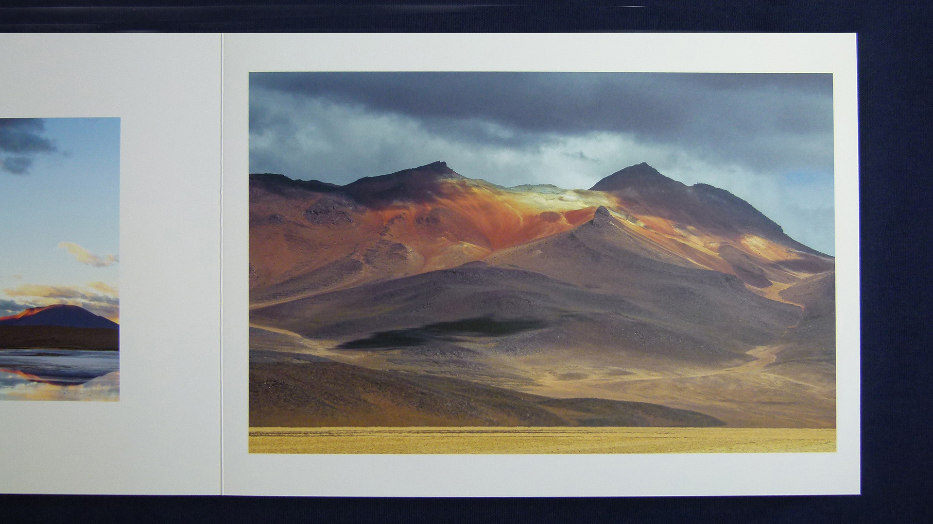
However beautiful the photographs – and they are indeed breathtaking at times thanks to the alien-like nature of the locale – this book could’ve easily become a trifle ho-hum had the designer not played around with the placement of the images inside. The double-wide spreads afforded by this format allowed her to play with their positioning, often across a spread. This also changes the size and position of the white space every time you turn a page.
“The road to Potosi is long and winding,” the photographer wrote about her excursion, and the movement of the photos inside the book gives the same impression – one of hiking through that same beautiful terrain with miles behind you, and miles still to go. By the end, we’ve traveled through 46 feet of paper – quite a journey!

