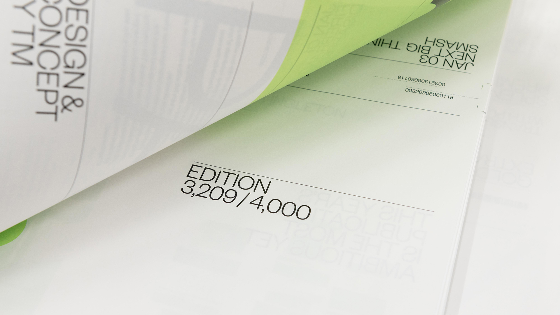
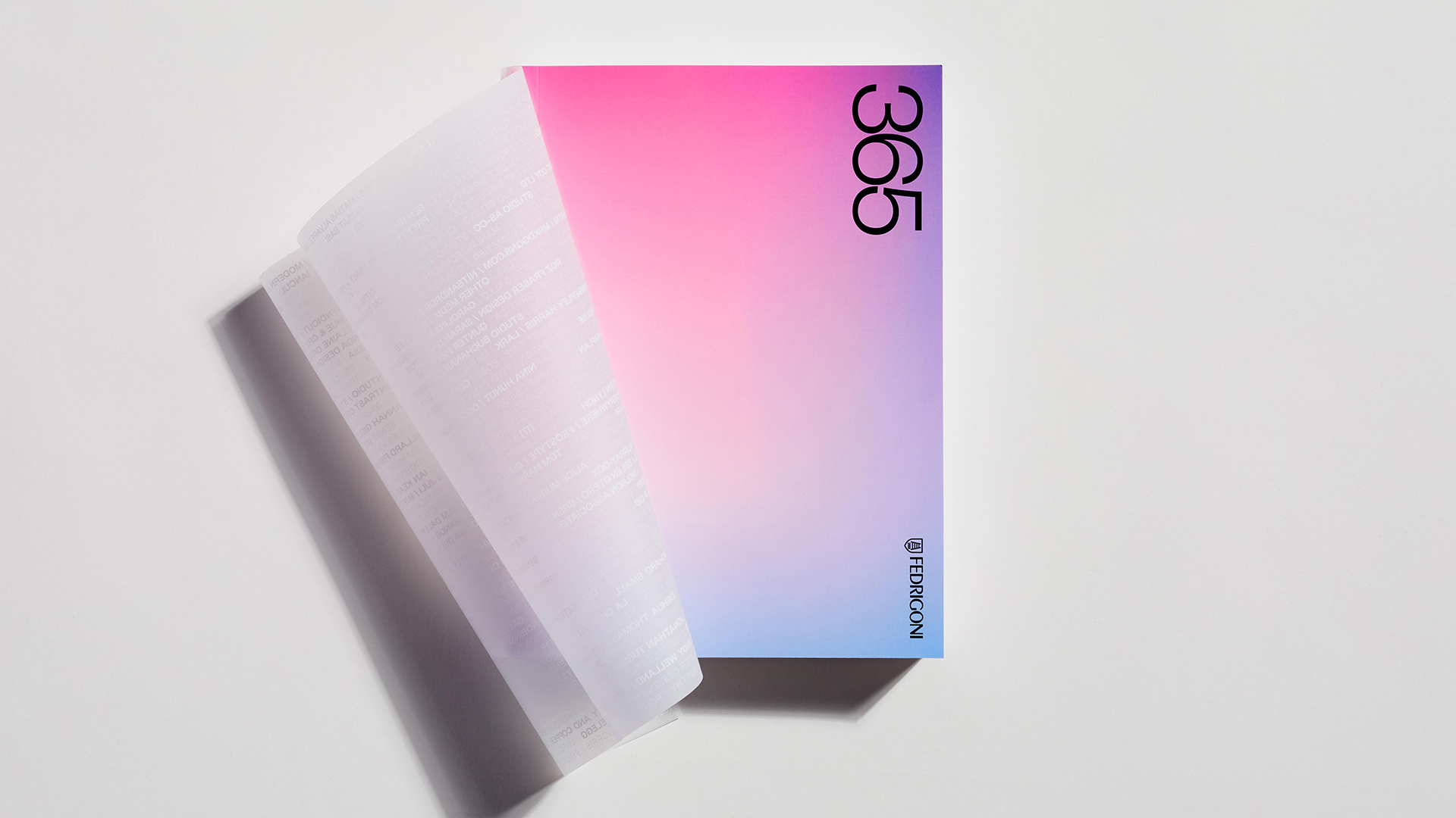
I love printed calendars and not just because of the wide variety of designs available. It’s also because they remind me that every year holds a near-limitless number of possibilities. It’s an idea beautifully illustrated in this edition of Fedrigoni’s 365 calendar – a product of the near-limitless possibilities provided by variable data printing and an extended color gamut. The result is a high-water mark in personalization: each of the 4,000 copies produced is vibrantly unique!
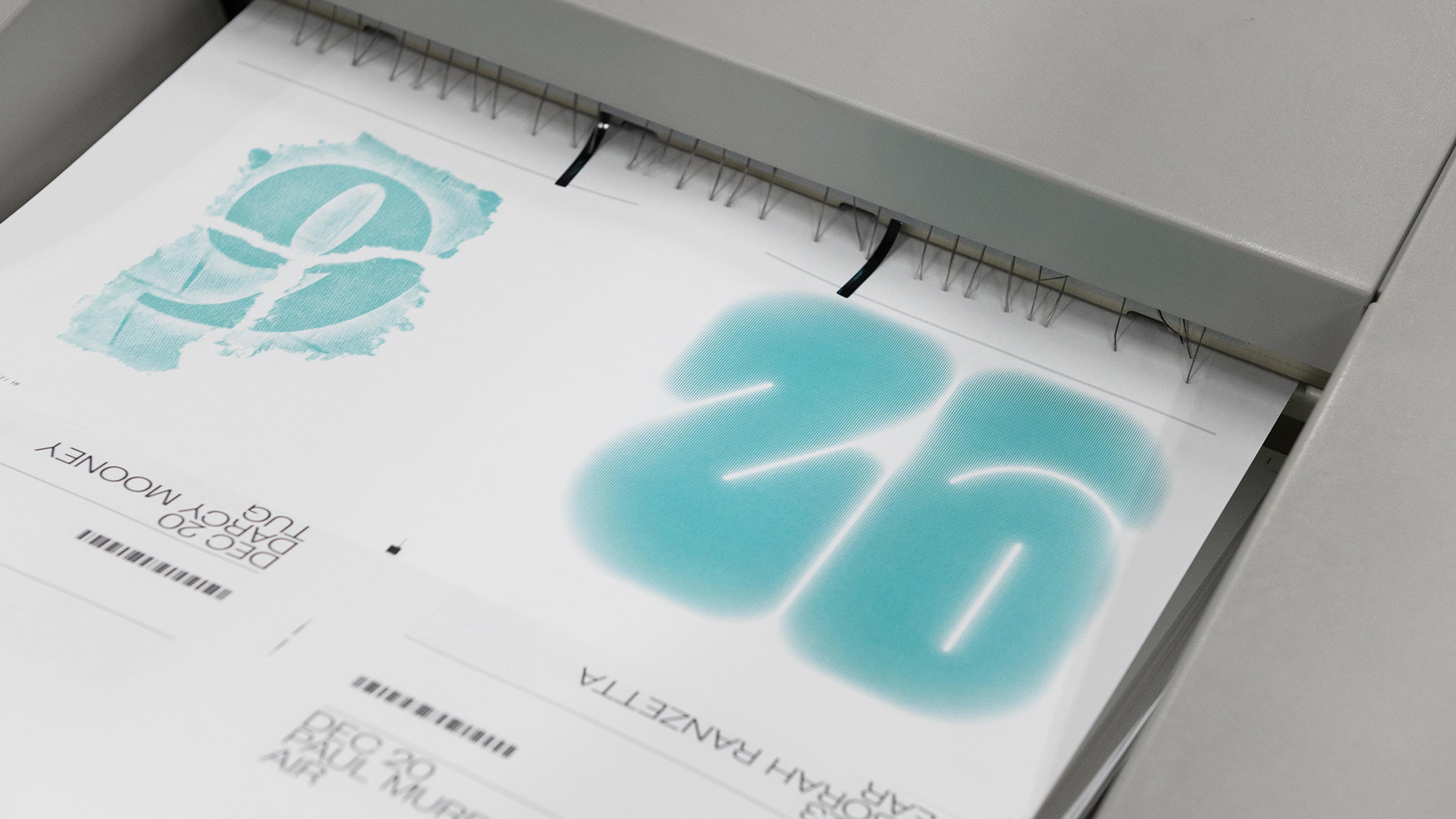
Designed by branding studio TsevdosMcNeil — Visual Communications (TM), the calendars were produced by information management and digital service company Ricoh using a high degree of automation and customization. Using the typographic designs submitted by more than 1,000 designers, the production included algorithms that seamlessly married different stylized number illustrations with many different colors to produce those 4,000 unique editions – 1.6 million pages in all.
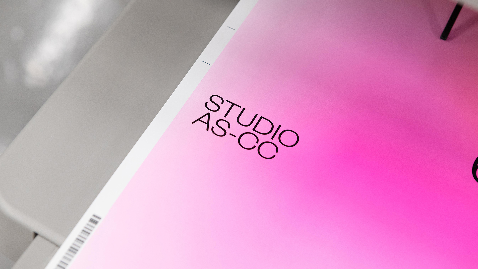
This was accomplished by printing the cover, interior pages and book jacket (more on that later) on the Ricoh Pro C7200x digital press and extending the color gamut by adding Neon Pink, Neon Yellow or White ink to its 5th color station.
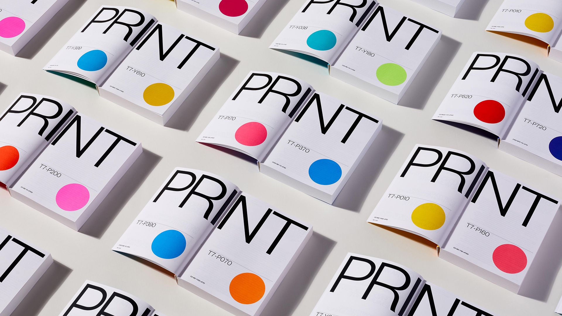
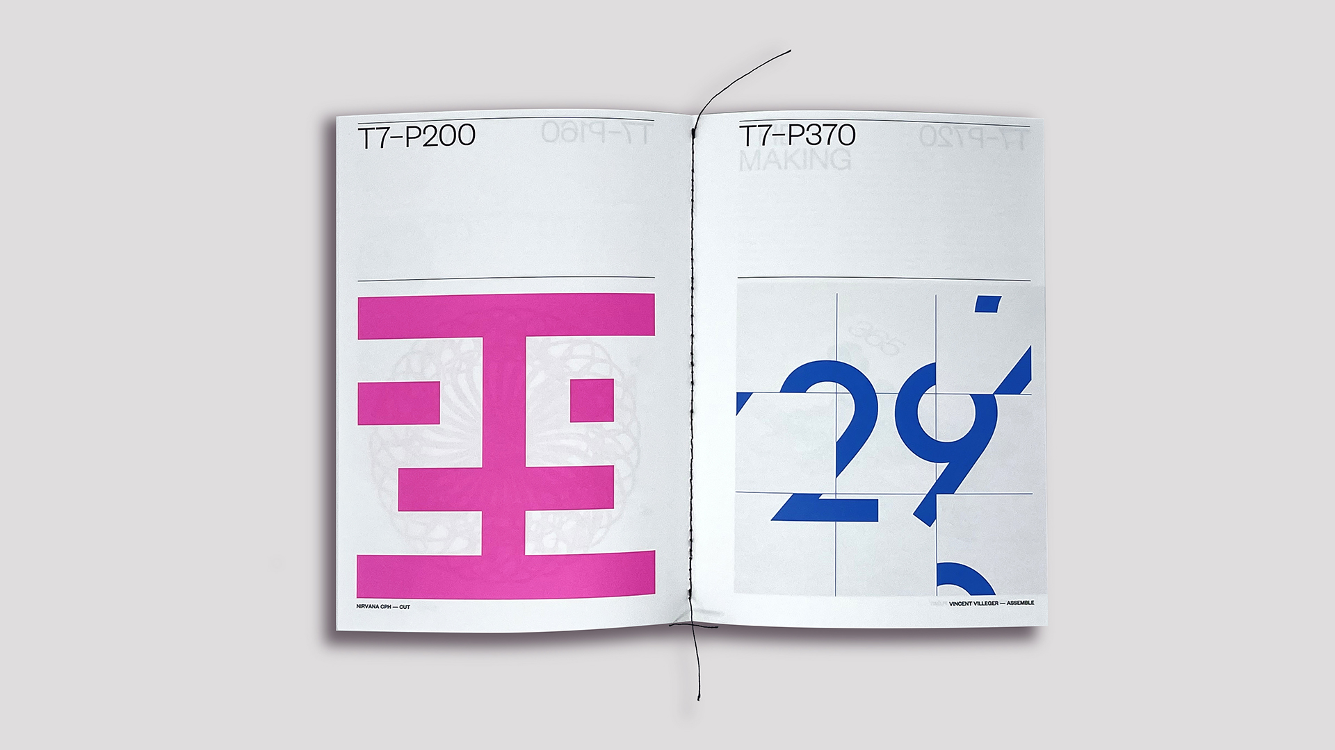
Using Color-Logic’s Touch7 Extended Colour Gamut system, they printed 10 extended gamut colors on press from the more than 700 options provided by the Touch7 system. (PRO members, be sure to watch our Deep Dive on this amazing tool for boosting the vibrancy of your own work right here.) This leads to March 23rd, for example, not only using a different font style in every calendar, but also a different color – being Pink in one copy, Blue in another.
The cover, too, printed on Fedrigoni Splendorlux Premium White, is completely different on every copy thanks to the use of variable data printing software that randomly blended 2 different gradient colors together and applied them to 10 master cover designs. (Interior pages were printed on Fedrigoni Vellum Premium White, made from 40% recycled fibers.)
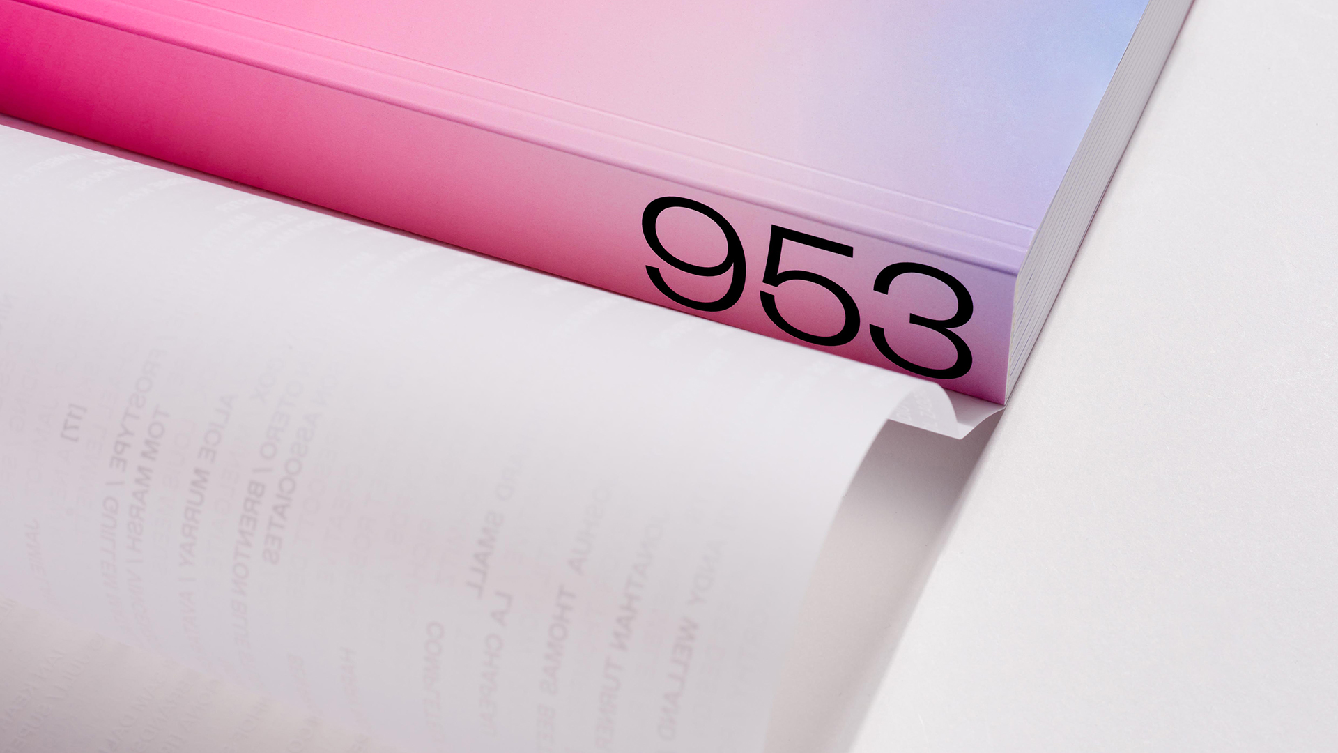
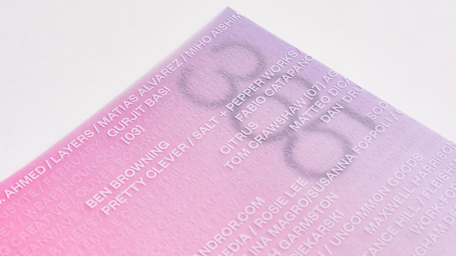
The pièce de résistance, however, is the book jacket. Here the names of all the designers who worked on the project are printed in White ink on translucent Fedrigoni Golden Stark Extra White, though only the names of those whose designs were used in that particular volume are printed in bold on the jacket of that edition. The dust jacket’s transparent nature also allows the vibrant color of the cover beneath to shine through.
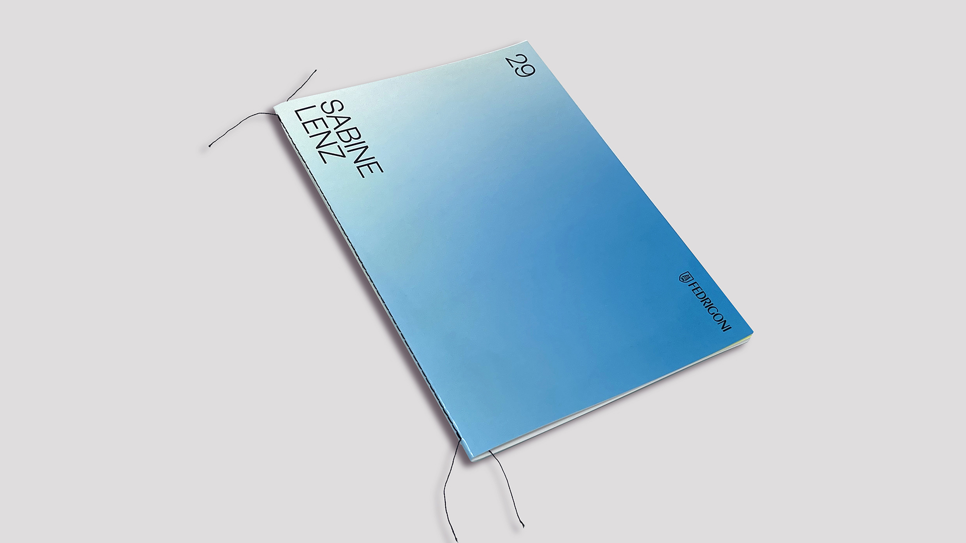
And as a reward for being part of this bold and vibrant experiment in personalization, every participating designer received their own one-of-a-kind booklet featuring their designs printed in all 10 Touch7 colors used throughout the calendars. Each booklet also included their name on the cover.
And taking it one step further, each recipient of the calendar received their own personalized behind the scenes book. With their name and date of birth being featured on the cover, but also using that number as an example to show the variable data capabilities inside the Singer sewn booklet.
Now that’s what I call getting personal!

