Planning your own wedding can be stressful enough, but when you’re a designer creating all the collateral for your big day, it can be even more daunting. Yet it can also be infinitely rewarding, as Ben Farrell discovered when he crafted these super-cute “Save the Date” and invitation for his own nuptials.
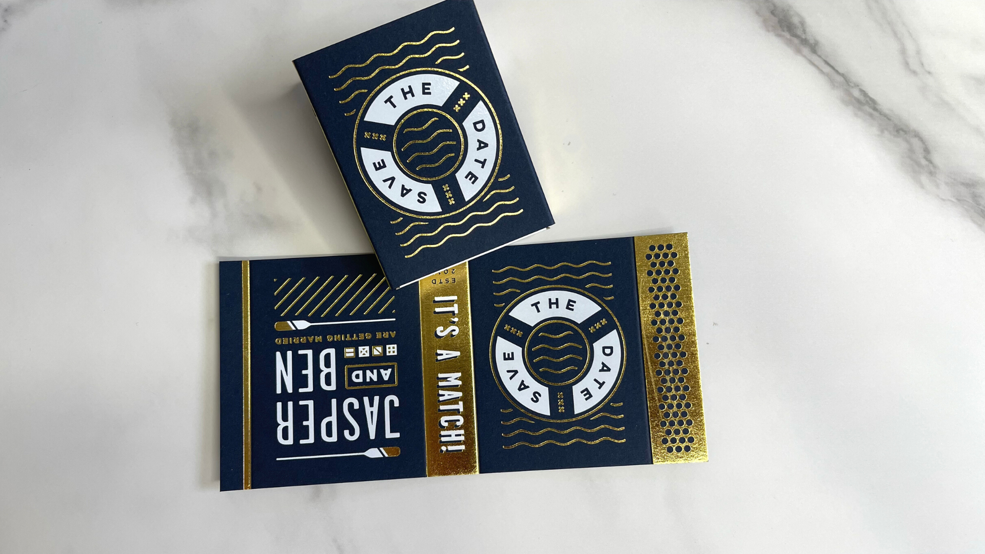
A native Londoner, Ben met his future partner, Jasper, a Dutchman working in the UK capital, on Tinder. Famously, the dating app rewards two people who “swipe right” on each other’s profiles with the message “It’s a Match!” Blending these words with his own love of vintage matchbox graphics, small-scale printed pieces, and a longstanding passion for maps and nautical themes, Ben created one of the cutest “Save the Date” pieces I’ve seen in a while.
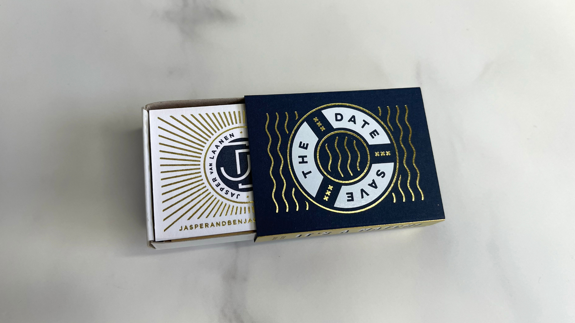
Using a 350 gsm (236 lb.) Colorplan Imperial Blue sheet, he added White foil to create this sharp-looking life preserver, knocking out the words “Save the Date,” and added Gold foil for the waves and Gold sides for the box. One side reads “It’s a Match” while the other boasts a “strike paper” pattern – the pattern is knocked out of the Gold foil allowing the Imperial Blue to show through. On the back of the matchbox are the happy couple’s names in White foil along with several design flourishes in Gold.
Sliding open the box reveals a small insert – printed on Colorplan Pristine White – with the couple’s name and interlocking initials letterpress printed in Blue, surrounded by a sunburst of Gold foil rays, while their email address, also in Gold, sits just beneath. On the back, a mix of Gold foil and Blue letterpress printing presents the wedding date along with the message “full invitations to follow.” (COVID, unfortunately, postponed the wedding.)
I’m sure by now you’re thinking what I’m thinking: If this is the “Save the Date,” just how fabulous is the actual invitation? Let’s find out!
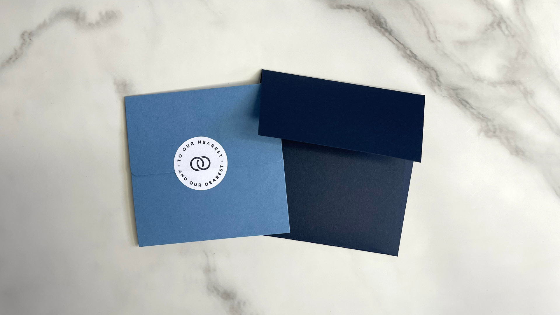
It arrived inside an Imperial Blue envelope (to match the “Save the Date” piece) and, at first glance, appears to be yet another envelope, a lighter Blue this time, held closed with a printed 90 gsm (60 lb.) Strathmore Ultimate White sticker. Imagine the recipient’s surprise then when lifting the flap revealed that this isn’t an envelope at all, but a cross fold! [PaperSpecs PRO members: Be sure to check out our PRO Guide to Cross Folds here!]
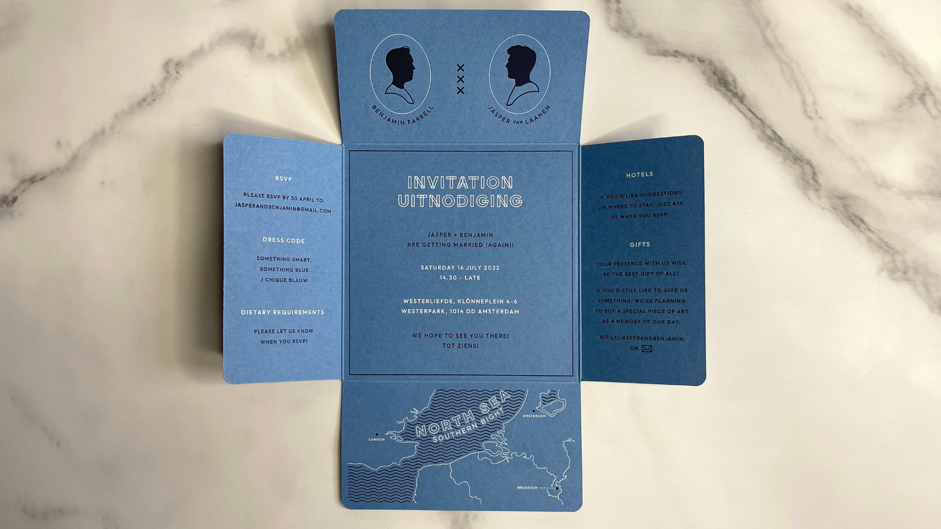
On the inside of the top panel are Victorian silhouettes of the happy couple with 3 vertical “x’s” between them – ostensibly a nod to the Amsterdam flag, but they can also be read as “kisses,” too. The bottom panel folds out next, presenting a map of the North Sea Southern Bight with key landmarks for the couple – London, Brunssum (Jasper’s hometown) and Amsterdam – displayed on either side of the sea. The letterpress printing used throughout the invitation on this uncoated Colorplan New Blue 350 gsm (236 lb.) sheet is particularly deep, providing an arresting, unexpected tactile texture to the wavy lines depicting the water.
The remaining parts of the invitation relay the usual information you’d expect, in both English and Dutch, through a combination of Blue ink and White foil.
Taken together, the map, “Save the Date” matchbox and color palettes all demonstrate a strong design vision coming together beautifully. And though Ben admits to feeling that he might have gone a little “overboard” with his use of Gold foil – one more nautical nod 😉 – it all makes for some fun, shimmery pieces that friends and family are bound to treasure for years to come.
While hot foil stamping added many eye-catching accents to this suite, there are many other ways you can get the shimmer and shine of foil these days. Be sure to download your free Foil Cheat Sheet to find out more!

