Field Notes [projects / website], which started in 2007 as a line of simple pocket notebooks, has grown into the paper equivalent of Apple, with paper nerds everywhere eagerly awaiting the unveiling of each quarterly “limited edition” 3 pack. Each set is unique and inspiring in its own way.
Which is to say that it was only a matter of time before the fanciest pocket notebooks in the business joined forces with one of the most beloved print shops in the business: Studio On Fire [projects / website].
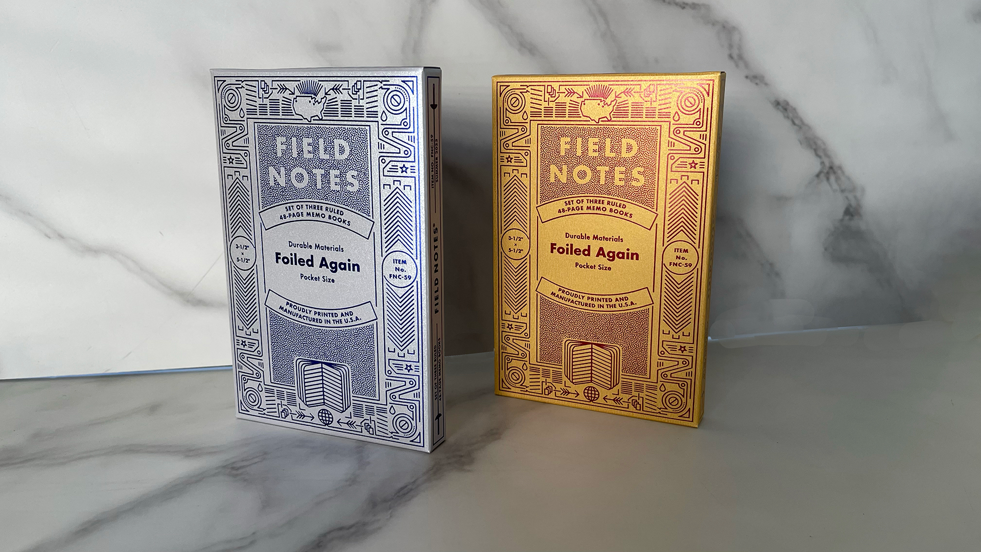
The result is the 59th Field Notes Quarterly Edition: “Foiled Again.” And as the name implies, these notebooks are all about the shimmer. Designed by Field Notes co-founder Aaron Draplin and that company’s Bryan Bedell, the “Foiled Again” 3-pack comes in a Hot Foil Stamped tuck box so detailed, it could only have been produced by our friends at Studio On Fire.
The first characteristic that catches the eye is the shiny interplay between the pearlescent 110 lb. Neenah Pearl Cover sheet and the colored Hot Foil. The notebooks – and the packaging – come in 2 “flavors.”
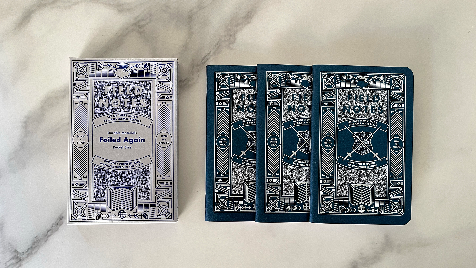
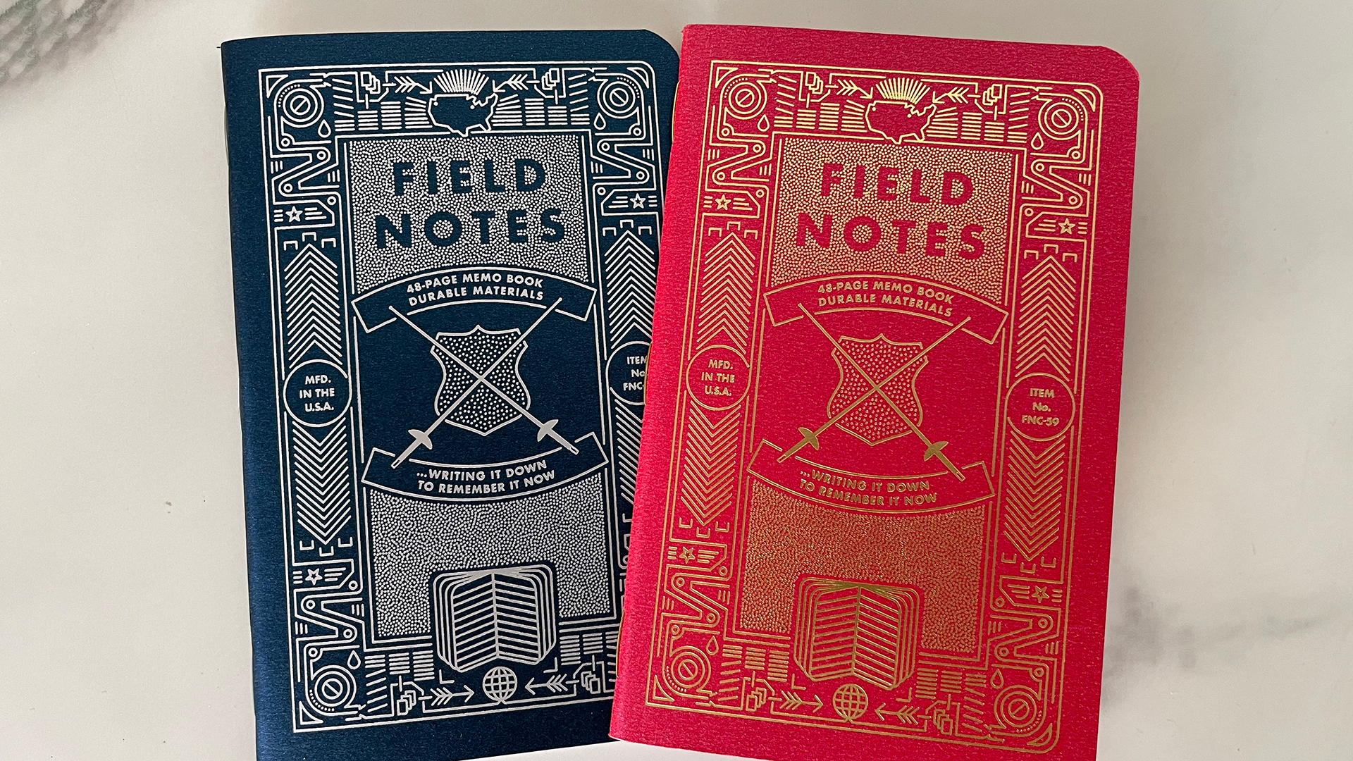
The retail edition features a tuck box of Blue Foil on Neenah Pearl Sterling (Silver) stock. The 3 notebooks inside show a reversed color scheme, with covers that are Neenah Pearl Indigo (Blue) with Silver Foil.
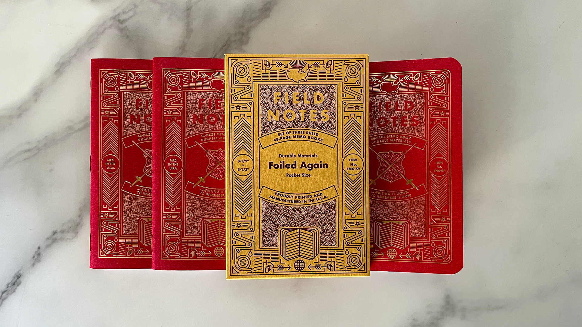
In addition to this set, those with a subscription to the Quarterly Editions also received a second one. This came in a tuck box featuring Red Foil on Neenah Pearl “Bright Gold,” with the notebook covers featuring Gold Foil on Neenah Pearl Poppy (Red) stock.
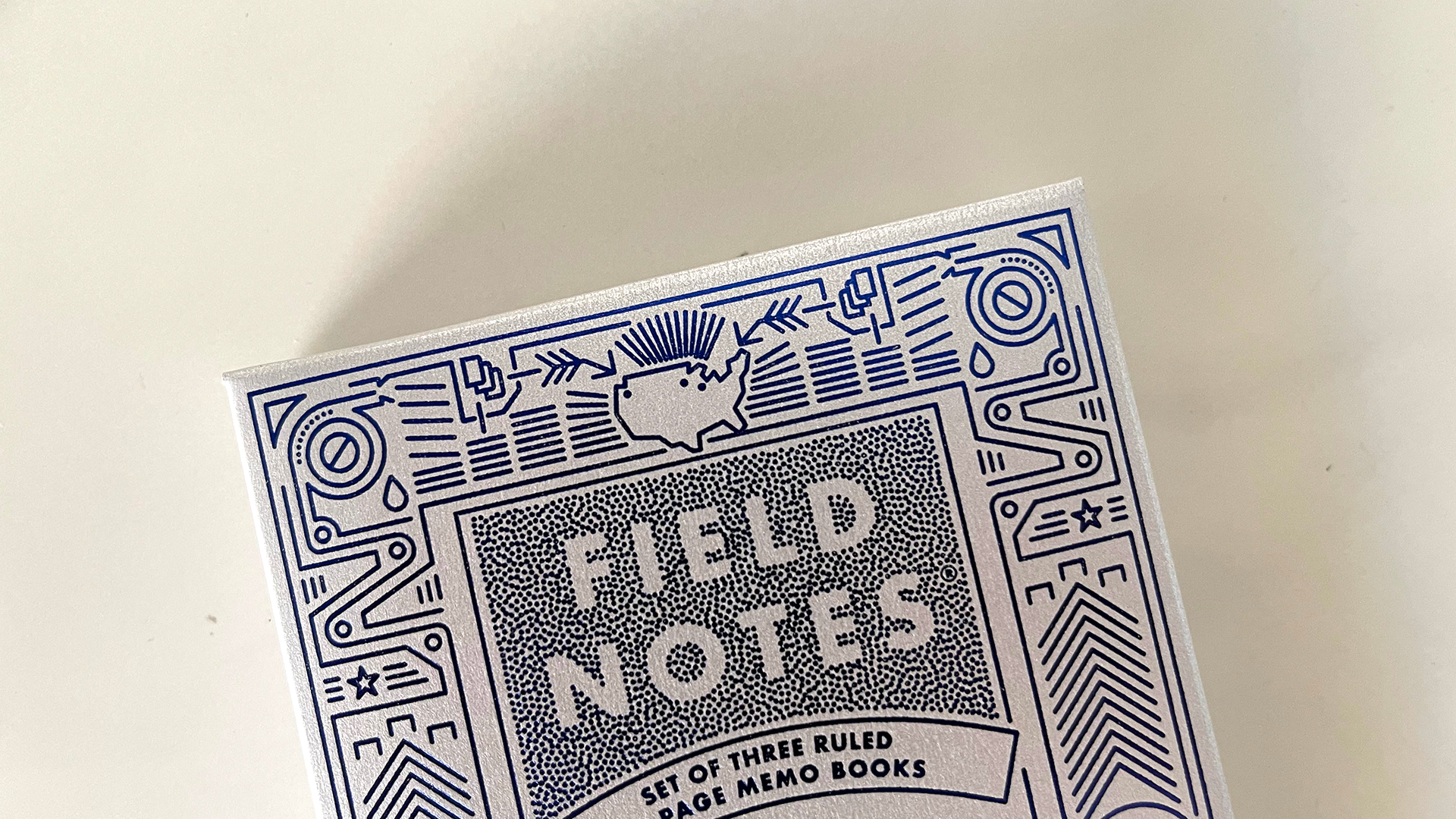
The artwork remains the same on both editions. The front of the box features the Field Notes name emerging from a dot pattern, with a complex illustration of the notebook-making process (drawn by Aaron) framing everything – all Foil stamped.
And if you take a much closer look, you can see 3 dots in the map of the U.S. These represent Portland (where Aaron lives), Minneapolis (where Studio On Fire is located) and Chicago (where Field Notes is headquartered).
On the back, the covers of the notebooks are reproduced small and in loving detail in Foil, again demonstrating Studio On Fire’s reputation for deft precision.
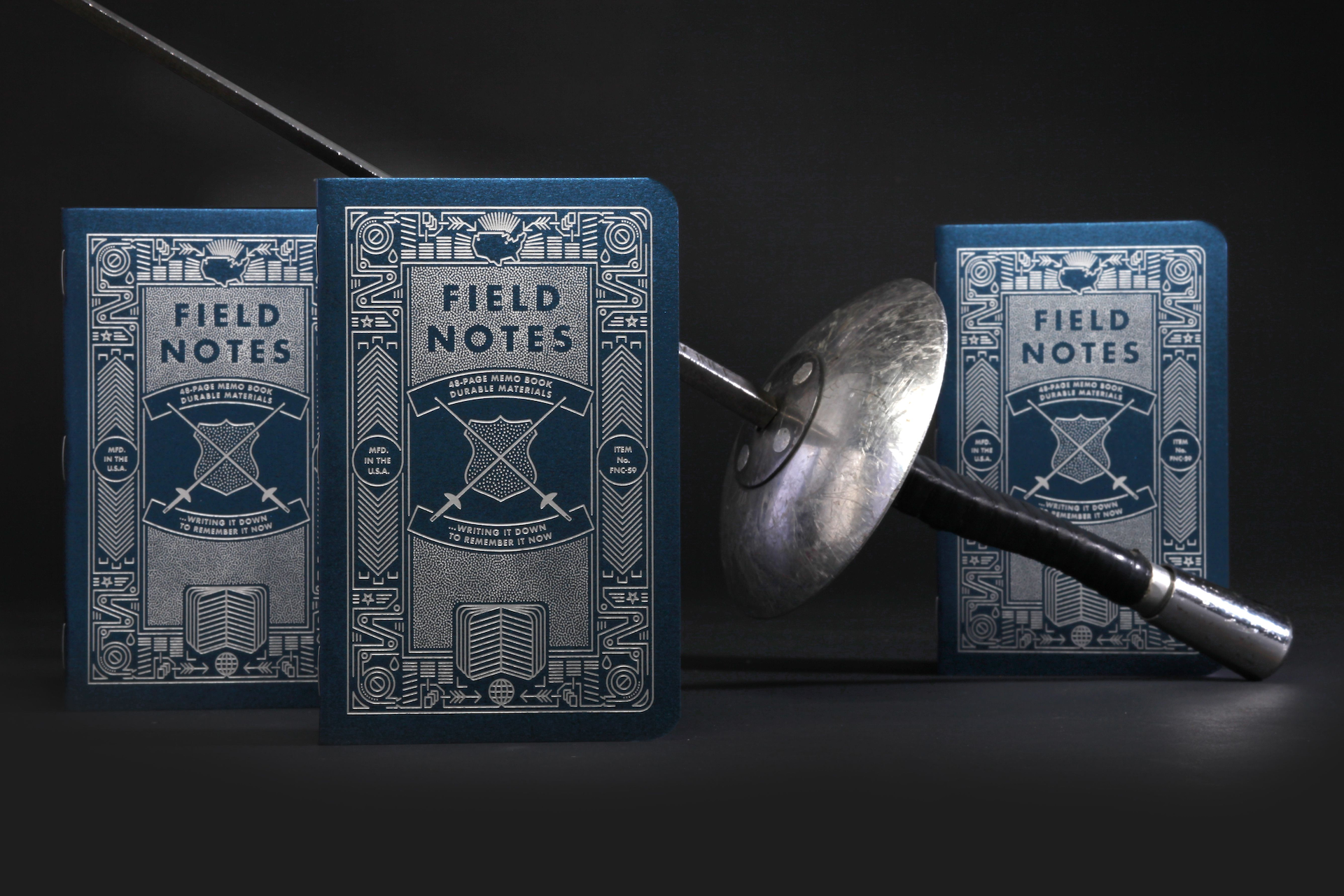
Inside, the artwork on the notebook covers is nearly identical to that of the tuck box – the only addition being a pair of swords (or fencing “foils” – pun very much intended here) crossed over a shield.
A closer look reveals just how intricate this detail is, from the tiny dots of foil that fill the shield to the way the sword handles overlay the tagline without actually touching it – that Studio On Fire precision again.
And on the inside front cover, information printed in Gold ink on the pearlescent paper provides an interesting contrast to the Gold Foil on the outer cover – you can really see how much more “pop” you get from Foil here.
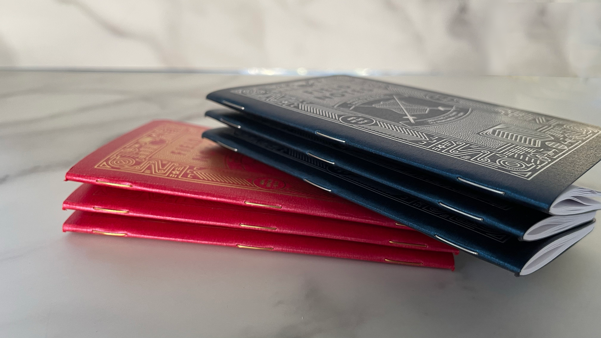
Other, smaller, details – such as the use of binding staples that match the color of the Foil on the notebook covers – only emphasize how much thought went into the making of these notebooks.
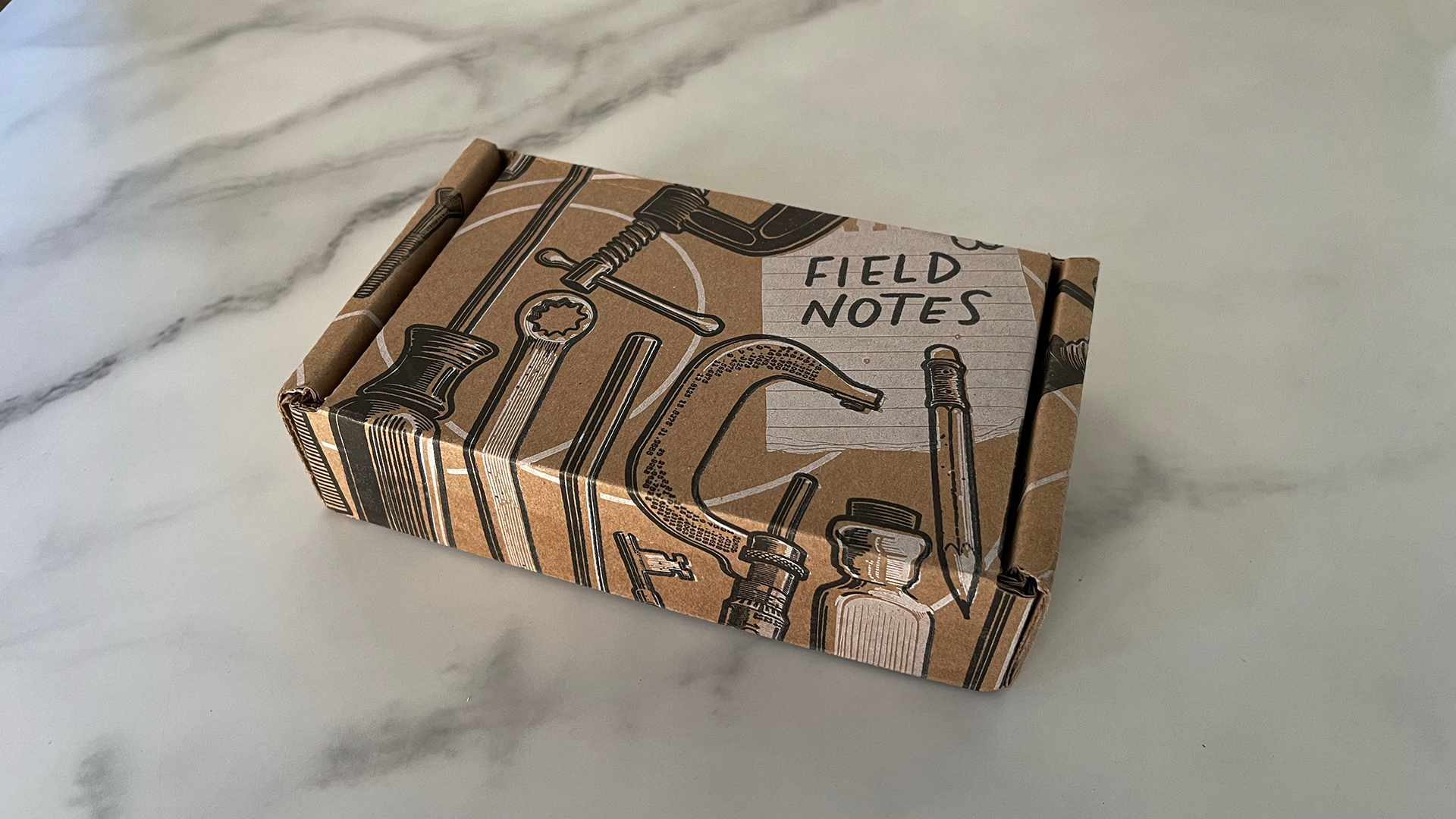
And for that fun final touch, Field Notes subscribers received both the subscriber and the retail versions of the notebooks in this fun mailing box.
It’s amazing to see how Field Notes notebooks have grown from a no-frills line for jotting down ideas to having foiled editions so beautiful, the company even bought a fencing foil on eBay for this edition’s photo shoot.
Alas they didn’t want to spring for 2 foils…so I guess they weren’t “foiled again” after all. (I love a good pun, too, you know ;-))









This is beautiful – swooning over!
You know, I think that’s the effect they were going for 😉