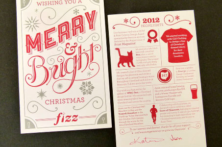
The deep bite of the letterpress printing along with the vibrant red and silver of these Christmas cards surely brought lots of seasonal joy to the friends and clients of Fizz Creative.
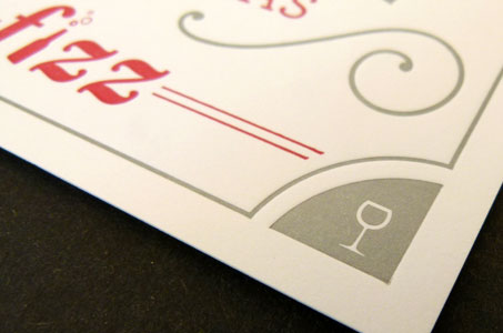
The custom typography, especially the hand-lettered word “Bright,” was a standout in this design. There’s a good balance between the red foreground elements and the silver background elements. Since this creative agency specializes in beverage branding, they also added four subtle silver embellishments (wine and beer glasses) in the corners.
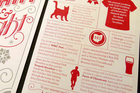
My favorite part was the back of the card where recipients found highlights from the year. The stories give you a bit of business and a dash of personal that bring this duo to life.
All in all, the card shows off their love for the holidays, the fun they had experimenting without the usual limitations, and best of all – their design skill.

