“The overall impact of the book is very thorough, well thought out all the way through,” says Kit Hinrichs, founder of Studio Hinrichs, in his review as guest judge for PaperSpecs Gallery’s quarterly competition. This is one of many reasons why it won our Take Note Award.
“Right from the outset, there was something special about this project,” agrees Frits Kouwenhoven, managing partner of Hemlock Printers.
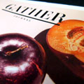
The bi-annual publication is a recipe-driven food magazine devoted not just to cooking and eating, but to what those acts inspire: bringing people together. It seems particularly fitting then that a notable collaboration between designer and printer was formed during the magazine’s initial planning phases.
Michele Outland, the magazine’s creative director, and Kouwenhoven birthed the memorable aesthetic beauty and keepsake quality that readers see and feel with each issue. “I really just can’t say enough about how Hemlock never gave up. They really persevered and stuck with us to make sure, at the end of the day, Gather Journal is exactly the piece that we wanted,” explains Outland.
[youtube=https://www.youtube.com/watch?v=http://youtu.be/Txwcw681TGI]
Print: Its Staying Power
Outland and Gather Journal’s editor and co-founder, Fiorella Valdesolo, share a love of food and cooking and envisioned a magazine with staying power, something readers would keep on their bookshelves and return to again and again for inspiration.
“I’m a huge lover of print and I don’t want it to go away. That was a big concern when we were planning this launch. We didn’t want a magazine that would end up in the recycle bin in two weeks,” says Outland.
No chance of that. The inviting warmth and ease of Gather Journal’s identity makes it as welcome as a good friend. From the page size (7.5” x 9.5”) that is essential to imparting a personal journal feel, to the images, which are nothing short of fine art, the beautiful design evokes a sense of gathering and savoring.
Paper: The Main Ingredient
Just as the sense of smell gets our taste buds tingling, the paper selection sets up the enjoyment of this printed piece. The paper is critical to conveying Gather Journal’s brand and message, and to translating the texture of the dining experience from the fresh ingredients to the fine linen tablecloths.
“I didn’t want the paper to feel too slick and coated. I had conversations with Frits trying to explain verbally what I was hoping, and him interpreting it and pulling samples and sending them out to me,” recalls Outland. “We investigated a lot of different sheets of paper. That back-and-forth was sometimes frustrating, but exhilarating, too.”
The end result of their creative intentions and collaboration with Hemlock is an ingenious combination of stocks – 100 lb. Mohawk Via Linen Cover on the outside and 70 lb. Lynx Opaque Text within.
“To put those two together – I don’t know if as a printer…it would have come to me in this way. The paper mix satisfies both budget and aesthetic considerations,” says Kouwenhoven. “Michele never gave up driving for what she wanted. That really taught me to go above and beyond to deliver the very best, and the results speak for themselves.”
Success: A Balanced Recipe
Gather Journal’s high level of quality is a blend of patience, perseverance and partnership between printer and designer. Outland feels it was a long process and that the outcome was well worth the time.
As artisan publishers, Outland and Valdesolo produce Gather Journal on a tight budget. While expenses are always in their minds, so are the creative vision and a sense of personal accountability. Both women feel a huge sense of responsibility to the acclaimed food photographers to make sure that the images are exquisitely reproduced.
“I have a particular passion for print,” comments Hinrichs, “and every detail of Gather Journal is shown in terrific form. From the combination of different kinds of artwork, which is really interesting, to the fabulous food photography, it’s clear why the magazine is so deserving of this Take Note Award.”


