 In the Designer’s Studio…with Alexander Isley
By Sabine Lenz
The name elicits images of sugary confections – Sweet Hospitality Group. But from its humble beginnings 27 years ago as a New York City theater concessionaire, the company has expanded quite a bit.
Opening cafes and bars, offering catering services, and continuing to run concession stands prove the diversity of the company, but the identity (name as well as logo) just wasn’t keeping pace with this growth.
“First, there was a lot of discussion about whether we should change the name,” explains Alexander Isley, founder and creative director of Alexander Isley Inc., the design consultancy that spearheaded the rebranding project for Sweet Hospitality Group. “We decided to keep the word ‘Sweet’ even though it didn’t accurately reflect all that the company does. There was simply too much equity, good will and name recognition within their market to abandon it.”
Over the years, the company did try to revamp its logo design. Each iteration incorporated some form of a scripty, swirly “S” shape, which didn’t set them apart from the many other catering businesses using the same style/idea.
The challenge was on.
The most difficult element to design
“When we’re typically doing a new identity for a company or an organization, we’ll deliver some eight or 10 different preliminary ideas,” elaborates Isley.
Many communication designers will agree that the logo is the most difficult element to design. It’s seen as the one summation of everything a company stands for and thus gets exposed to a lot of scrutiny that other design elements won’t.
“I really believe that your brand is much more than just a logo,” says Isley. “It’s really how you talk to people and the feeling that they come away with from things that they’ve seen. If we can create a brand and an identity based on colors and graphic elements as well as just a central icon, that’s desirable. We were looking for something that could be replicated and used across different areas.”
Isley and his team started exploring the iconic “S” in Sweet Hospitality Group. How much could they abstract the “S” and still keep it recognizable as a logo? Could the “S” be the basis for a repetitive pattern? Should the logo be a geometric shape, a semi circle, a …? How would it convey warmth and a personal connection?
Design inspiration: raw and starchy
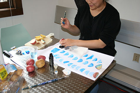
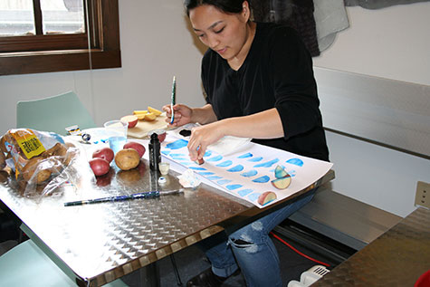
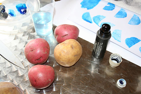
Do you remember your first artsy projects back in kindergarten? You cut a potato in half and created stars and other shapes on the exposed surface, which you used to print something amazing (place mats in my case ;-)).
This is the inspiration the Isley design team used. Starting with yams, cauliflowers and other vegetables, they ultimately settled on a potato print. Not just any potato, mind you. The perfect half circle for the new Sweet Hospitality Group “S” logo was achieved with the help of a Yukon Gold potato.
“We didn’t start off thinking ‘We’re going to see potato prints in the future of this company,’ but it came about as a result of wanting to do something that was handmade and had something obliquely to do with food,” Isley laughs.
Unique shapes and patterns
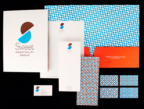
The ultimate winner of the potato print series was scanned and utilized for the contemporary “S” shape of the logo, as well as the basis of numerous geometric patterns.
“Each person in the company has a different pattern on the back of his/her business card,” explains Isley. “No two match. The back of stationery items, inside the pocket folder – all are made from these patterns, but they’re not perfectly aligned. From a distance, they look like they’re a geometric pattern, but when you get close, each one is a little bit different.”
Making it look real
From the technical side, this was not a case of creating a simple step-and-repeat pattern in Illustrator. (Remember, we’re talking to a fellow perfectionist here. ;-)) With the help of many Photoshop layers, these are painstakingly created patterns that ultimately make for some monumentally large files.
“This isn’t line art, it’s continuous-tone patterns. There are variations and gradations, imperfections and irregularities throughout all of the patterns, which make the viewer believe the pieces have been stamped by hand,” adds Isley.
A color palette-able to everyone
The color palette was also a challenge because this rebranding wasn’t only for Sweet Hospitality Group but its three subdivisions (Sweet Concessions, Sweet Catering and Sweet Cafés) as well.
“It really needed to be a system that could serve as an umbrella,” elaborates Isley. “We thought a good way to do that would be to color code it. The overall brand for Sweet Hospitality Group is a blue. Then there’s a red, a purple and a green for the different sub-categories.”
The anchoring color that ties all the brands together is a subtle chocolate-cake brown.
Picking the colors took as long as the actual concept itself. “It’s not just about picking colors that you like, it’s how colors are appealing and memorable and instinctive and can work within the system,” adds Isley.
And this goes beyond PMS and CMYK choices. In today’s world, brand colors must be easily replicable online as well as in offset or digital printing.
Every great design needs a willing client
“We really wanted to do something that was a little bit more fun and unusual, a little bit more graphically aggressive than what our client’s competitors do. I think that’s a real credit to Sweet Hospitality Group who went along with that and wasn’t afraid to be different.”
Isley’s team didn’t tell their client that the logo started out as a potato print until the presentation was over. As soon as it was revealed, they responded with “Oh, that’s great!”
For Isley though, the most important part is that the logo looks handmade, not the fact that it was conceived from a spud. He realizes that designers are not going to be there to explain to everybody who looks at the stationery or the website that the graphic was made from potatoes. That’s just an added, interesting bonus.
In a world where many clients simply want a Word file, it was a pleasant surprise to me to see letterheads and notecards as part of the stationery system.
Isley agrees. “They wanted to do letterheads, notecards and insert sheets for the pocket folder as well, which was nice. You can set yourself apart by using them because people are so used to communicating electronically. When you send a little thank you card or note card, they are completely disarmed by the fact that you took time to do it.”
Parting advice from Isley: “If the project is a success, it’s due to your client. If it’s a failure, it’s due to you.”
Paper Specs for Sweet Hospitality Group
Letterhead: 80 lb. Mohawk Via Satin Pure White Text
Business Card: 100 lb. Mohawk Via Satin Pure White Cover
Note Card: 100 lb. Mohawk Via Satin Pure White Cover
Folder: 130 lb. DTC Mohawk Via Smooth Pure White Cover
———-

Copyright 2013 PaperSpecs.com.

