Shephard. Jim Shephard. The name faintly rings a bell, but unfortunately his business card is no help at all.
While bold and colorful, even printed on both sides, it just tells me his name, phone number, e-mail, and a fancy slogan. I have no idea what Jim does.
I’m going through a pile of business cards that I “collected” at a recent conference so I can write my follow-up cards/e-mails and keep track of the people I met. But I have to say, the majority of business cards don’t make it easy.
The company names could be anything from realtors to lawyers (Strutz & Associates anyone?). The job titles range from acronyms to the nonsensical. And most of them don’t tell me in any way why I should remember this company or person. In short, they are crap.
The unachievable perfect business card
My own business cards have been eight years in the making. And whenever a set is printed, I can be sure to come up with an idea on how to improve it even more a few weeks later. It is, as any fellow designer can relate, a work in progress.
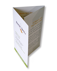
But, when I hand out my card, people know how to contact me; they know the company I work for and what we do. Heck, on the inside of the business card, I even give you helpful tips on buying paper. And … I always get an “Oh, this is so cool!” or “I love the idea, I always wanted to do something like this.”
And in my design book, THAT is a great reaction.
But don’t just take my word for it
Just this morning, I stumbled over Joel Bauer’s short video take (rant?) on business cards. I know, it’s been around the virtual block a few times, but I could really relate and wanted to share it with you.
For now, enjoy the video, but remember to make your and your clients’ business cards stand out from the crowd – tell me what you can do for me and why I should remember you/your client.


