Editor’s note: It feels like much of our lives are spent looking for that little “Instruction Manual” that always seems to be missing from our bookshelf. An instruction manual for life itself, certainly, but also one for designers that tells us everything we need to know in order to succeed in this business. Why else would we collect inspirational quotes, spend more than we care to admit on books depicting good design, and cover our cubicle walls with images that inspire?
In the following piece, designer Jamie Wieck shares his favorite takeaway from a type of “design instruction manual” – a single observation that just might be the golden rule of graphic design.
……………………….
If I told you that by the end of this article you’d be a better designer, would you believe me? It’s a bold statement and not one I make lightly, but I’m willing to put your trust and my reputation on the line to share with you what could be the most useful graphic design advice you’ll ever hear. Even if you disagree, I’d still argue that it is an incredibly effective take on the design process.
Recently I had the pleasure of giving a talk to a fantastic group of students from Aberdeen college on the subject of graphic design. In the Q&A session that followed, I was asked by one student, “What was the best piece of advice you’ve ever been given about graphic design?”
This is without a doubt my favorite question to answer, not only because the anecdote is rich like a good old-fashioned story, but also because it really did change my outlook on design. In fact, I’d go so far as to say that you can pretty much divide my professional career into two periods: before I heard this advice and after – it really was that important.
I was in my second year of college when I stumbled across the teachings of legendary designer and Fletcher/Forbes/Gill/Pentagram founder Bob Gill.
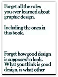
And stumbled I did: “Forget All the Rules You Ever Learned about Graphic Design, Including the Ones in This Book” quite literally hit me in the face as I careered haphazardly into the library’s bookshelf. It would prove to be the best misstep I ever made.
I’d been looking for something completely different, but picking the book off the floor I was immediately grabbed by the cover’s authoritative-yet-contradictory title. Turning the book over I realized that the title was in fact the book’s opening paragraph, which snaked its way across and under the dust jacket to continue within the book. I was hooked: This curious book demanded my attention. Discarding my more frivolous reading material, I sat down in the library aisle and read the book there and then.
“Unless you can begin with an interesting problem, it is unlikely you will end up with an interesting solution.”
–Bob Gill
It was this single sentence that hit me like a sucker punch to the stomach. The astonishing way it condensed Gill’s countless years of academic toil and experience into a simple statement floored me. It just seemed to make so much sense. For me, this single piece of advice had all the hallmarks of a paradigm shift moment, since on reading it and rereading it, the teaching just seemed so glaringly obvious. How could I have never seen design this clearly?
It was at this moment that I began to become a graphic designer. I realized that until a few moments ago, I hadn’t had the faintest idea of how to design something. As shameless as it sounds, I’d confess that before I’d read Gill’s book, the closest I came to being a designer was copying (and tweaking) another design I liked.
The statement’s power comes from its seemingly universal-truth quality. You may have even encountered variants of this advice in more quantifiable professions, like accounting or programming. Here the adage “garbage in, garbage out” is rigorously followed: You simply can’t get valid data if your input data is flawed. I find it’s this cool reductionism, an approach to design seemingly at odds with such a notoriously subjective profession, that makes Gill’s teaching so very effective.

Gill’s rule serves as the perfect complement to the idea that “form must follow function,” another universal truth of graphic design.
As Gill’s approach to problem solving forms the thematic core of “Forget All the Rules…,” the rest of his fantastic book is devoted to illustrating his thinking in a variety of ways. Looking back over the book (it’s since been reprinted a few times), his RentaNooYawka logotype is, for me, one of his most memorable solutions. It not only perfectly illustrates his attitude to problem solving, but it appeals to my love of language. Bob Gill explains:
“I had a client who supplied guides to tourists, they were called ‘Rent a New Yorker’ and that was the problem. Well, I’m sure every third year design student would immediately do a logo with the skyline of New York with some contemporary typeface underneath it saying ‘Rent a New Yorker.’ To me that’s pretty boring. So the first thing I had to do was to try and convert this problem, which is a very conventional one, into an interesting one. I decided the most interesting statement I could make, the most interesting problem to give myself, was to say that ‘our guides are authentic New Yorkers, they’ll really show you New York!’
“Well, how do you communicate that a guide is an authentic New Yorker? Well, eventually I came to the conclusion that if I could give their logo a New York accent that might in some way communicate that these are real New Yorkers. So I suggested to the client that they could spell their name in a New York accent: RentaNooYawka. Well, they loved it, but that’s an example of making what is essentially a conventional problem into an interesting one.’”
Reading my enthusiasm for Bob Gill’s approach to design, you may be mistaken in thinking I’m slavish to the process. I can’t deny how useful it’s been, but I’m not interested in distilling the design process into a dry academic exercise. Gill’s approach is useful because it strips away the indecisiveness that hounds any new problem. All designers are, after all, communicators, and what Bob Gill reminds us is that we need to first and foremost concentrate on answering the client’s problem, and anything that can streamline this is to be applauded.
So forget what design is meant to look like, there’s no such thing as “style.” Just concentrate on redefining the problem to get a better solution.
………


