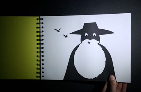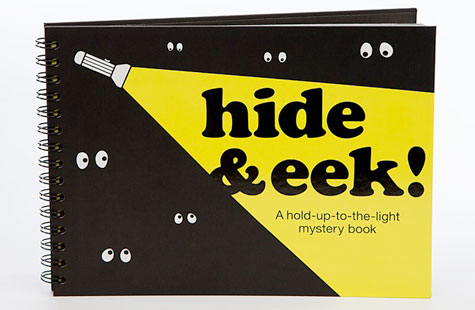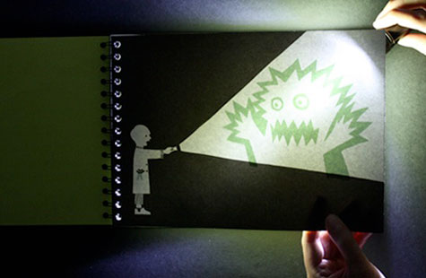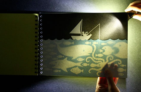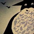
Come the end of October, thoughts naturally turn to tricks, treats and gentle scares: three qualities to be found in an unusual children’s book called “Hide & Eek!” On each of its 48 pages, readers discover illustrations that make perfect sense on their own, but dramatically change contexts when a flashlight is shone behind them, revealing additional illustrations. Light reveals the birds living in a man’s beard, the monster lurking in a child’s flashlight beam, and many other little surprises.
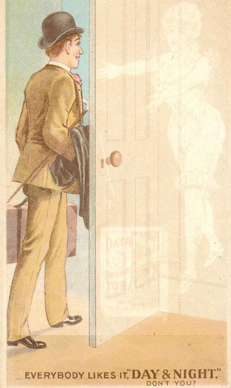
The idea is as simple as it is effective, and was inspired by Victorian novelty cards such as the one below for Day & Night Chewing and Smoking Tobacco, circa 1890.
“I started to think how it could be a lot of fun using hidden images within other images,” says Jim Sutherland of London’s Hat-trick Design Consultants, who art directed the book that wife Rebecca Sutherland illustrated.
At the end of last year, they pitched the idea to the people at publisher Knock Knock after meeting them at the Design Indaba conference, and developed the book with their guidance.
In all, it took about nine months to bring to life. “We tried simply having the image on the back initially,” Sutherland remembers, “but it wasn’t magic enough. The idea of using the [flashlight] to make it a bedtime book really made the book much more interactive and magical.”
“Hide & Eek!” required a long gestation in part because its very nature pits the limits of the paper against the limits of the ink in a delicate ballet that is all about subtlety. Each page is French folded, duplexed and Wire-O bound, with the hidden illustrations inside those duplexed pages.
“The tone of the colors needed a lot of testing so that the images are invisible from the outside to the naked eye, but show up clearly when the light shines through,” he explains. If the tone is just a gradient or two too dark and you can already see the hidden illustration, it spoils the surprise. The whole process required multiple proofing tests on different paper weights. The final version uses an uncoated 140 gsm stock.
Once that challenge was overcome, what remained was the second most daunting task: “coming up with lots of ideas for interesting hidden ‘stories’,” says Sutherland. “We were keen to add in some further hidden elements to discover. For example, one of the chicks in the egg has a hammer, the girl walking up the stairs (hiding a massive dinosaur) has a toy dinosaur, etc.”
Though it’s too early to tell how well “Hide & Eek!” has sold, Knock Knock has encountered a flurry of interest from retailers. All of which has Hat-trick casting their minds to doing an entire series of books: “Hide & Eek! Under the Sea,” “Hide & Eek! in the Jungle,” and on and on.
Says Sutherland, “It’s one of the nicest projects we’ve done at Hat-trick. It makes me smile like a child every time I look at it in the dark.”
………


