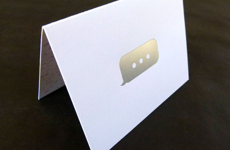
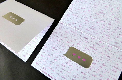
Research, and lots of it, went into this cheeky and delightful notecard. We all use emoticons to one degree or another to convey our digital thoughts, but who knew there were that many? And who but a saucy design team would think to use them in this way?
Inspired by the visual style and language of the texting culture, SK Designworks created this stationery to deliver those indispensible, personal and highly prized handwritten messages. While the softly textured Crane’s Lettra is most often associated with letterpress these days, this piece was offset printed.
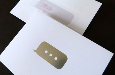
Magenta-colored ink gets a snap of shine thanks to silver foil stamped dialogue boxes that appear on the front and inside of the card. Visual swapping of dots on the front box to hearts on the inside box makes the design interesting. And that one-liner (A Little Heavy Texting…) made us :”) and laugh. We’d just like to give a ((( ))) to the designers.

