Flags are great symbols of identity (countries) and forms of communication (sailors). So to name your boutique design studio after the pennant is perfect inspiration. And when you can create a striking logo and business card that reinforces the motif visually, well, you’re sailing with a very strong wind indeed.
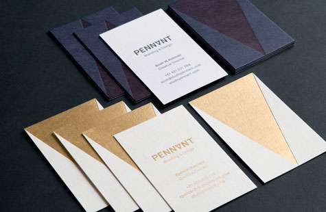
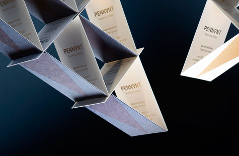
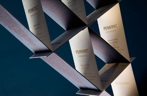
Studio Pennant first high-flying moment was to literally incorporate a pennant into the logo. They did this subtly and tastefully by turning the “A” in the name upside down. The resulting V shape is placed on the back of the cards in a strong simple statement of identity. Foiling the image contrasts with the thick uncoated stock chosen (Vellum Blotter, Linen Cream Gmund and Navy Blue Keaykolour).
The business card layout allows each member to have a customized look (some done in gold foil, other in black foil) while keeping the design coherent. The designers also produced the cards in short runs so they can update and explore other interesting effects and print techniques (like laminating two colors of stock together as they did on one version) later on.

