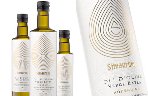
If you’ve been to an olive oil tasting bar – which have sprung up in tourist towns and strip malls alike – there seem to be as many varieties and makers as olive oil’s cousin, vino. And as any savvy marketer knows, if a bottle goes onto the shelf with that much competition, the identity and the label better be as attention-grabbing and memorable as this one.
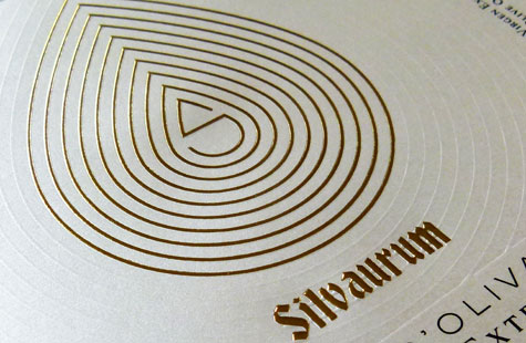
Pagà Disseny designed an elegant label for this extra virgin offering. The central graphic, a monogram S, is surrounded by concentric teardrop shapes (recalling a drop of oil). Its gold foil stamping treatment tells a story of pure luxury.
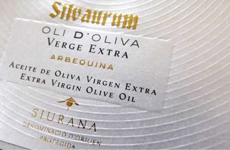
The teardrop shape repeats and radiates outward from the monogram, but is done with a subtle no-ink emboss that adds texture. The embossed, pearlescent-coated effect of the label paper (Constellation Jade Satin) enhances the high-end feel of the packaging.
Love this piece?
Like it and share with your friends below.


