Take a look:
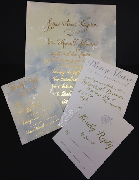
Paper design included:
- 75 invitation suites
- 40 rehearsal invitation suites
- 175 seating cards
- 75 place cards
- 185 dinner menus
- 70 rehearsal dinner menus and place cards
- 25 table numbers
Invitations themselves featured gold foil printing and custom calligraphy, according to PSDispatch.com, with edges “torn to resemble the famous wallpaper scene in the modern adaptation of Great Expectations, starring Ethan Hawke and Gwyneth Paltrow.” (Famous wallpaper scene?)
Each invitation was presented in a floral patterned, hand-painted box, and contained a lace upholstered events booklet. PSDispatch.com goes on to explain what a stir the stamping work caused at Corcoran Printing, which is a nice touch.
All of that said, the one thing we can’t quite understand is why these cards look so, well, meh. Is it just that they photograph poorly? Or perhaps this was merely the state the invitations were in when they left Corcoran Printing before being hand finished by the artist.
That’s because the design work was done by Kristy Rice at Momental Designs in Wyoming, who’s done some really nice work on many other invitations. Even if her other work isn’t to your particular taste, you certainly can’t slag it off as being dull or “meh.”
Perhaps Ms. Simpson presented the artist with this concept and said, “Make 75 of these, please.” As everyone else seems to fancy themselves an art director and designer today, we wouldn’t be at all surprised.


