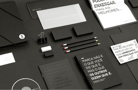
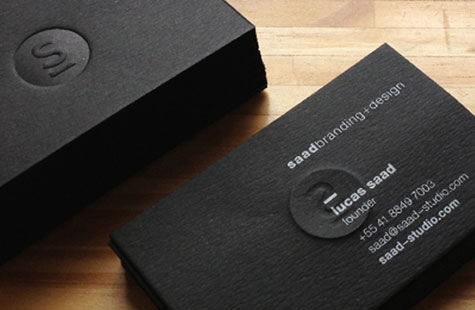
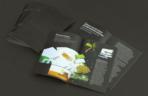
If your studio’s core business is strategic brand management, and you want to convey creativity and innovation, then you better make an impression – and a strong one – with your own identity. The suite for saadbranding+design’s own rebranding does precisely that with boldness and drama.
The black and white palette is chic and minimal. The unexpected message printed with glow-in-the-dark ink adds a playful touch as well as a literal reminder to think about the importance of branding. Every element was conceived and executed to support this idea.
From postcards and brochure to envelopes and stickers, the design team thought of everything and brought it all together coherently. One of my favorite pieces is the notebook (a gift for prospective clients). Those black pages with the accompanying silver ink pen and split Wire-O binding makes it beautiful and memorable.
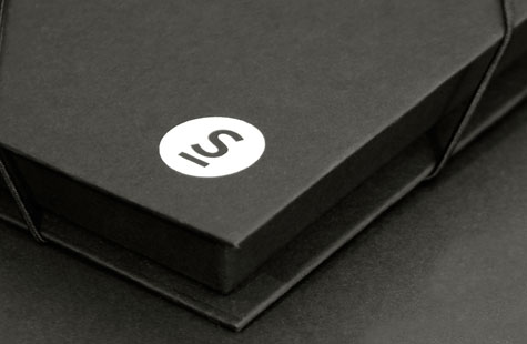
Logistics on this many pieces with their variety of production requirements must have also been an organizational feat. Embossing, specialty inks, matching colors across papers and vendors. The results are superb.
Love this piece?
Like it and share with your friends below.
About the PaperSpecs Gallery
We’ve created a curated space where design, paper and printing excellence are celebrated and made very visible – for those who love the medium of paper. For those who want a little inspiration. For those who may be your next clients.
What’s in it for you?
As well as receiving exposure for your work (and the admiration of your peers), a feature video about your project might appear on the PaperSpecs website.
Go on, Show us What You’ve Got
Those selected to appear in the PaperSpecs Gallery will be notified by e-mail. Not all entries will be selected for inclusion. We’re looking for those printed pieces that are truly inspirational in terms of creative and appropriate use of paper, and excellence in design and printing.
We can’t wait to see what you’re capable of!

