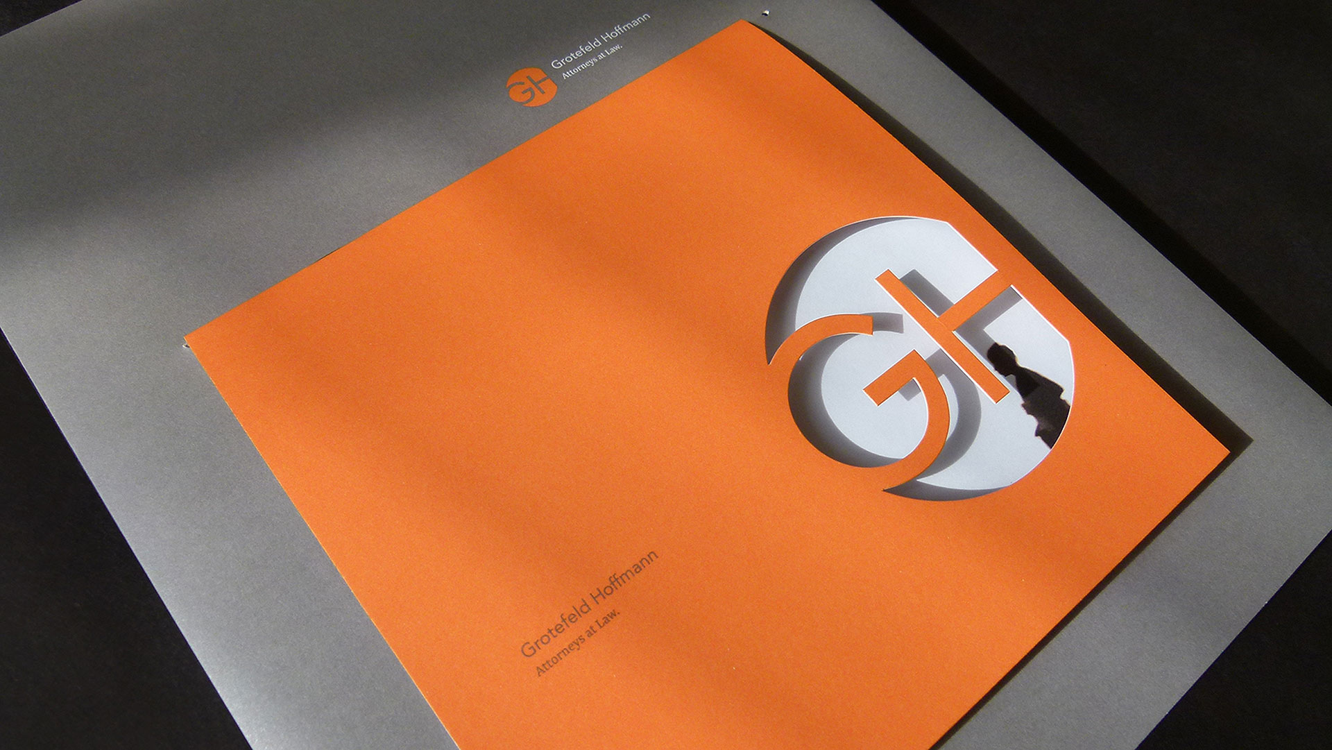
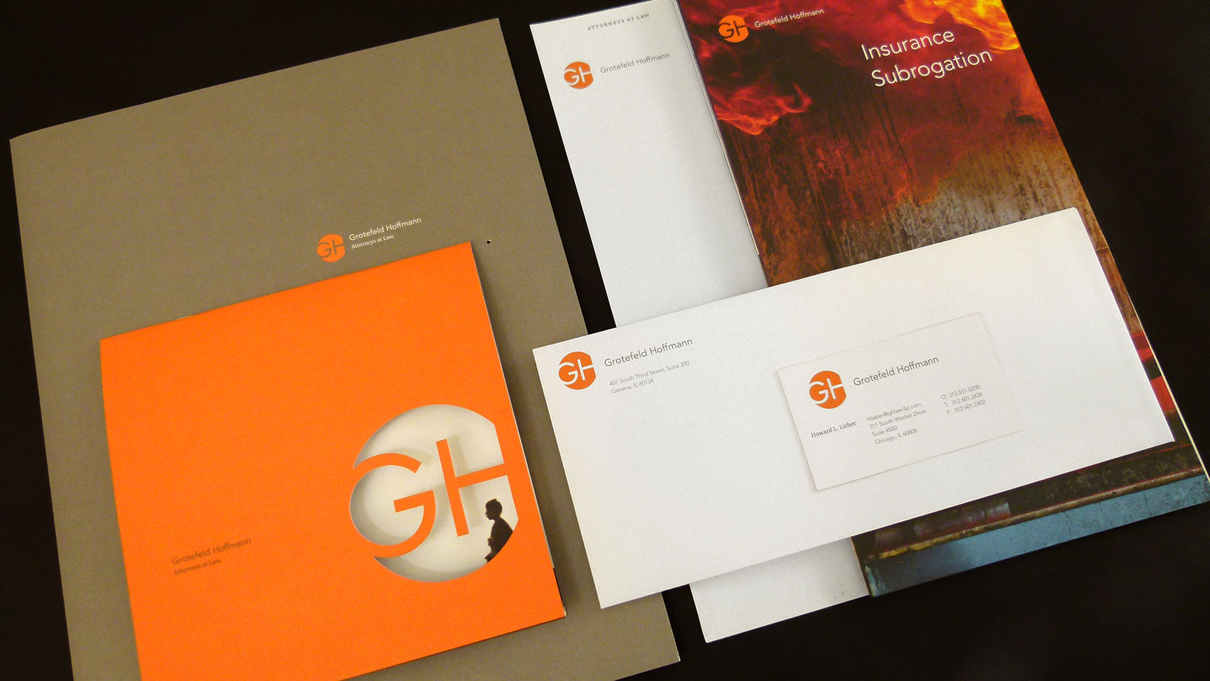
Bridging the distance between a client’s initial experience with a company (often online these days) and that first face-to-face meeting can be challenging. That’s where printed marketing kits play a critical role. Faust Ltd. has executed this suite of materials in an unprecedented way (for a law firm), and it works magnificently.
The orange color is a welcome departure from the usual slate grays and navy blues so emblematic of legal branding. The simple sans-serif type on the logo gives the feeling of strength and a conservative flavor clients expect, while the tight crop lends a contemporary edge. Together, the elements evoke a professional, energetic and fearless identity that is sure to separate this company from the crowd.
A custom diecut capabilities piece nestles into a slit on the cover of the sales kit folder creating a memorable focal point and a dimensional experience the moment the package is pulled from its envelope.
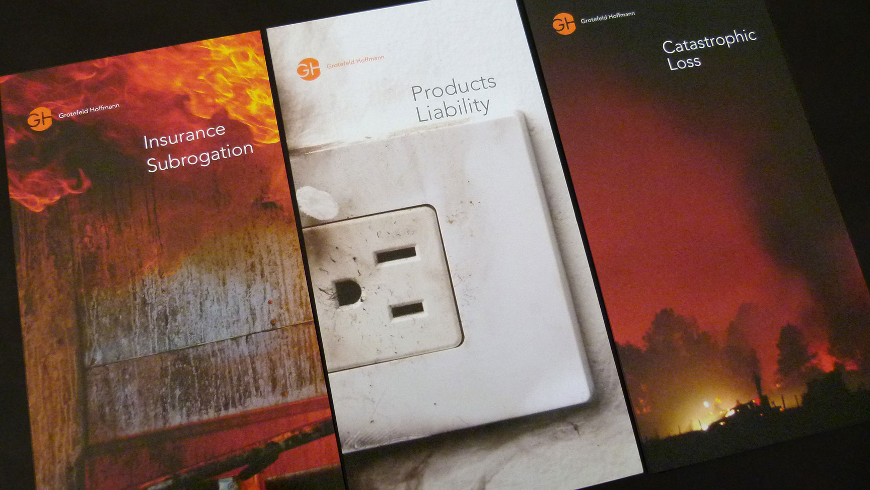
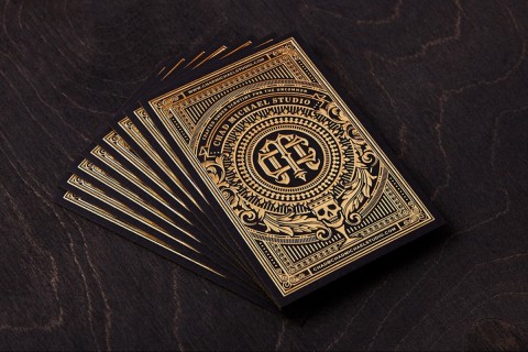
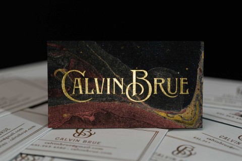
Inside, brochures about the firm’s various litigation specialties have been designed with great photography and full color (also a departure for this traditional field). These pieces allow the kit to be customized for each client’s need. Duplex business cards and gorgeous Classic Crest paper wrap up a very compelling case of design.

