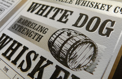
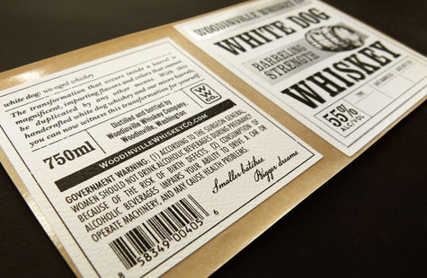
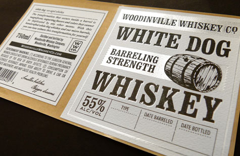
David Cole is back with another fabulous label for Woodinville Whiskey Co. The design is a complete redo for this particular offering, allowing it to coordinate well with the rest of the distiller’s family of whiskeys and a recently updated branding.
To emphasize the liquid’s crystal-clear, pure nature, Cole used a monochromatic palette with high impact. Snow-white paper, two hits of black, and that icy silver foil tell the perfect visual story for White Dog (an un-aged whiskey) and create a stark contrast with the warm tones used on the packaging for the aged products.
Flexography gives great texture to the label as does the felt finish on the stock, which reminds me of hammered pewter. That the new label was accomplished without the need to resubmit a COLA application (thus reducing production time by at least two months!) proves that design can be smart as well as gorgeous.
About the PaperSpecs Gallery
We’ve created a curated space where design, paper and printing excellence are celebrated and made very visible – for those who love the medium of paper. For those who want a little inspiration. For those who may be your next clients.
What’s in it for you?
As well as receiving exposure for your work (and the admiration of your peers), a feature video about your project might appear on the PaperSpecs website.
Go on, Show us What You’ve Got
Those selected to appear in the PaperSpecs Gallery will be notified by e-mail. Not all entries will be selected for inclusion. We’re looking for those printed pieces that are truly inspirational in terms of creative and appropriate use of paper, and excellence in design and printing.
We can’t wait to see what you’re capable of!

