Web Designer Business Card
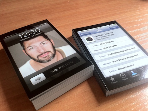
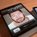
This first one isn’t going to be new to a lot of people, but so far it’s the best version of this idea we’ve seen. The concept is simple. On the front: an iPhone image of the Web designer with “Hire me Now” in the “unlock” position below. (As with hostage takers, you have to humanize yourself to potential employers…) On the back, his contact info in the iPhone format many of us are familiar with. Cards are printed on 350 gram paper with selective gloss. The only thing that would’ve made this better? If he’d gone all the way and made the cards iPhone shaped.
Pilates Studio Business Card
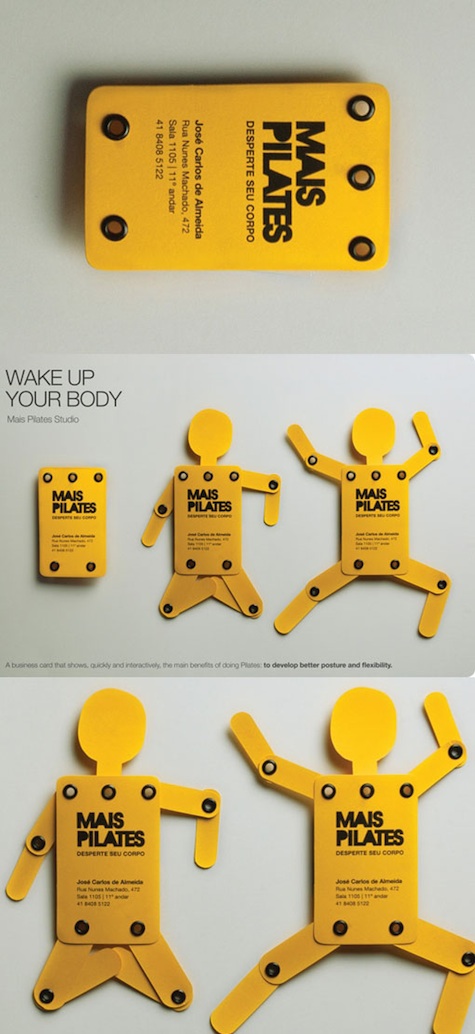
Though this was probably done better here, this piece for a Brazilian Pilates studio is still pretty impressive, and fulfills one of the fundamental rules of a successful card: it’s something the recipient is liable to hang on to (playing with it while on the phone, most likely).
Dining Club Business Card
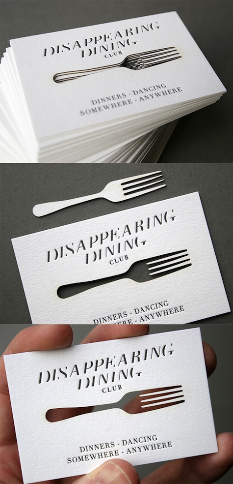
Though we must admit we’re not really clear on what a “dining club” is, we do rather fancy this laser-cut card for the “Disappearing Dining Club.” Crafted by United Creatives and printed by Blush Publishing, the card is wonder of tasteful restraint that really gets its message across. Rather than mangling the description ourselves, here’s the background from CardObserver.com:
“Disappearing Diners is a club which arranges fine dining at all sorts of unusual venues as pop-up events. This card is the result of a collaboration between a designer, letterpress printing studio and a specialist laser cutting service. The text has been letterpress printed on the cards with a font that was specially designed with the name of the club and its concept in mind. The fork motif has been laser cut from the cards, and as the fork is made of negative space, it also reflects the transient nature of the events the club organizes.”

