 There are few design arenas more thankless than packaging and, it must be said, for good reason. Sadly, much of it is unnecessary, aesthetically bankrupt, and more often than not, an afterthought. But when creativity, skill and budget align, it can also be some of the most inspiring design there is. This week, we once again bow before the sultans of wine packaging, Stranger & Stranger, and see what happens when Nike really does, in fact, “just do it.”
‘Book of Stranger’ Design
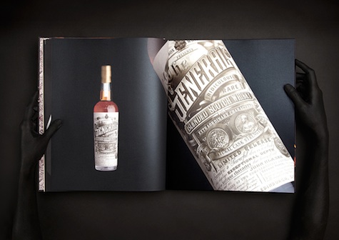
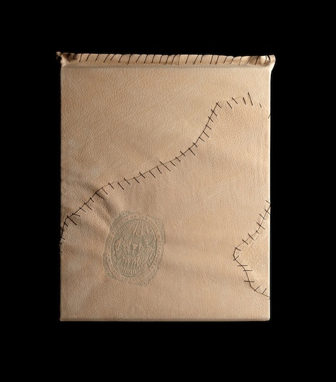
Few wine packaging designers inspire as much awe as Stranger & Stranger – a reputation richly deserved. Last year, to mark their 20th anniversary, they inserted a few hundred of their choicest designs between two covers with “The Book of Stranger,” an exquisite tome that was sent to select recipients over the holidays. Taking as their inspiration the nightmarescapes of Hieronymous Bosch, they sealed each book in a skin-like covering – complete with a “The Skin of Stranger” embossed seal. The wraparound book cover itself is equally disturbing, again echoing Bosch’s work. And for those who absolutely MUST own a copy…you can buy one for $135.
Nike: The Opening Package Design
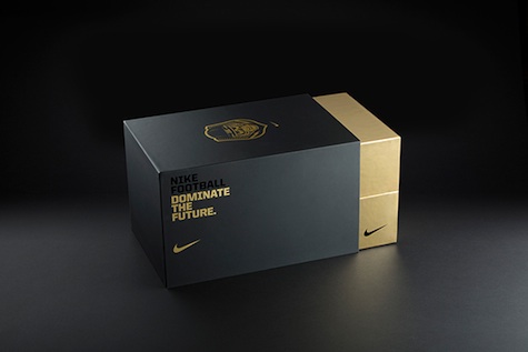
We can’t pretend to any great knowledge when it comes to sport, and that goes double once you get third-party companies involved. But when Nike came up with a dazzling invitation package for its annual “The Opening presented by Nike Football” event – well you just know that got our attention.
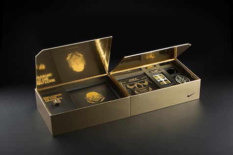
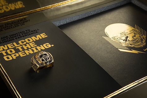
“Each of the 160 athletes were hand delivered a fold-open gold box that contained an invite, tee, camp book, mouthguard, eyeblacks and gold skull ring,” according to an understandably proud Hovercraft Studio, which designed it. Absolutely stunning!

