[youtube=http://www.youtube.com/watch?v=7yKGHpyqokA]
The issue is actually culled from online content on Cite’s blog, Offcite. The online readership drove the print content, [and] print offered a way to explore the difference between content in a physical and digital form and what it means to share in both formats.
– John Earles, Designer
Cite: The Architecture + Design Review of Houston is the quarterly magazine of the Rice Design Alliance – affiliated with Rice School of Architecture – and bills itself as a healthy mix of “an appreciation of high design with a shot of down and dirty civic engagement.” Fair enough.
Though not averse to publishing gorgeous pictures, often they are arresting images of a struggling economy, with all the degradation to buildings and roadways that entails. Which is what makes the construction of Cite’s 91st issue so appropriate.
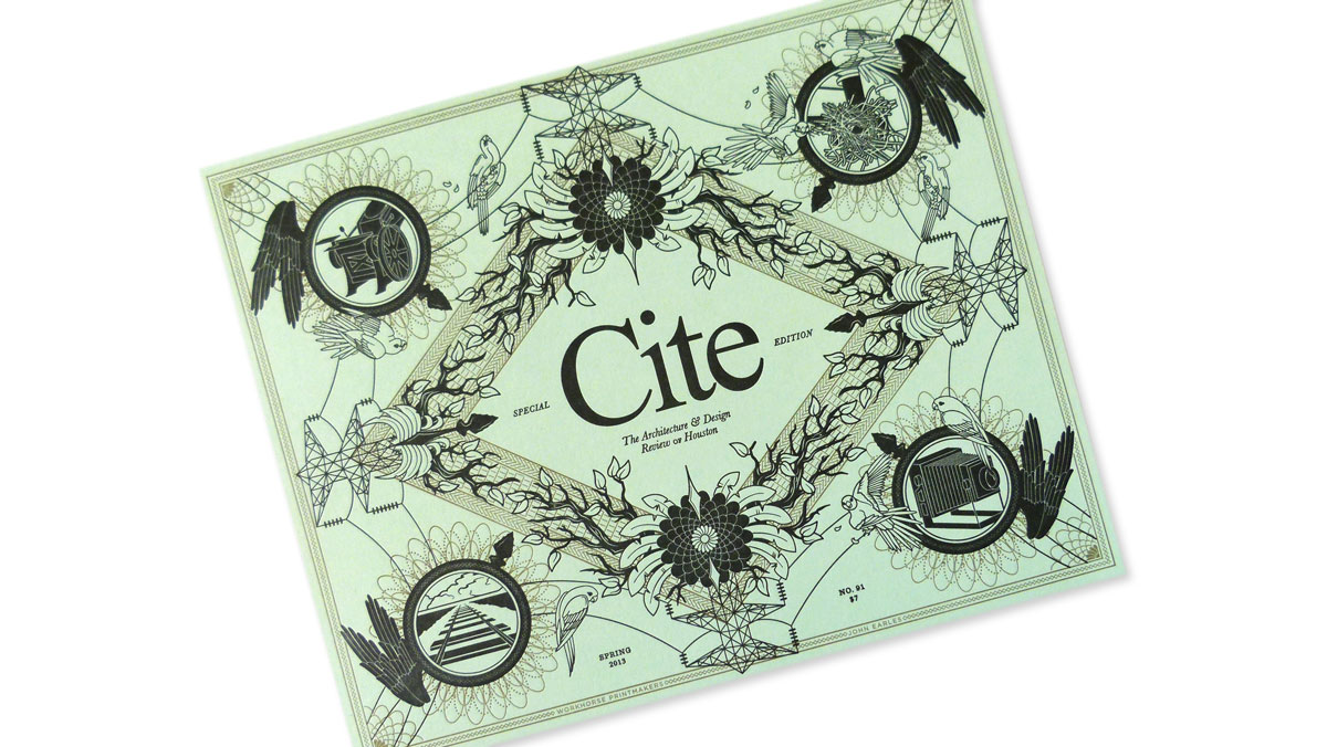
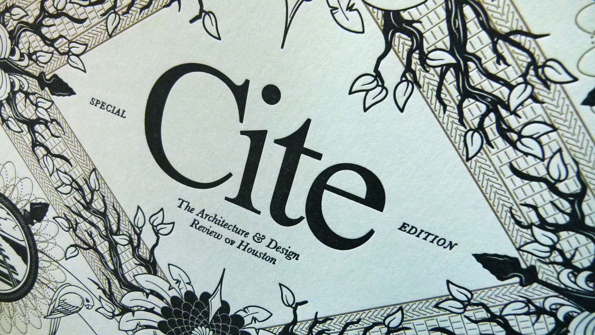
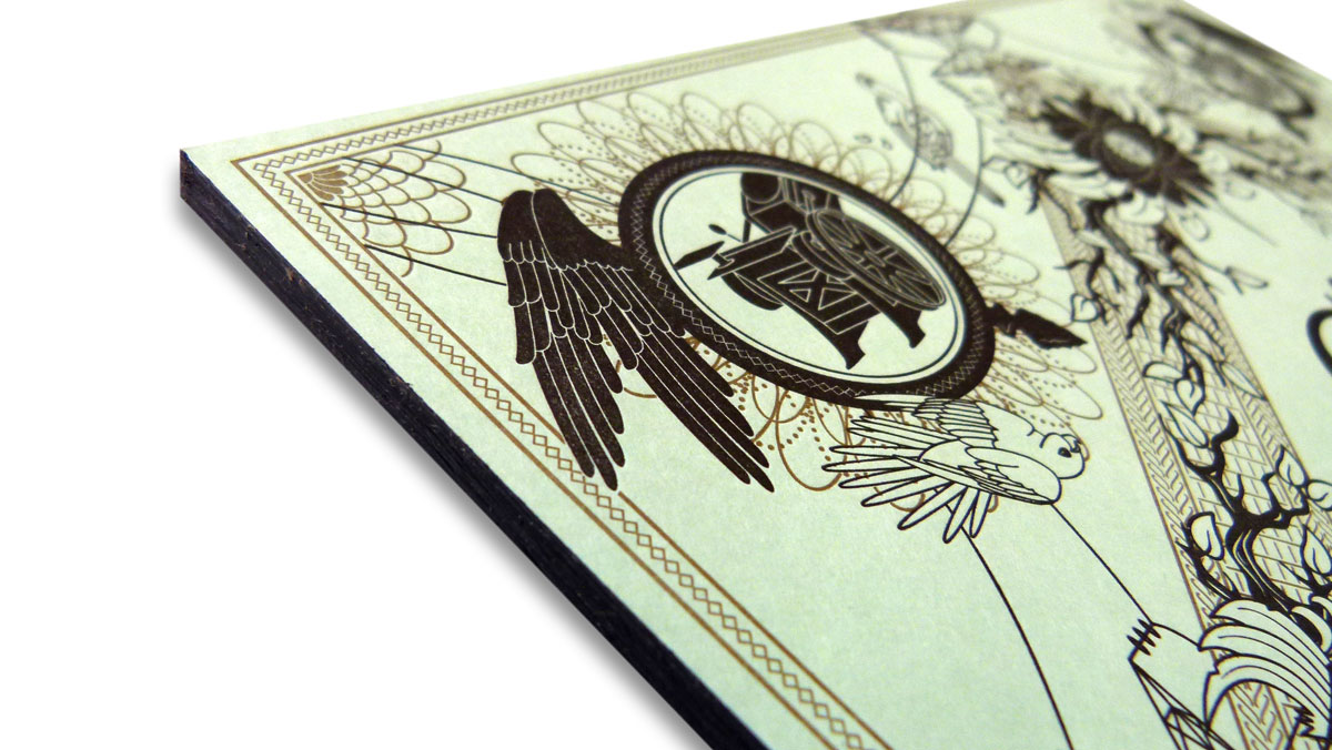
It “was designed around physical engagement with the reader,” cover illustrator John Earles at Workhorse Printmakers explains. “The letterpress cover gives the issue a tactile richness and a feel of care and history not usually reserved for a magazine. The pad binding, rather than perfect binding, allows the issue to fall apart through use or to be torn apart and shared.”
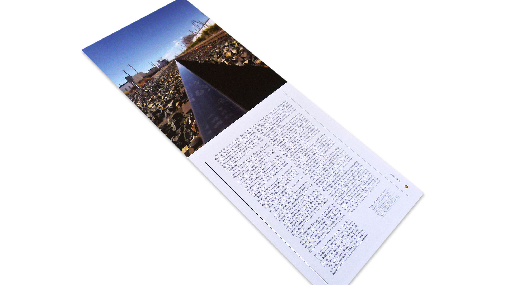
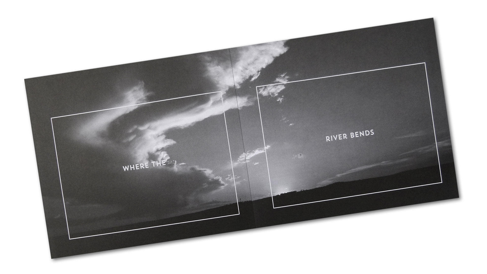
Yet this 65-page issue is by no means purely about being “torn apart.” The cover alone is beautifully letterpress printed by Workhorse Printmakers on the aptly named French Pop-Tone Spearmint 100 lb. Cover. The inside of the magazine was printed offset by Specialty Bindery and Printing.
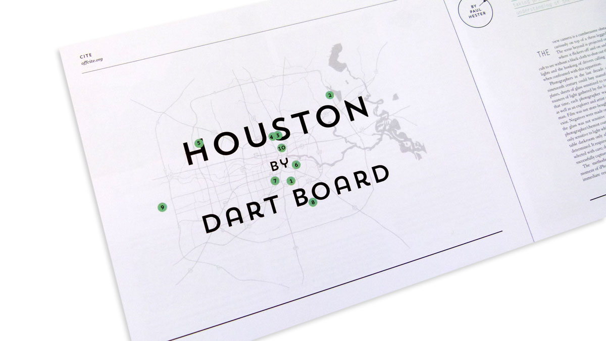
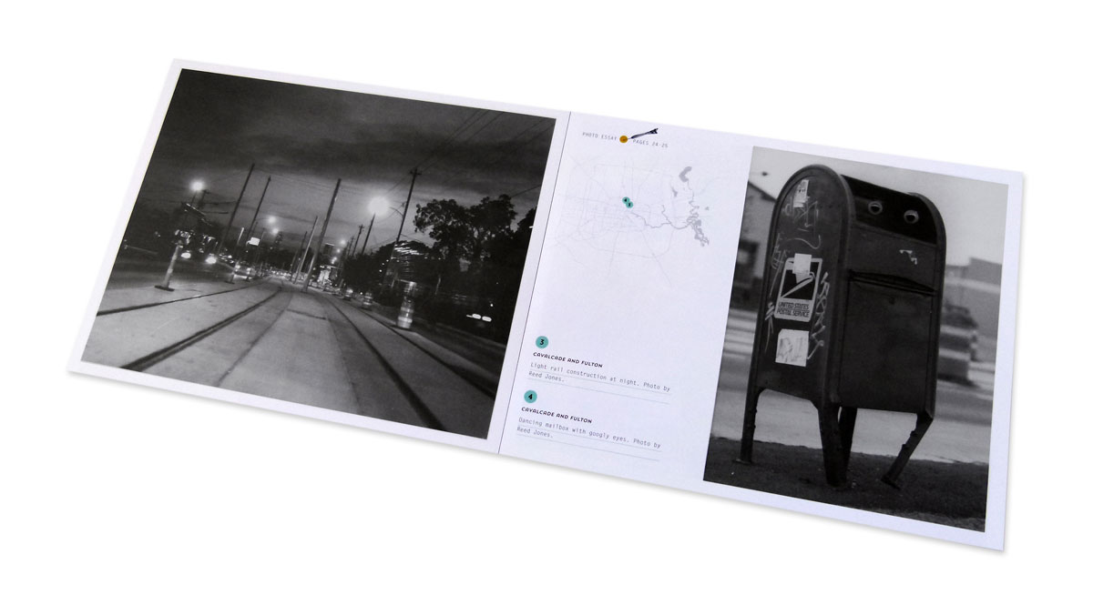
“Offset printing reproduces photographs and dense floods of color effectively in the interior,” says Earles. “And the imperfection of letterpress printing on the cover magnifies the feeling that this issue is something special and unique.”

