Invitations are probably one the most ubiquitous printed pieces there are, from personal events to summons to various corporate shindigs. In this inaugural edition of Cool Invitations of the Week, we check out three very different approaches to wedding invitations that make us weep for joy, though whether that’s for the design or the happiness they embody, who can say? (And don’t forget to check out our Cool Designs of the Week, Cool Cards of the Week and Cool Packaging of the Week, because really, you can never have enough cool. Cool?)
Justina & Wesley’s Invitation
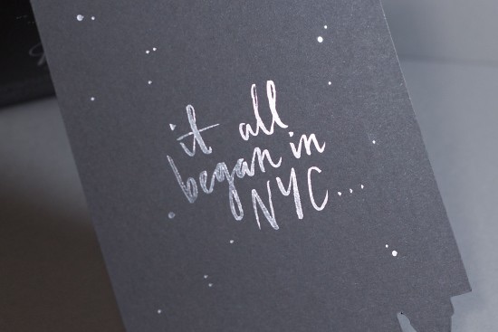
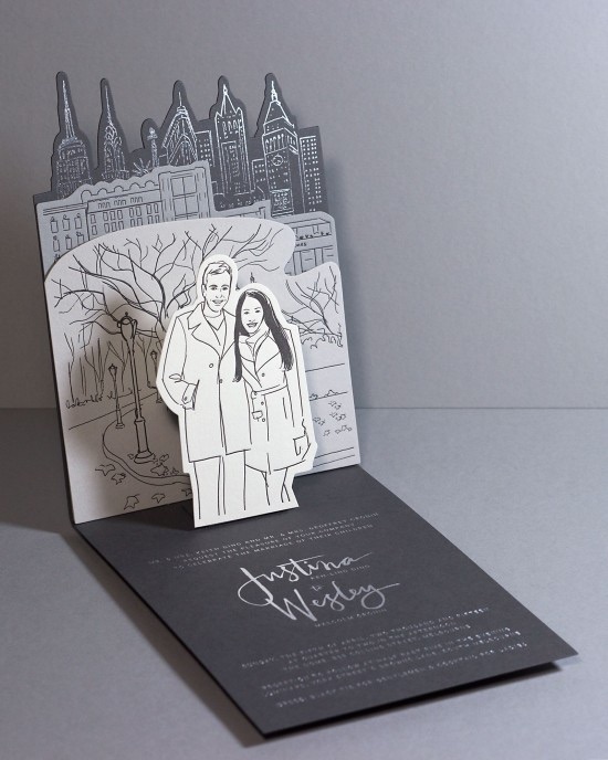
As much as we experienced a vicarious thrill reliving the New York Fairytale engagement of these two, it was the invitation that sealed the deal for us. You’ve seen the attempt to work illustrations of the happy couple into invitations many times, of course, but have you ever seen it accomplished so elegantly? Here is the bride’s explanation of this lovely design by The Hungry Workshop:
“The end result was a pop up invitation with four different layers, with each layer featuring illustrations on one side and information regarding the wedding on the other side. The first layer in the foreground was an illustration of Wes and I in Central Park just after Wes proposed, with the lake in the background. The second layer is a row of shops on Fifth Avenue including Chanel, Hermes, Bergdorf Goodman and Harry Winston which all have significant meaning to us. And the third layer is of the Manhattan skyline including the Metropolitan Life North building where the Eleven Madison Park restaurant is; this was where Wes took me for dinner the night of our engagement.”
Kristen & Loren’s Invitation
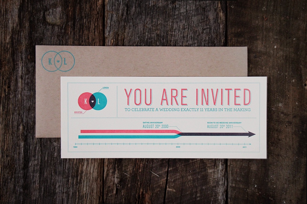
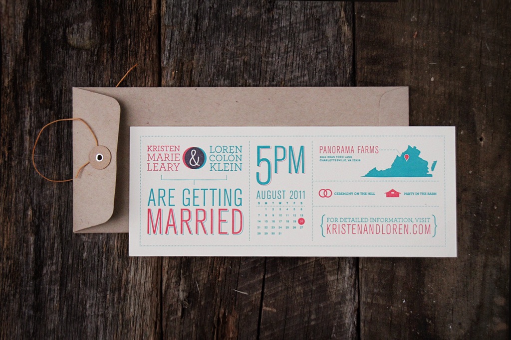
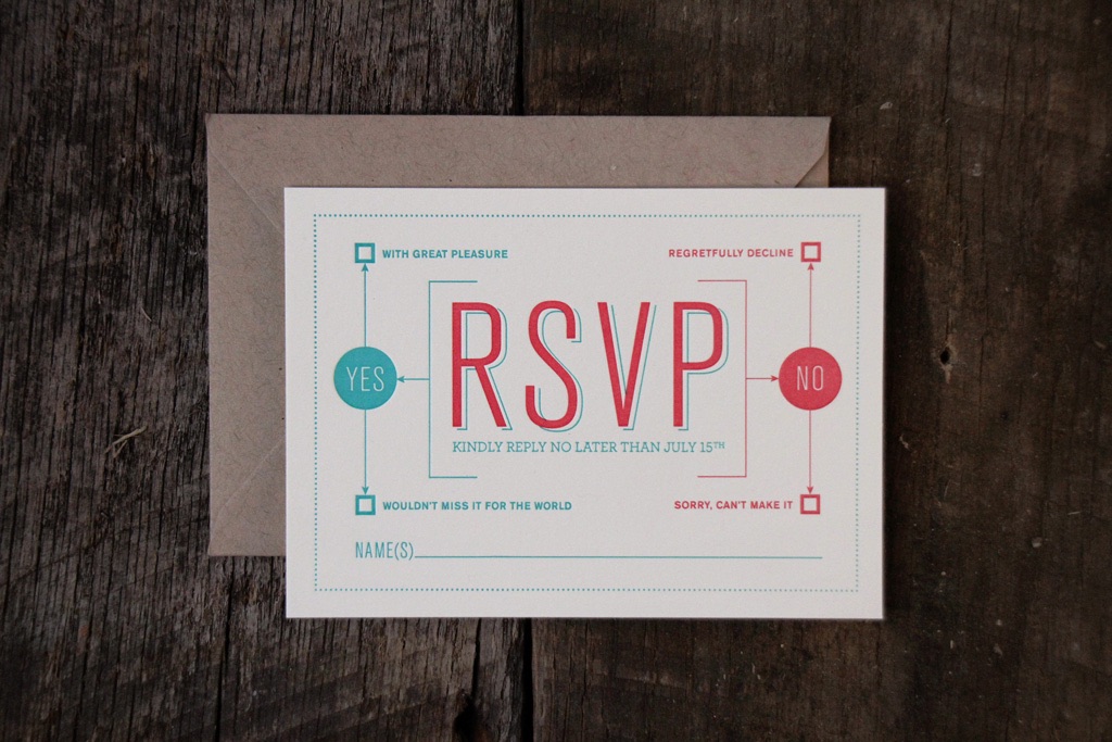
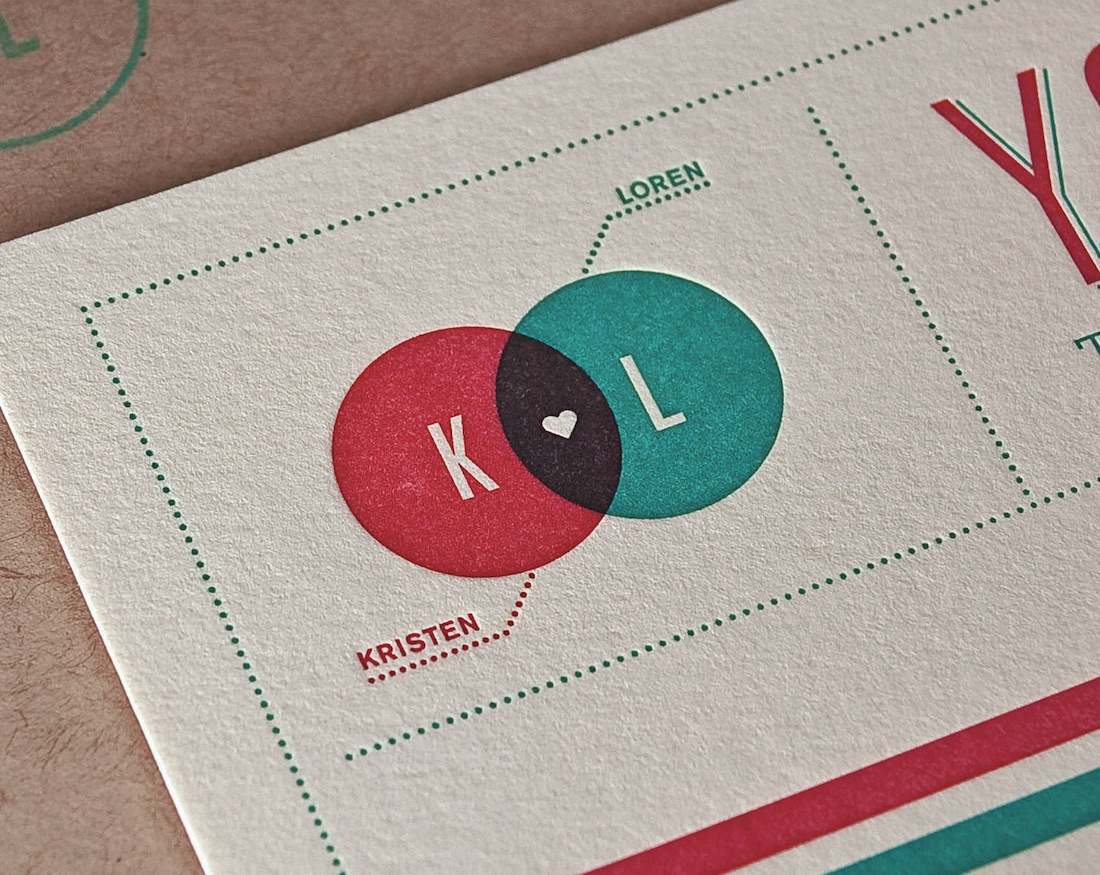
It’s always a special treat to see what designers come up with for their very own wedding invitations, and Loren Klein doesn’t disappoint. The strength of this letterpress suite lies in his ability to brand the event (e.g., the distinctive Venn diagram logo he came up with) and to evoke the rustic nature of the wedding’s venue – a farm. The use of infographics is particularly clever, showing how long they’ve been dating (a topic bound to come up amongst the guests) and where the event is actually taking place. The logo deserves extra kudos here for the use of the two colors in the Venn diagram overprinted to realize a third as a backdrop for the heart.
Charmaine & Patrick’s Invitation
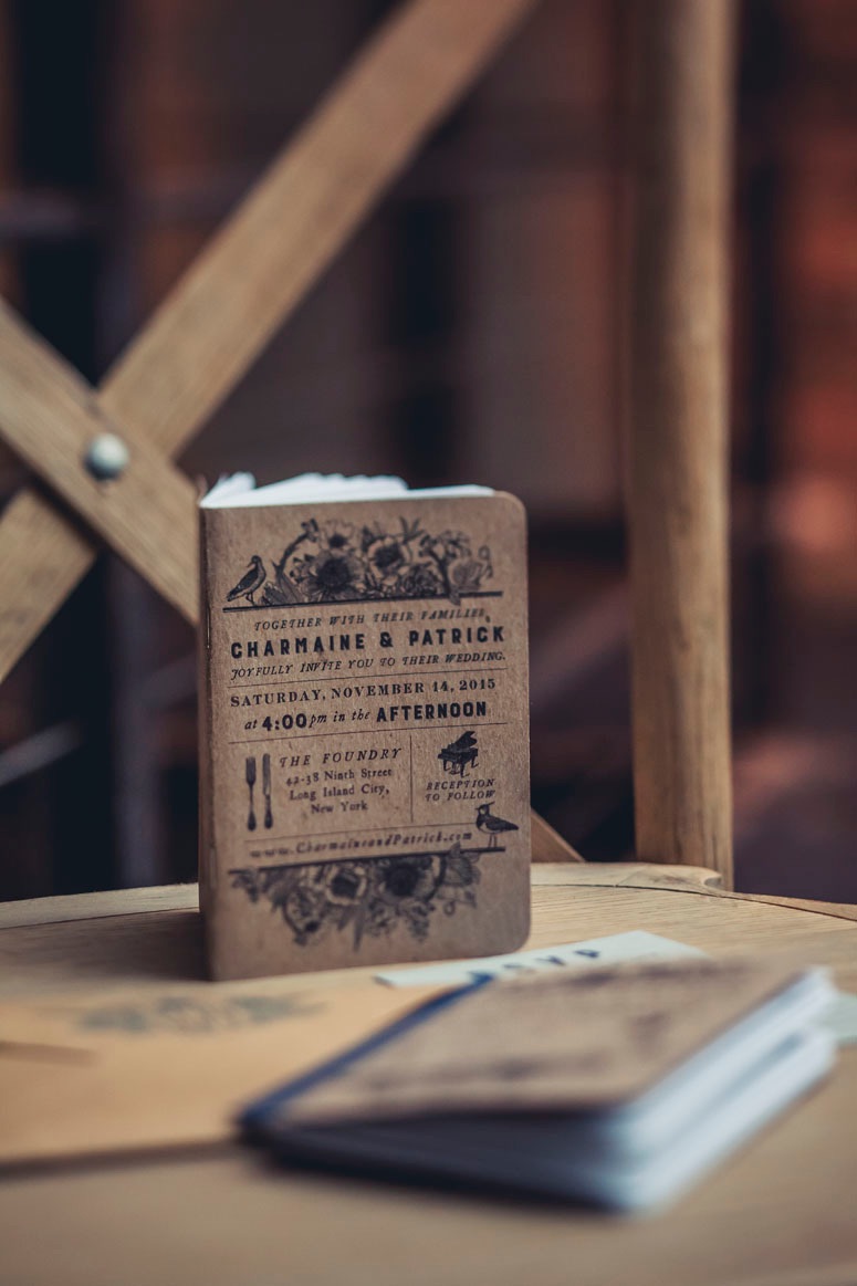
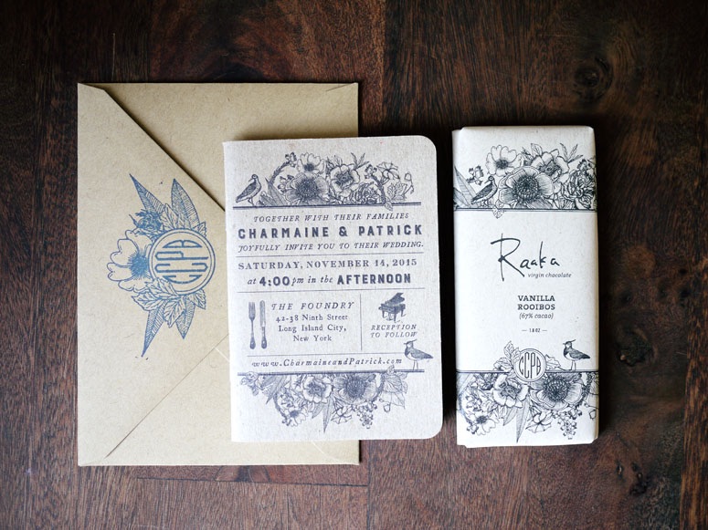
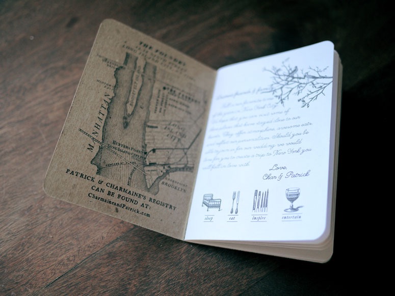
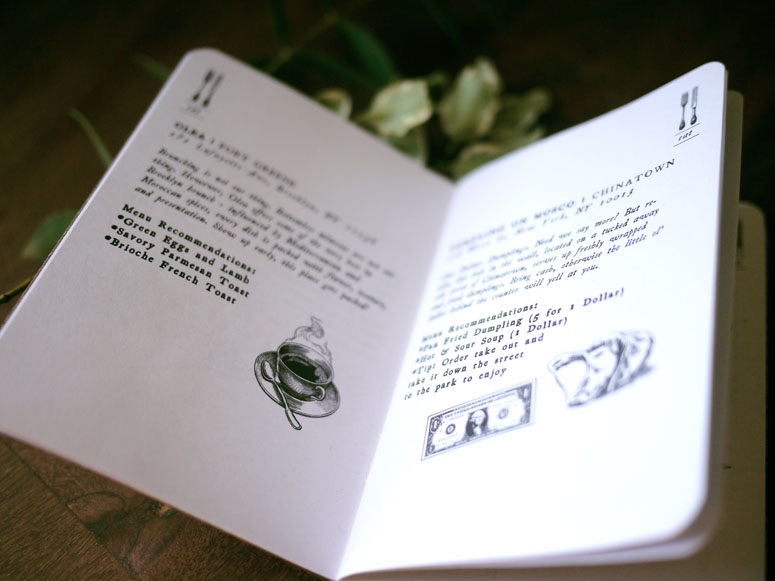
What were we just saying about designers’ invitations? This 32-page, saddle-stitched booklet has all the relevant wedding details on the cover, and then proceeds to give out-of-town visitors a guided tour of the couple’s favorite places in New York. Charmaine’s friend Annie Lim supplied the charming illustrations and Scout Books printed the volumes on 100% recycled paper. The happy couple also included a Raaka chocolate bar with each book, featuring a custom-printed wrapper on kraft paper, also illustrated by Annie.
