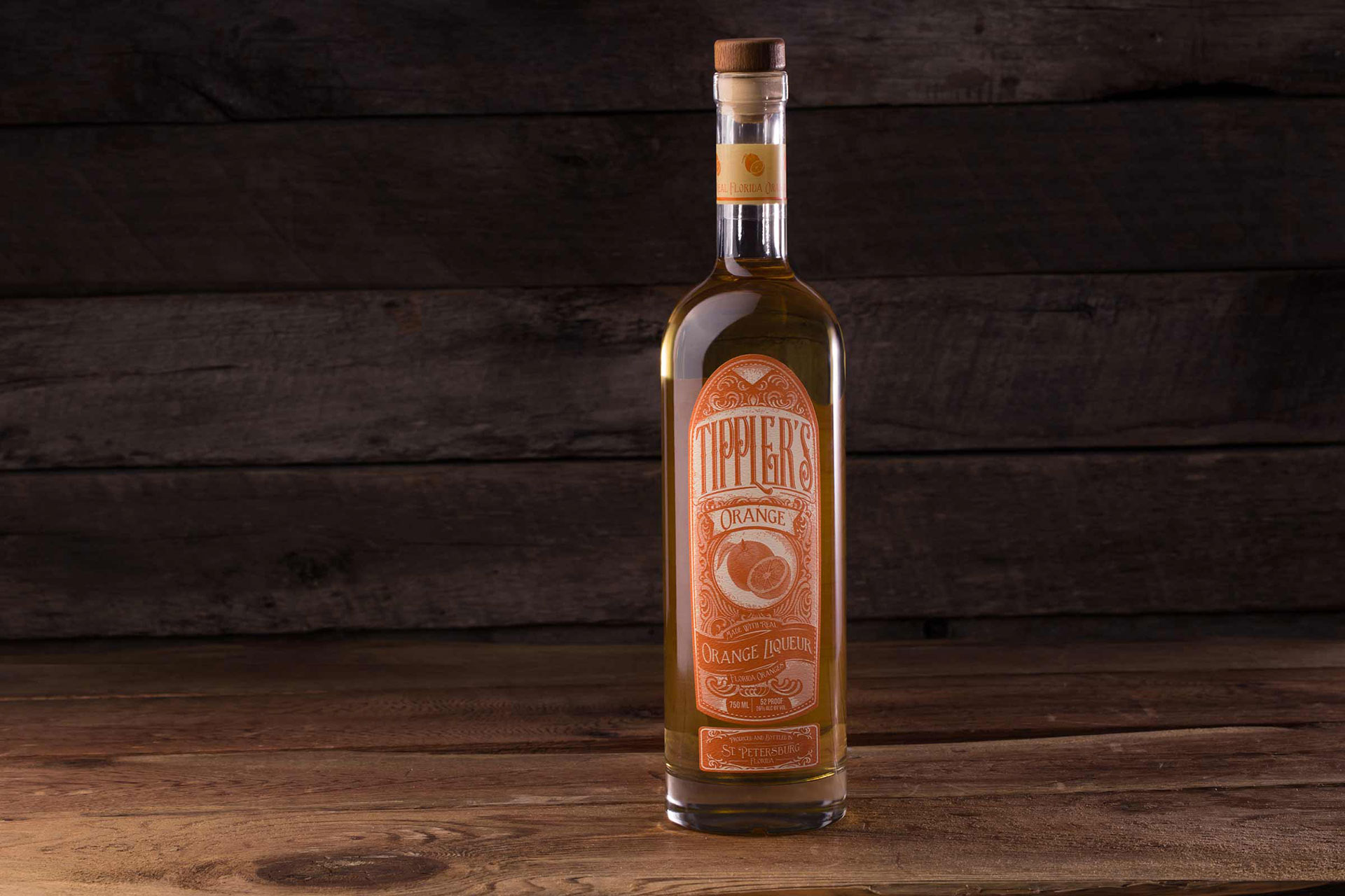
It’s very ornate and very busy, but the name and the illustration of the oranges really sticks out.
– Grant Gunderson, Dunn&Co
Tippler’s Orange Liqueur recalls a time before air conditioning and Disney World, when Florida was a new frontier and citrus was just finding its way into crates to be shipped north. “I wanted to create something that felt like that time period, when things were designed with great detail,” says Grant Gunderson, senior art director at Dunn&Co, the design firm for the project.
Although the design is intricate, the name of the liqueur and the custom fruit illustration really pop thanks to the designer’s choice to employ only two colors on Avery Dennison Eggshell Felt 70 lb. Text. Gunderson calls the label “organized chaos.”
While you’d never guess from looking at this one, Gunderson had never designed a label before, so this project provided some lessons for the designer. “I learned to not try and make the label too large,” he says. “I was pushing for it to be pretty large, but we ended up doing a reprint because it covered the fact that the base of the bottle was good quality thick glass.”
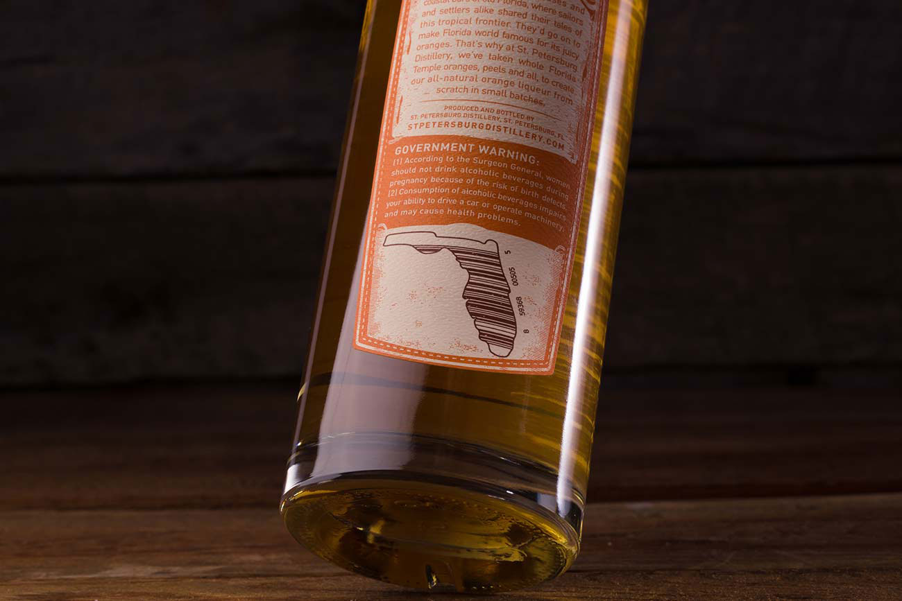
Additionally, the charming barcode, which resides within an outline of the state of Florida and further reinforces the brand’s authenticity, posed some challenges and insights for the design team. “I also learned that the barcode needs to be pretty exact to be readable and that it can’t be read in any color with percentages of red,” Gunderson says. “So the final color was a deep brown.”


