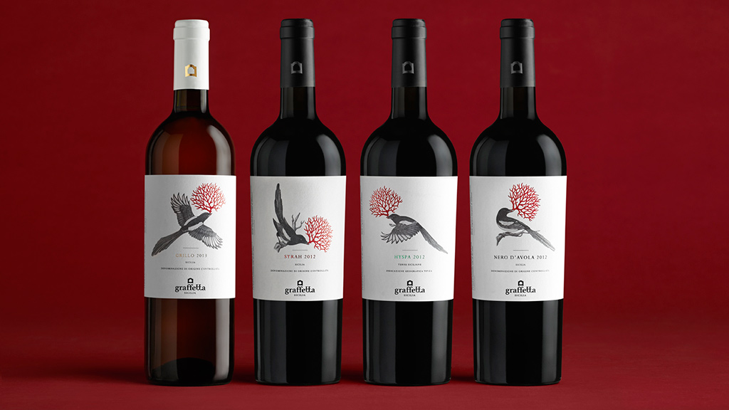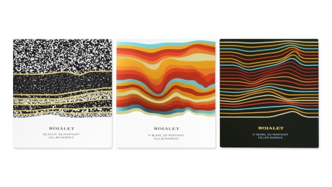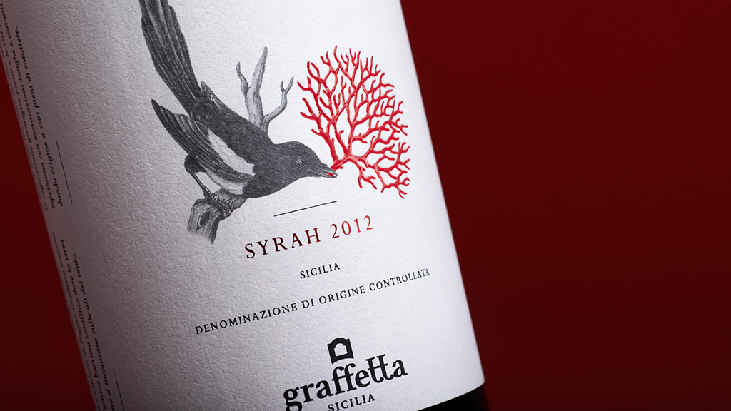
[In this label design] We see a unique encounter (that is) able to break through the barriers of time and give these wines a high-impact visual identity.
– Stefano Dell’Orto, Neom
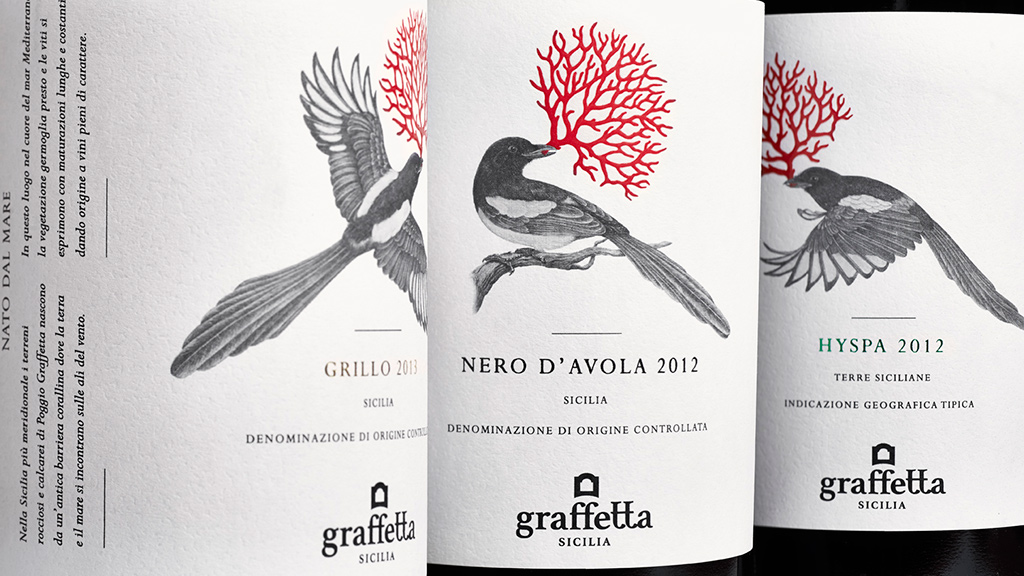
Sometimes the best way to stand out in the uber-competitive world of wine & spirit labeling is to keep it clean and simple. The labels for these offerings from Italy’s Alimenta S.p.A., for example, simultaneously suggest a mom-and-pop winery (the low-key bird illustration) and refined sophistication (the red bit of coral in its beak).
“In ancient times the Graffetta farmland, located in the splendid southernmost tip of Sicily, was a coral reef immersed in the… Mediterranean Sea,” explains Stefano Dell’Orto of label designers Neom. “From this particular origin, imprinted in the DNA of the land, we have ‘seen’ the precious red coral, vibrant with life and sea…” snapped up by that connoisseur of all things shiny, the magpie. And purpler prose than that has inspired labeling that could never hold a candle to that red coral detail.
Still, whatever its inspiration, a wine label rises or falls on its ability to attract lovers of the grape – or wine magpies, to push this metaphor a bit further – and this these surely must.
The rough surface of the Fedrigoni Constellation Snow Country paper contrasts wonderfully with the thermography of the red coral branches, rewarding repeated touches with a feeling of subtle dimensionality. Further, each one of these pieces is comprised of three-color offset printing by Tipografia Sangiovanni, as well as hot foil stamping, with the names of the wines themselves (e.g., Syrah 2012) being embossed.
Clearly magpies aren’t just scavengers of lesser treasures such as tin foil and bits of string – they’re excellent judges of quality wine labels, too.

