Right from the beginning, we were determined not to follow the norm of including a bee in the honey logo, just because this was not another honey.
– Evaggelos Spiliopoulos, S & Team
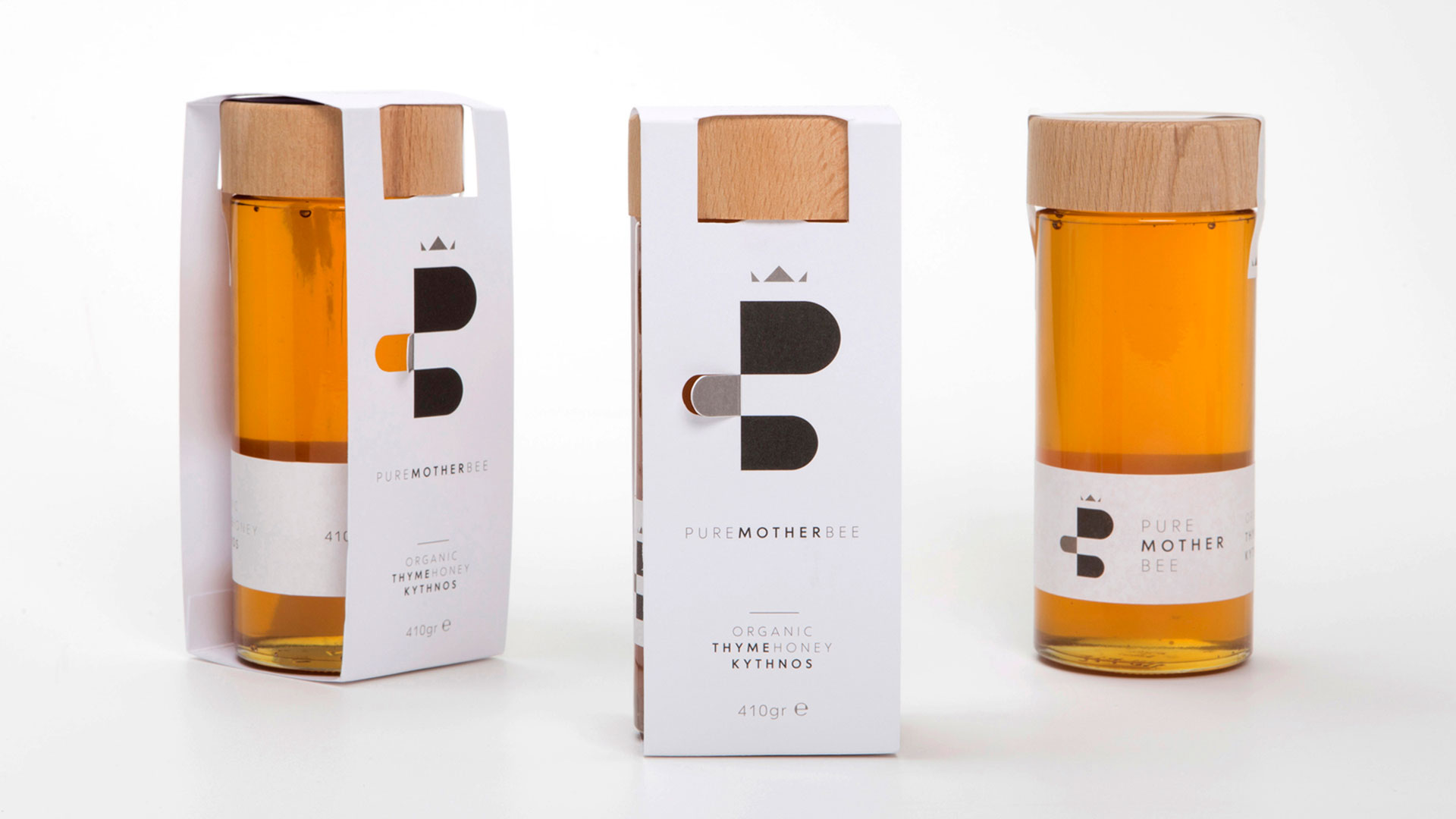
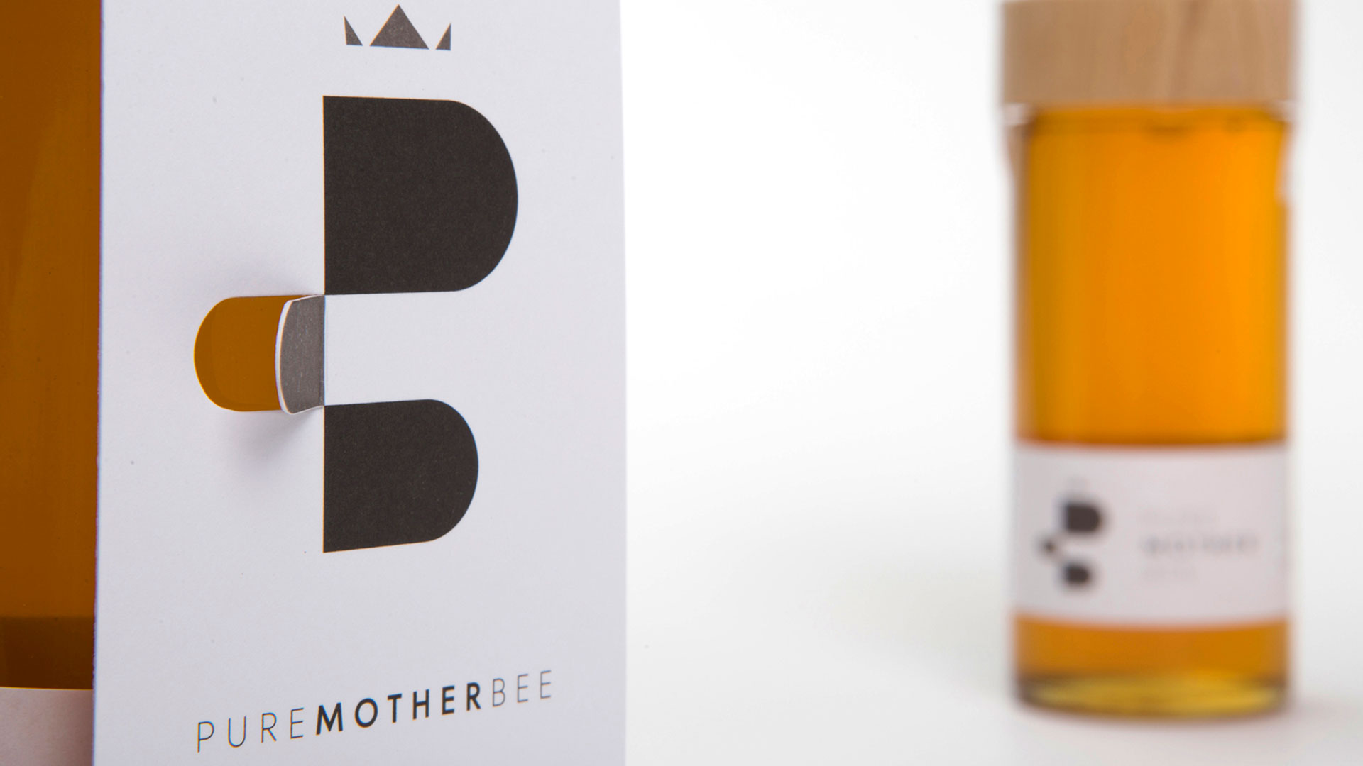
When the Gonidis Beekeeping Family asked the S & Team brand agency to create the packaging for its 100% organic honey, the creative team knew it was important to keep the design as simple as possible to underline the honey’s premium quality and pure taste. S & Team began by creating a new Pure Mother Bee logo, which combines the letter “B,” a bee’s figure in profile, and a queen’s crown.
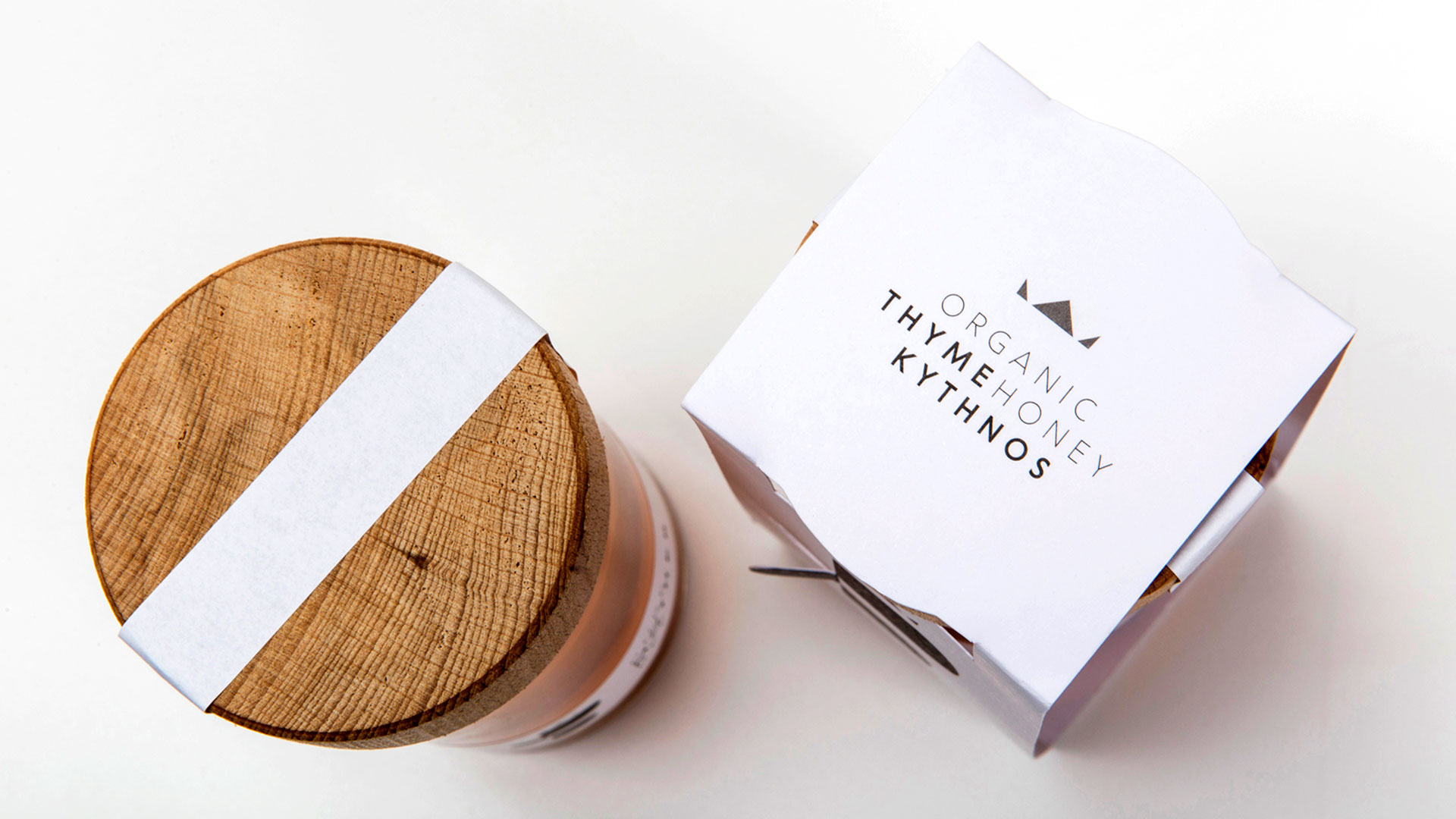
The next step was to devise a packaging solution that was in line with both the name and the logo. “We included only the absolutely necessary information, such as the brand’s name, honey type and grams,” says creative director Evaggelos Spiliopoulos. “For the 410 gram packaging destined for organic and delicatessen stores, we picked a tall and elegant bottle to match the honey’s elegant taste, and a wooden cap to imply the honey’s 100% organic origin.”
With the help of printer Ektipotiki Axion in Athens, Greece, S & Team produced a label and outer packaging wrap that was offset printed with three spot colors. The star of the packaging, however, is the logo’s laser die cut that mimics a bee’s flapping wing. The 500 wraps were hand-folded, resulting in an elegant packaging solution that reinforces the premium brand while allowing the product to take center stage.

