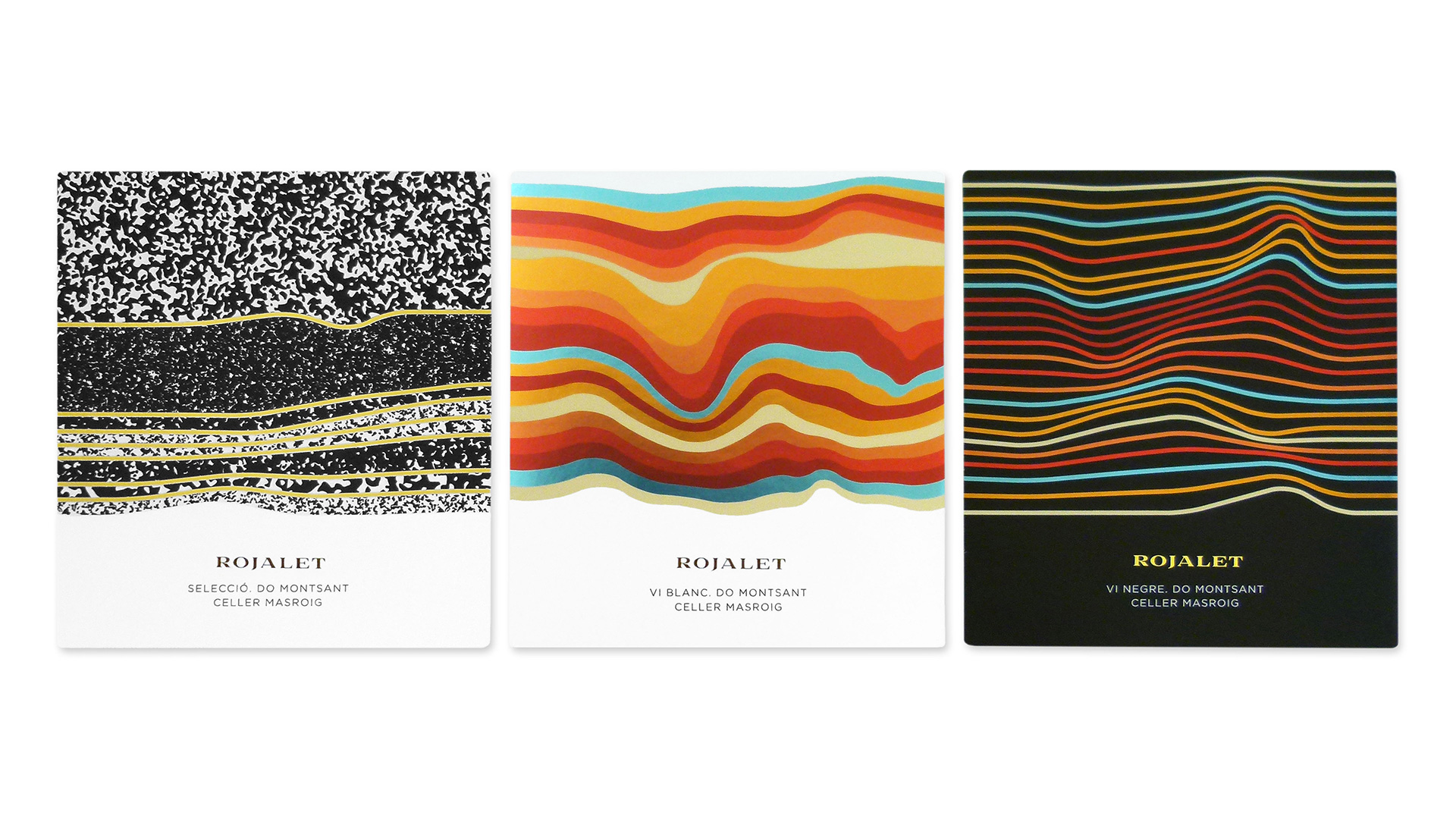
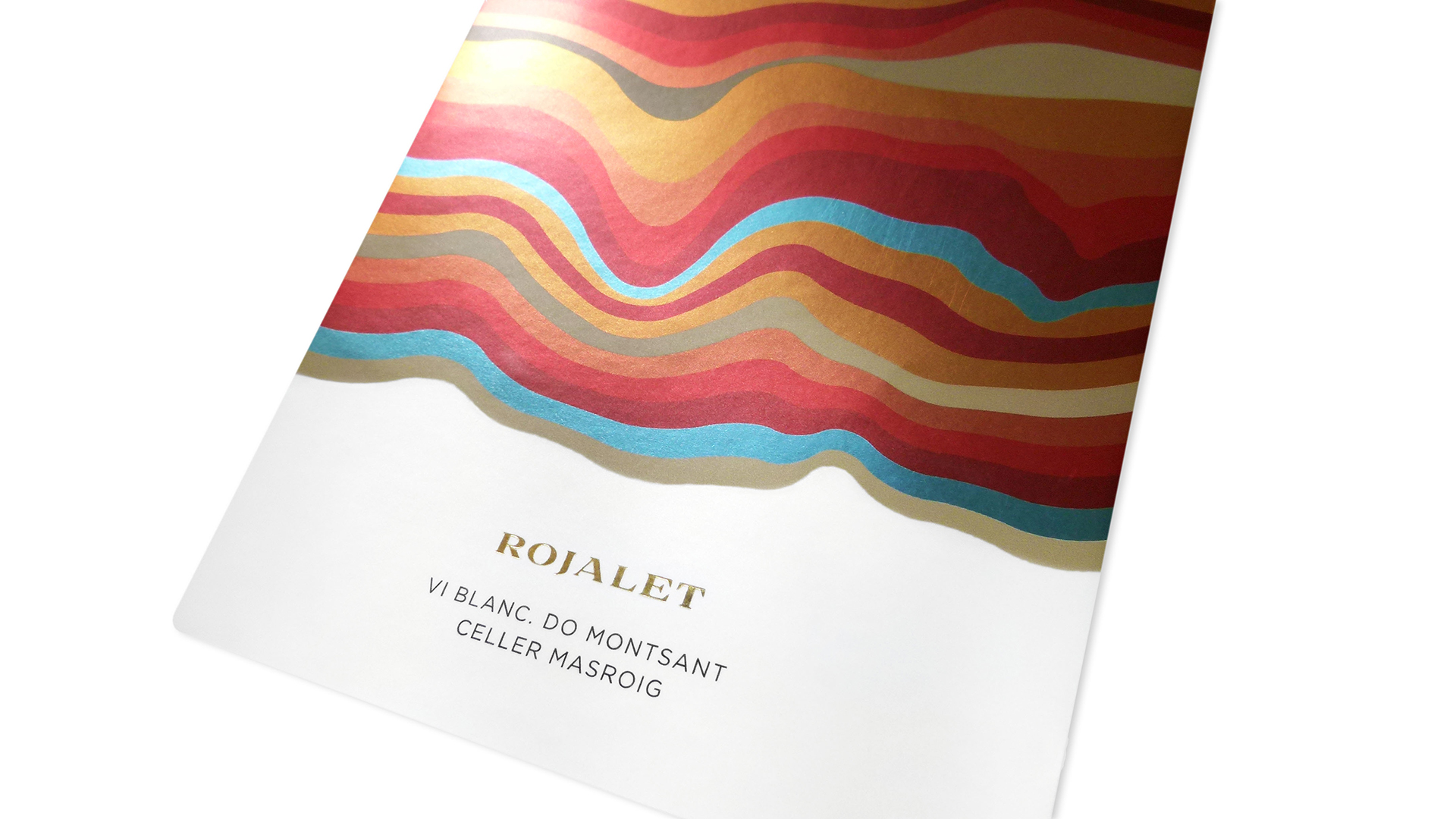
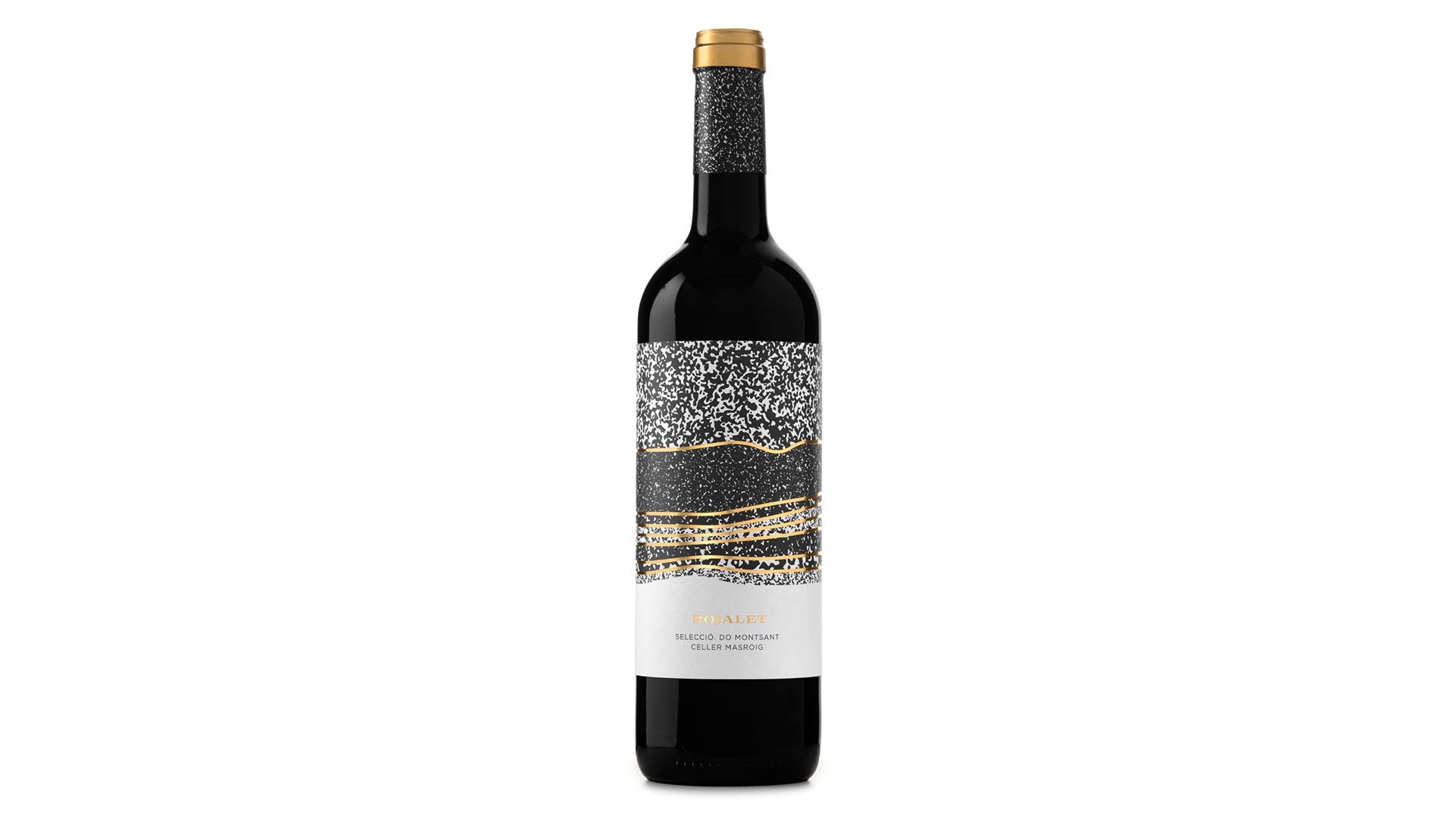
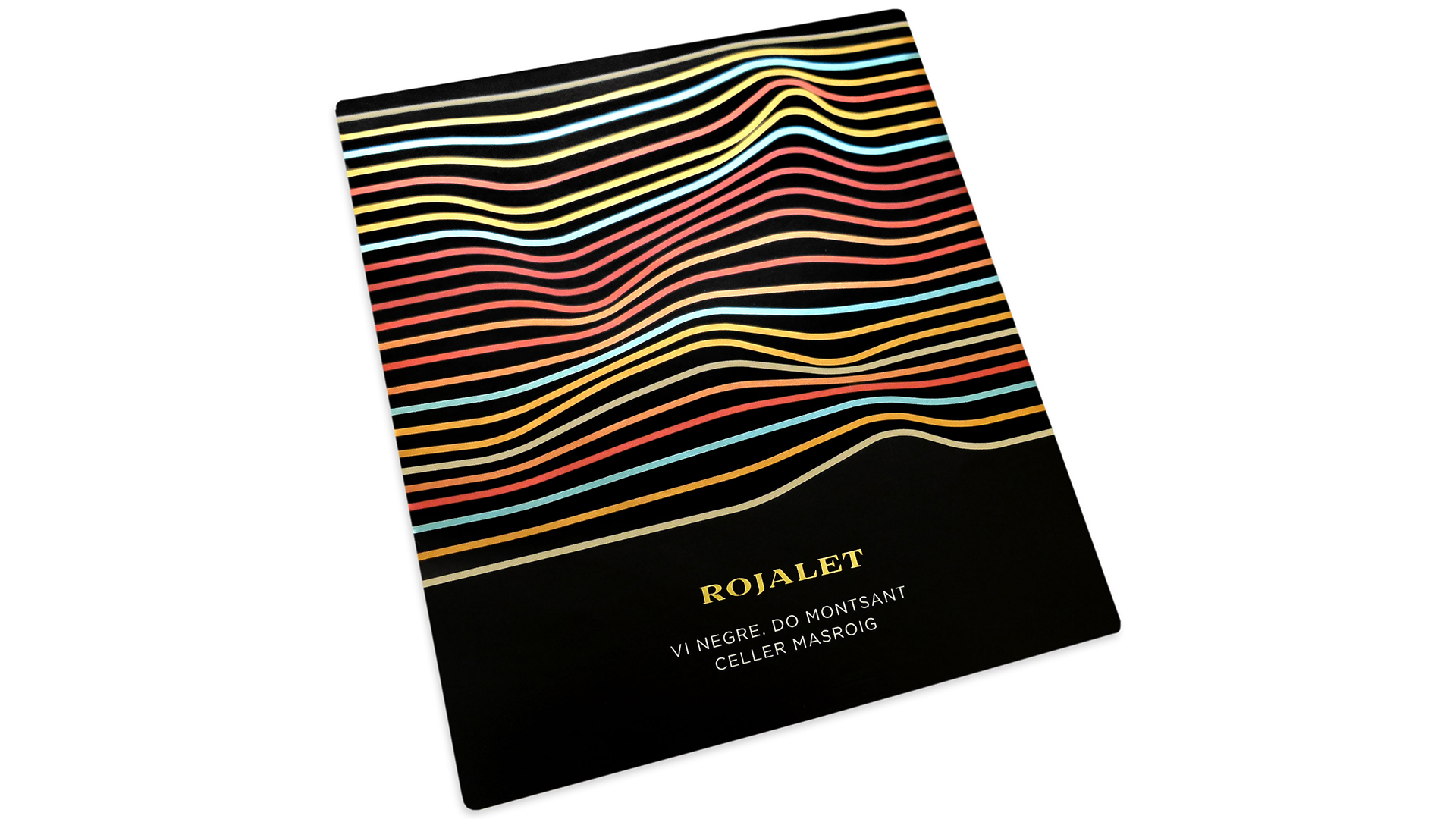
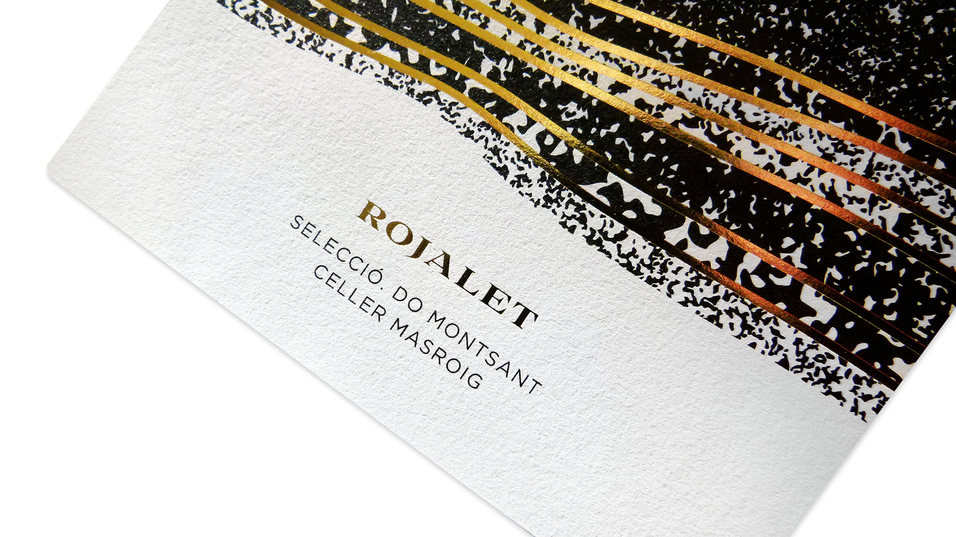
We took full advantage of the metal paper, playing with white ink in the background to create highlights.
– Eduard Duch, Atipus
Rojalet Wines succeeds in using abstract art to effectively communicate the flavor and origins of the varietals within — a tall order for a small swath of real estate.
“For the label design, we were inspired by the name of the product itself: Rojalet sounds similar to ‘red’ in Catalan,” says designer Eduard Duch, whose Barcelona design firm Atipus created the series of three labels.
The name refers to the characteristic red soil where the vines grow. “Therefore, the same name leads us to think about the earth, and one of the representations of soil are the layers,” Duch explains. The layers tell the story of the soil, its composition and thus the character of the grape. “In the labels, more than representing one type of soil, we aim to communicate through an abstract vision of this layer the wine you’ll find in the bottle: fresh, fruity, dense, wood, etc.”
Atipus took full advantage of metal paper as a backdrop for the abstract artwork, playing with white ink in the background to create highlights of the three different varietals. Rojalet vi negre and Rojalet vi blanc are digitally printed on black metallic paper using CMYK plus white with a matte laminated finish. Rojalet Selecció is offset printed on Tintoretto Gesso (Manter/Fedrigoni) using black ink and gold hot foil. Each design sets its contents apart while working together as a trio.

