What would a United Nations of Graphic Design look like? I think it might look a little something like the letterpress calendar crafted by Fabien Barral (aka MR CUP) and the international talent he manages to corral for the project each year. Christened “The Creative Manifesto,” it has grown from a scrappy little piece first published in 2011 and designed entirely by Fabien alone into a much-anticipated annual event featuring the work of 13 designers (himself included) from France and Istanbul to Detroit and New York City.
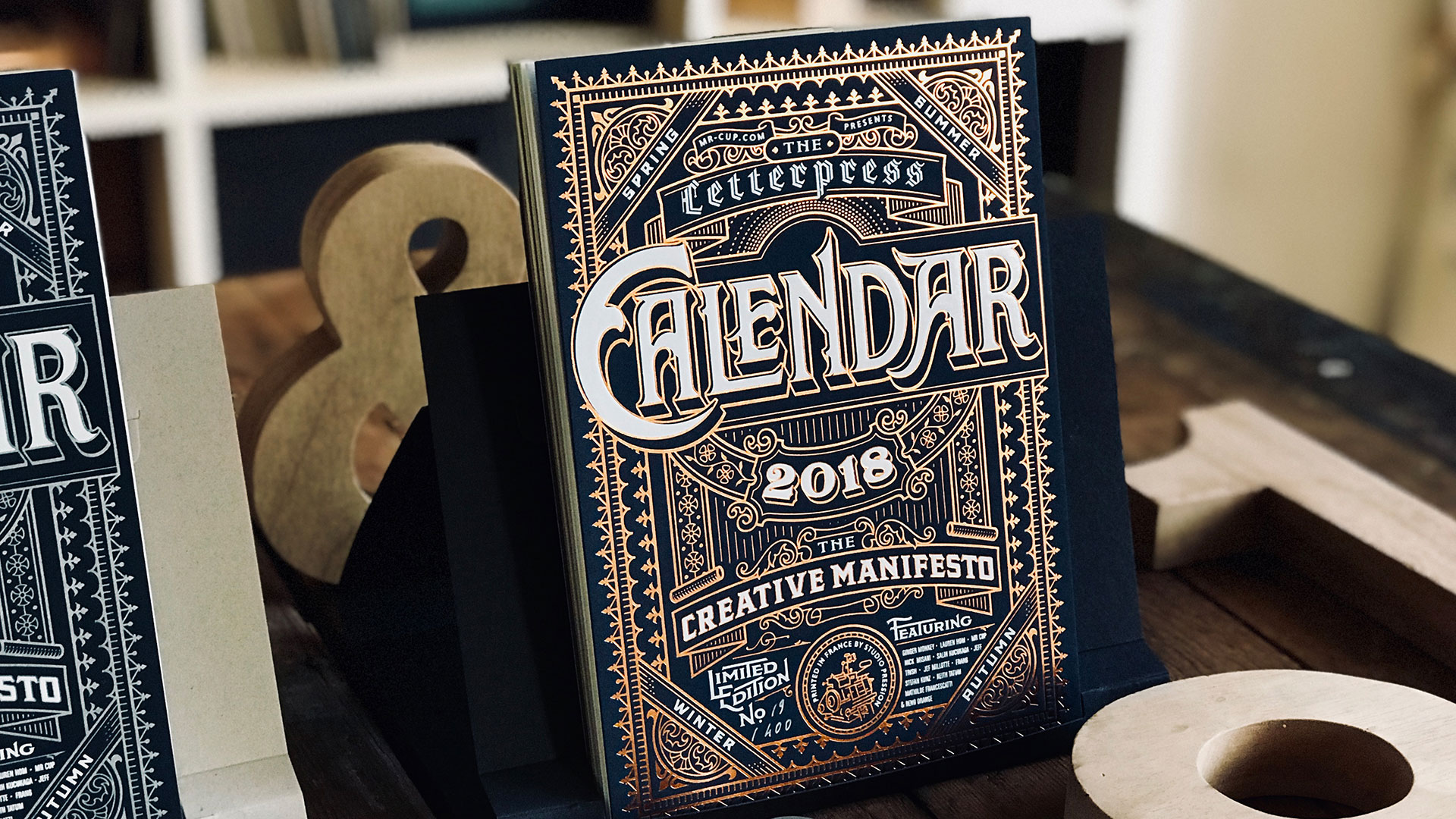
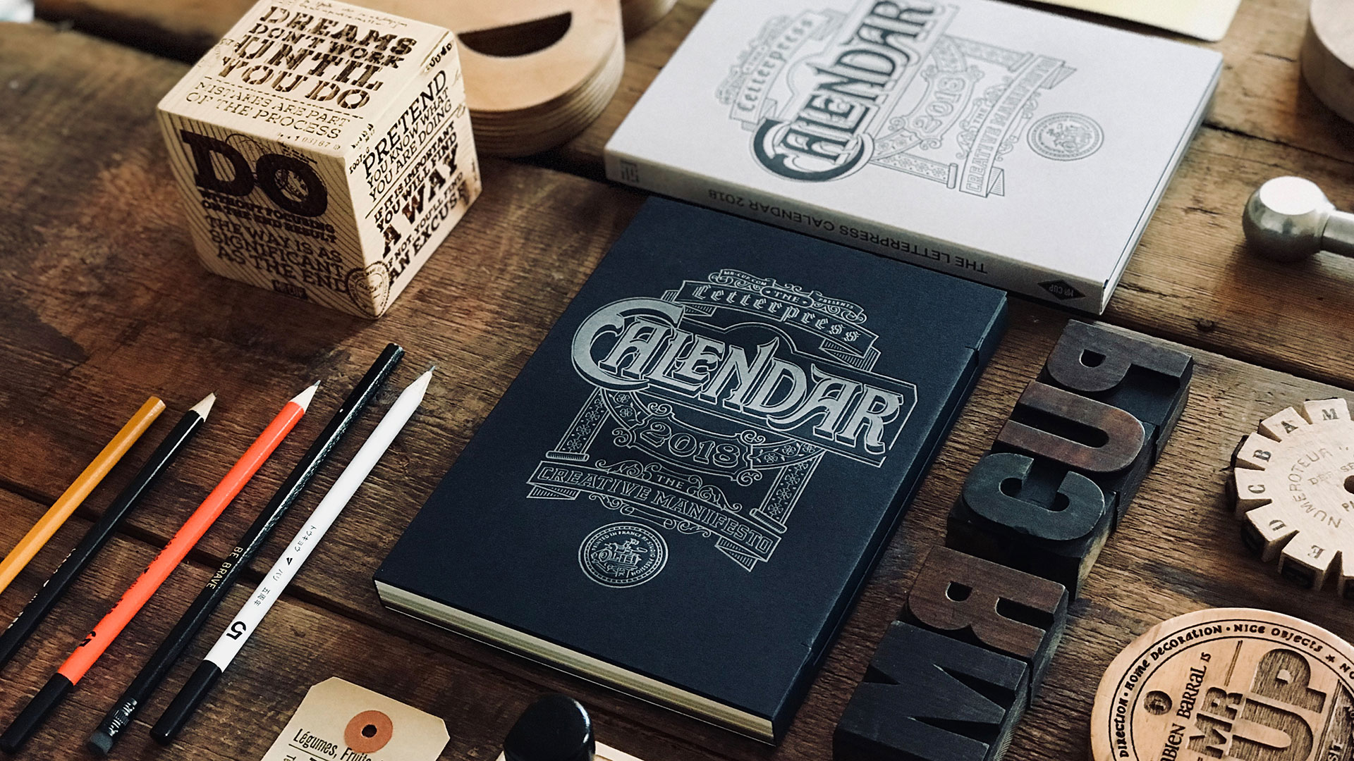
The 2018 edition is a thing of beauty. As in the past this one comes in both a deluxe edition (white and copper foil stamped on Favini Sumo dark blue paper) and a normal one (boasting silver and white inks) – both printed by Studio Pression.
Both editions feature an ornate cover designed by Tom Lane (aka Ginger Monkey) that manages to be both consistent with those of previous calendars (see last year’s, for example) while still being unequivocally Tom’s creation. Magnesium printing plates were used rather than the photopolymer variety to ensure a crisper letterpress impression – something that really shows on all the filigree work on the cover. That of the deluxe edition is particularly arresting with its playful contrasts between the dark paper on the one hand and the copper and white foil on the other.
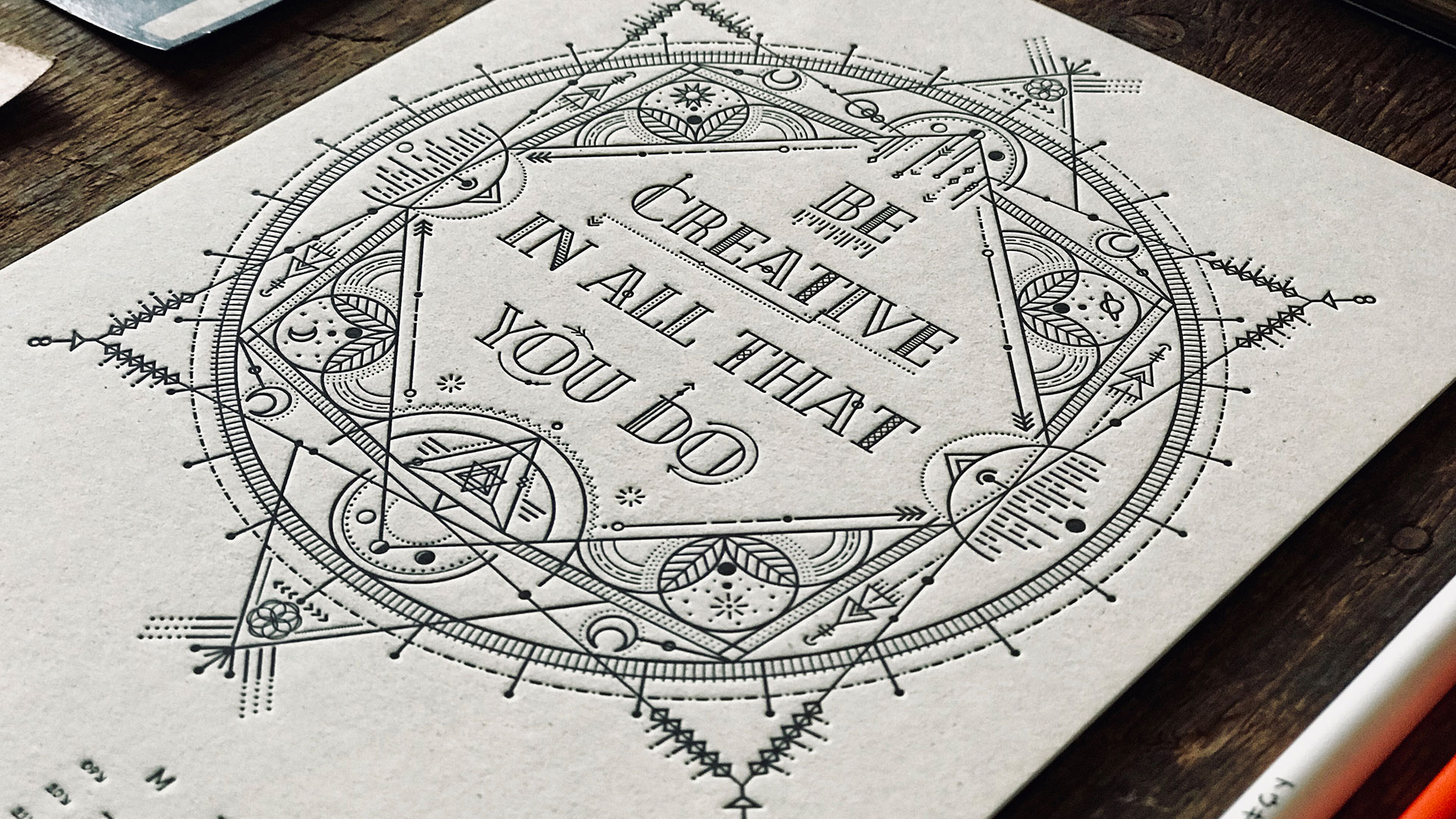
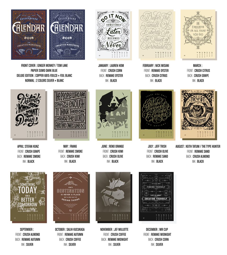
Inside, a different designer tackled each month, rendering in type and layout a different slogan meant to inspire in 2018, all on duplex laminated sheets:
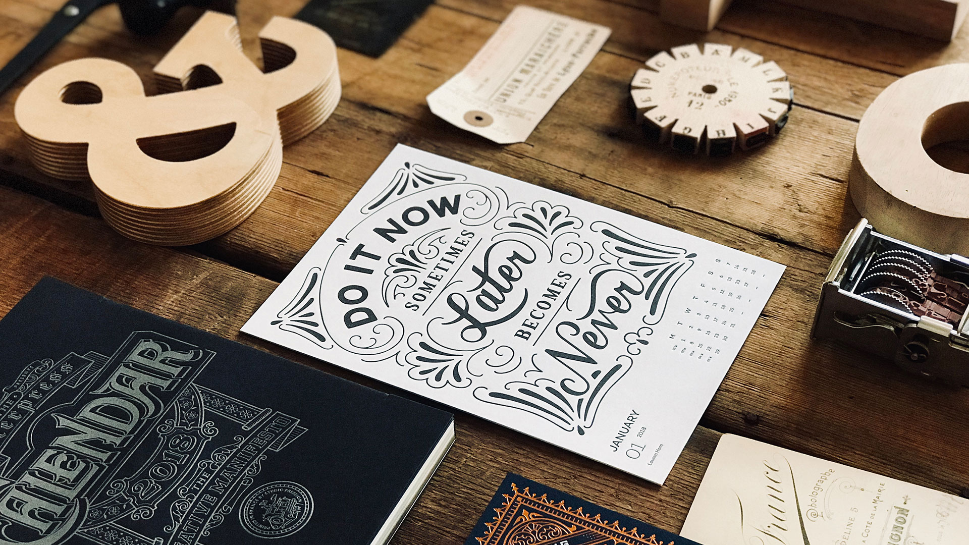
January: Lauren Hom
February: Nick Misani
March: Mathilde Francescatti
April: Stefan Kunz
May: Francis Chouquet
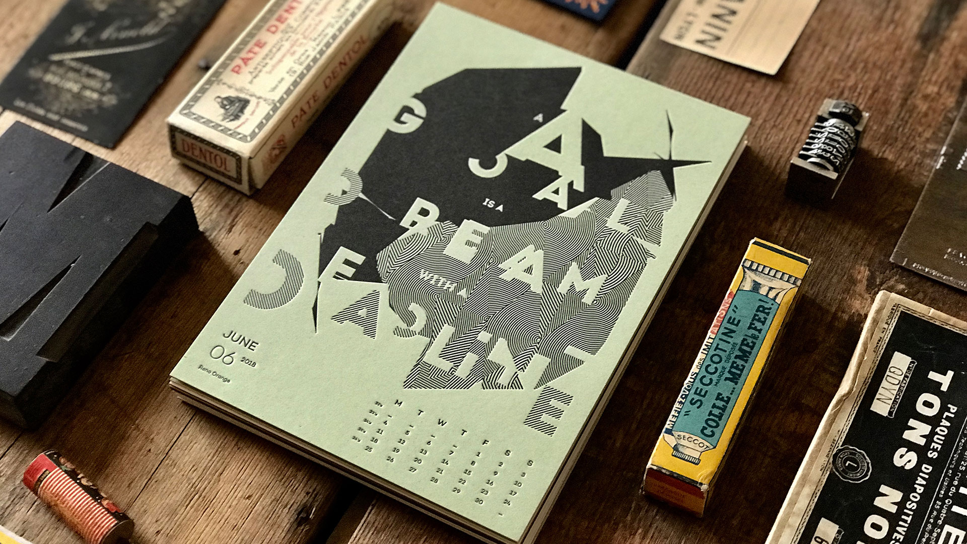
June: Reno Orange
July: Jeff Trish
August: Keith Tatum / The Type Hunter
September: Kelli Anderson
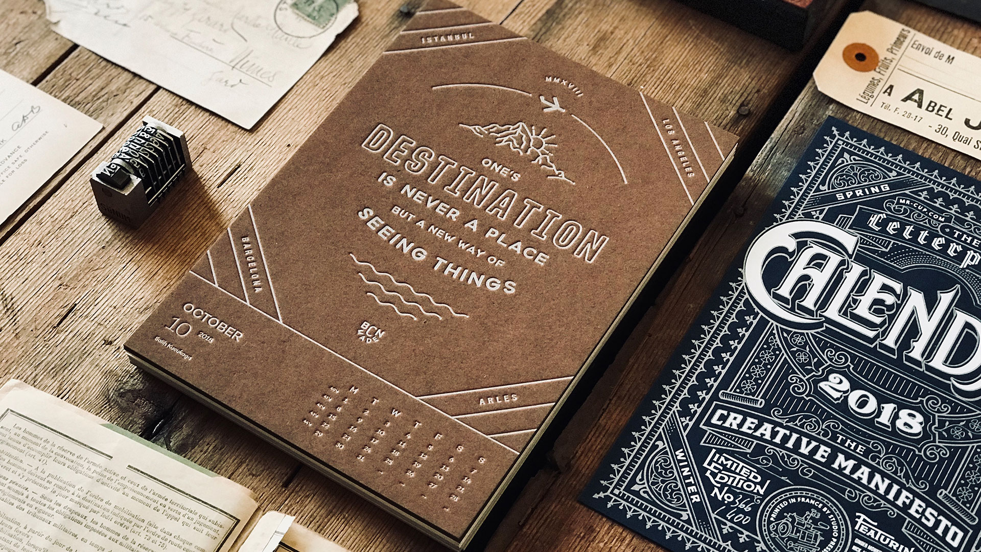
October: Salih Kucukaga
November: Jef Millotte
December: Fabien himself
And because it’s letterpress, each month is a treat for the fingertips as well as the eyes, from the slender swirls of February’s “Prefer the tumult of liberty to the quiet of servitude,” to June’s freakout of lines and type: “A goal is a dream with a deadline,” it reads, if you stare at it long enough. The duplexing not only hides the bruising on the back of each sheet, but also adds to the tactile experience, giving you something truly substantial to hold on to.
This calendar is also as easy on the environment as it is on the eyes, thanks to careful consideration of the papers used, Fabien explains.
“We chose two ranges of eco-friendly papers developed by Favini. The Remake collection includes leather residues to substitute FSC cellulose, and the Crush collection is a range of papers made using process residues from organic products: kiwi, coffee, hazelnut or almonds. FSC certified, GMO free, this paper contains 40% post-consumer recycled waste.”
Coffee, hazelnuts and almonds – Not only is this calendar gorgeous, it just made it that much harder to stick to my new year’s resolutions for 2018 😉





Spinningly stunning!
I like that – “Spinningly” 🙂
wow