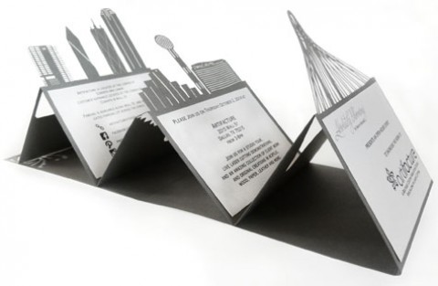
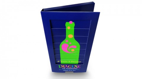
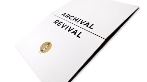
Simple can be thrilling, especially when it’s about to spring a surprise on you as it does with this...
4314 Search Result(s) for:
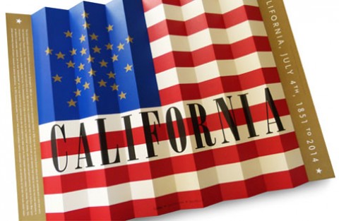
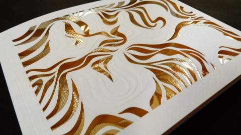
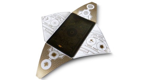
The folds which create dimensionality. The larger format which creates an impact. The metallic gold spot color which adds...
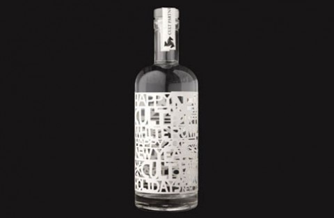
Cult Partners’ year-end promotion is sooo appropriate for their client base. But really, who wouldn’t love 90-proof white rum...
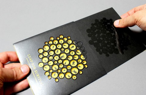
A series of holes were drilled into recycled black card, representing tiny frogs eggs. Each hole had black gloss...
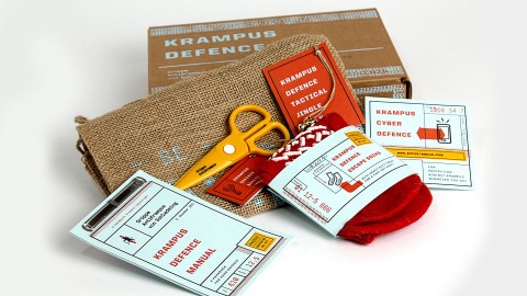
We learned to have fun with the theme and run with it. Plus, hand-assembly always goes good with cold...
The creation of title and custom lettershapes inspired by and reflecting the original construction elements of each ‘Lilium’ piece....
One of the production highlights is the ticket wallet. It’s the printed product that holds the whole campaign together...
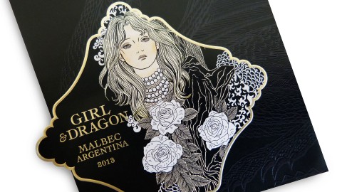
Cult Partners takes us on a “Game of Thrones” like adventure in Gothic-luxe style with this wistful wine label....
We do not look for the fitting medium in the beginning of the production process, but we create our...
We learned patience! Truly this project had so many stakeholders, thus many, many opinions. Additionally, there were so many...
The idea came also from the fact that Anne loves these photo booths; she takes photos of herself doing...
“Our approach was to display, with elegance and clarity, each of the features in a lavishly over-sized format.” In...
This colorful and energetic mailer promoted an annual two-day fundraising event that garnered $12.3 million to benefit local children’s...
The design team at The Workhouse has revealed its obsession with typography in Wayward Arts Magazine (Issue 18) from...
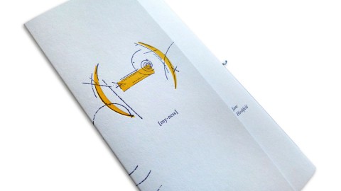
The chapbook’s short cover literally begs you to take a look inside. – Thomas Ingalls My delight … my...
This super thick invitation fits perfectly inside the clear capacity envelope! Our team’s attention to the smallest detail is...
Careful file prep and color management allowed us to get great results out of the uncoated paper stock. –...
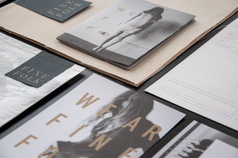
The sophisticated, beautiful look of this branding reminds everyone, ‘We ar Finefolk.’ – Ingred Sidie, Co-Creative Director “There...
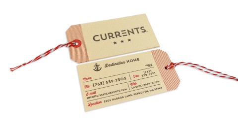
“A website is invaluable in the property management business, but the high quality of the design and the craft...
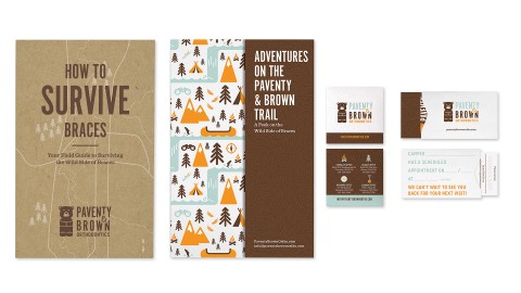
“Most of these print pieces were more than just marketing fluff pieces.” – Suzy Simmons, Co-Creative Director Getting braces...
The ultimate lesson here was that additional steps might be tricky, but they are sometimes necessary to achieve the...
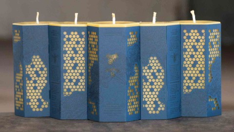
Beeswax production is an incredibly labor-intensive task, both by the bees and our neighbors at Worker B. – Todd...
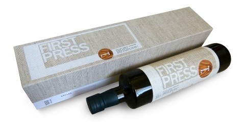
There are not too many things in life that define quality better than fine food (and of course fine...
A beautiful printed piece was the logical choice; we wanted to produce something that people would hang on to,...
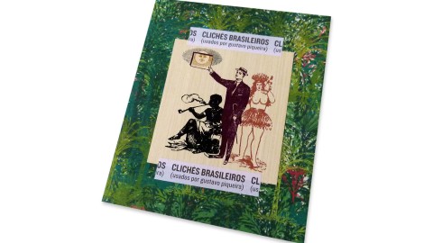
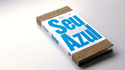
What better way to employ letterpress clichés than through their original medium? – Gustavo Piqueira, Designer Occasionally a book...
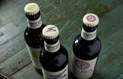
It’s nice to be taking the Americans on at their own game and reclaiming our brewing heritage. – Myles...
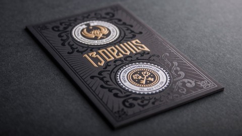
The design is complex and intricate, which can be hard to pull off, but when it works it’s bound...
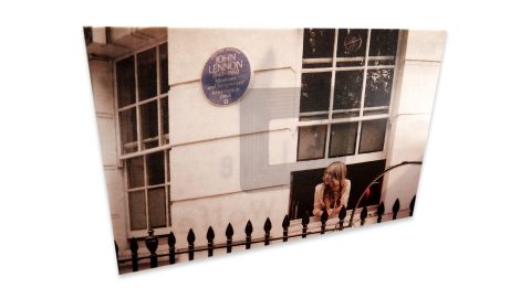
I love that the lyrics are represented on each card (which was quite a feat given the size), and...
One surefire way to get clients excited about print? Round them up, ply them with generous lashings of whiskey,...

