Ninety percent of success today seems to come down to simply getting out of your own way – don’t...
Marketing Collateral
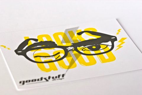
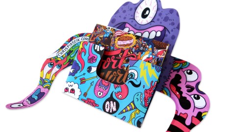
This fun self-promo for the work of designer Shaun Malinowski actually delivers two lessons in one: nearly everyone loves collectible...
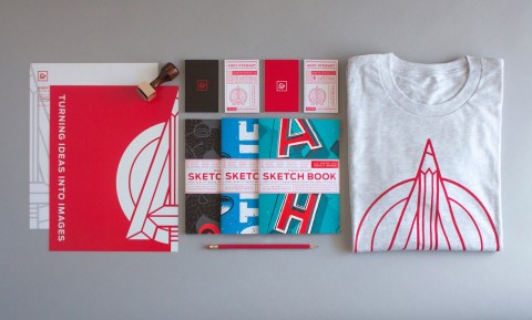
Branding your own design firm is right up there with giving yourself injections in terms of difficulty – both...
Though clients may specify it and we all know we should use it, some still find the idea of...
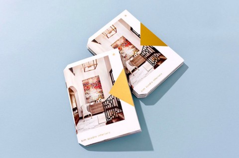
When you provide a service as creative as interior design, it pays to make your approach as unique as the...
At this point in our long and illustrious career (never you mind how long 😉 ), we’ve probably seen...
Occasionally you come across a piece of design that rubs you the wrong way at first, but quickly grows on...
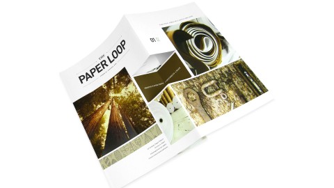
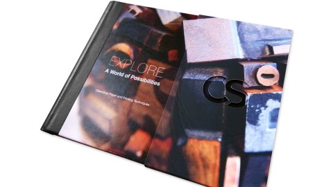
When Oregon Printing Communications Marketing Manager Amanda Pond developed a cutting-edge marketing collateral piece she had a few goals in mind: to feature...
I love what I do and have a passion for life. I try to live the life of...
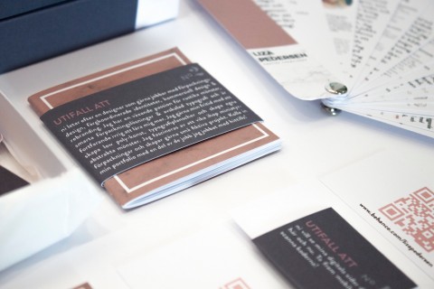
It’s a competitive marketplace out there. Fully realizing this, Sweden’s Liza Pedersen, fresh out of design school, has hit the...
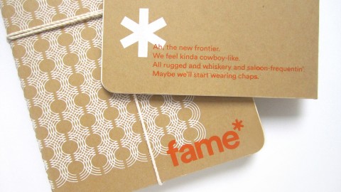
Our approach to branding is all-encompassing, and these Moleskine journal designs are just one more example of finding unique...
When you own a glittering skyscraper in the heart of London’s financial district, your identity materials better be every bit...
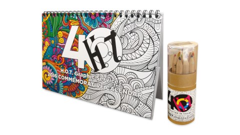
The adult coloring book craze inspired H.O.T. Graphic Services’ 40th anniversary commemorative calendar. It was a way for the...
Despite producing stunning work, digital presses remain, in many people’s minds, little more than their own office laser printer...
This is a very unique promotional piece that our client can present to his potential clients. His brand is...
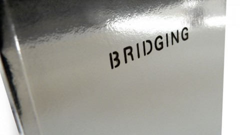
The most noteworthy (and time consuming) production highlight is probably the hand-done red tape binding that we applied in-house...
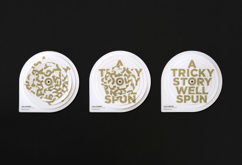
Lisa Sanders wanted a simple yet sophisticated self-promotion that would explain what public relations was and generate interest for...
Leaving a well-designed physical artifact behind more often than not still makes a bigger impression (maybe even more these...
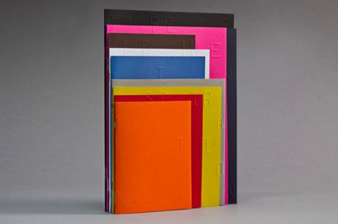
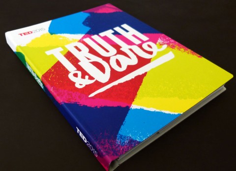
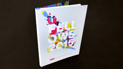
Albertson Design beautifully coordinates this TED 2015 Program Guide with the 2015 TED Fellows Book, all while giving this...
The high production value shows off the quality of the fonts. – Jenn Contois, Monotype Many’s the time we’ve...
I try to live the life of my work and believe that worldly experiences and touching one’s senses is...
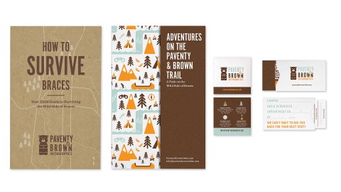
“Most of these print pieces were more than just marketing fluff pieces.” – Suzy Simmons, Co-Creative Director Getting braces...
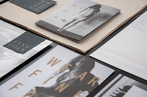
The sophisticated, beautiful look of this branding reminds everyone, ‘We ar Finefolk.’ – Ingred Sidie, Co-Creative Director “There...
We do not look for the fitting medium in the beginning of the production process, but we create our...
The TED Fellows Program is a global network of “visionaries in their fields who collaborate across disciplines and make...
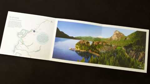
The creative team at EKISTICS shows off their talent for design in this perfectly balanced brochure for Klahanie...
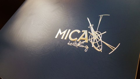
The in-house creative team at Mica Heli captured this breathtaking destination and adventurous skiing experience with such skill that...
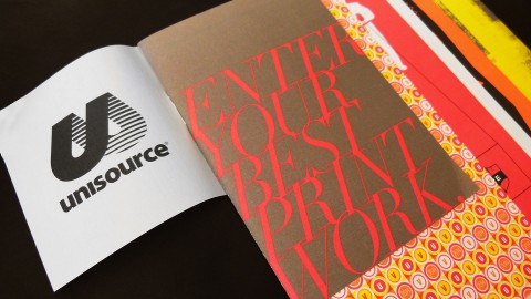
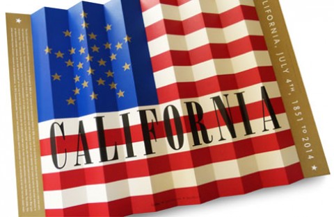
Well, I’m sure Carter Hales Design Lab wasn’t eligible to enter this piece into the 2014 Unisource Canada Design...
The folds which create dimensionality. The larger format which creates an impact. The metallic gold spot color which adds...
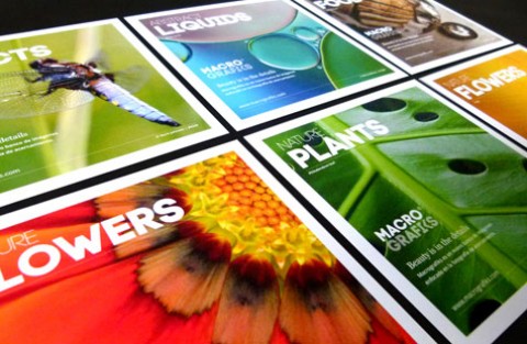
The creative team at FA Design capitalizes beautifully on the up-close-and-personal nature of their client’s business (Macrografiks is an...

