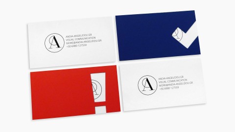
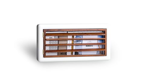
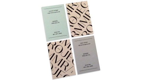
It’s a tall order to design something that appeals to other designers. But when a printer needed a...
Inspiration
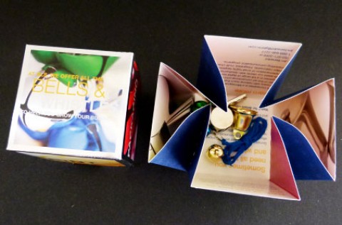
This clever dimensional mailer has me whistling an appreciative tune. Designed and printed by GLS as a self-promotional...
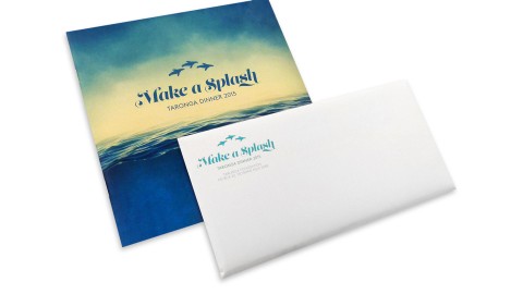
It’s rare to receive an invitation in the mail these days – our invites for Taronga Zoo have become...
I try to live the life of my work and believe that worldly experiences and touching one’s senses is...
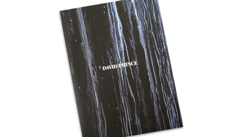
We sought to find a visual language that could embody the unique traces of his art. – Gustavo Pique,...
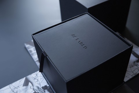
Simplicity, fashion, modernity. We had to convey the sense of luxurious, minimalist. The art of making more with less....
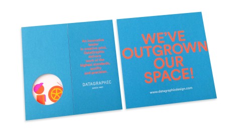
When the time arose for 82-year-old printing company DataGraphic to move to larger digs, they teamed with designers Claudia...
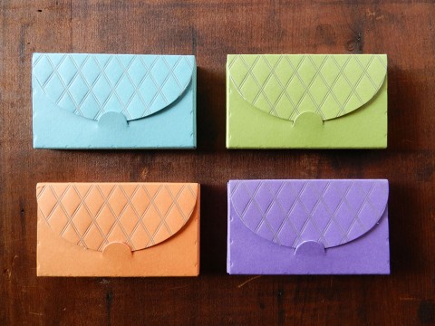
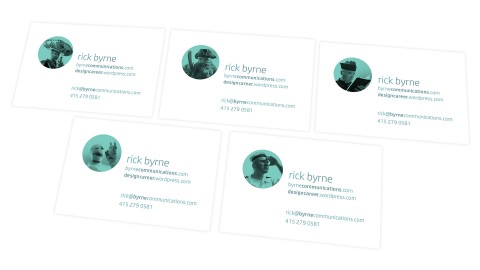
Nothing frustrates me more than presenting a scuffed up business card to a prospective client. Enter designer and letterpress...
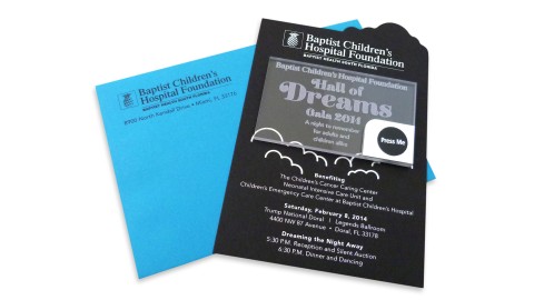
The “invite and envelopes help to create a connection with the design and allow the recipient to physically engage...
When a business card flirts with your fingertips long after you’ve stopped looking at it, you know you’re on...
We wanted the recipients of the annual to have something interesting to look through and something that caught...
The variety of the mailing set does not only present facts about the LoftCube, but also transports the guest’s...
The dramatic curves and contrasts in Kris Sowersby’s beautiful Domaine Sans typeface inspired the ‘type as image’ approach to...
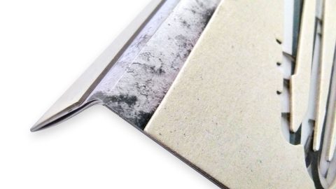
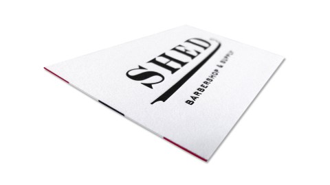
The striped edge painting really brings the piece together and couldn’t be more fitting for a barber. – Brandon...
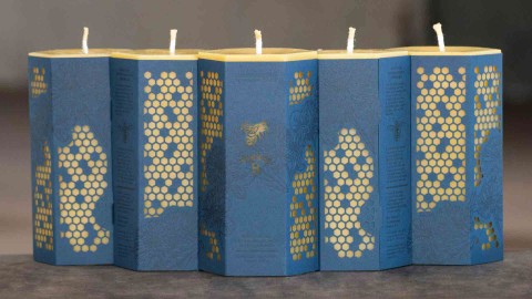
Beeswax production is an incredibly labor-intensive task, both by the bees and our neighbors at Worker B. – Todd...
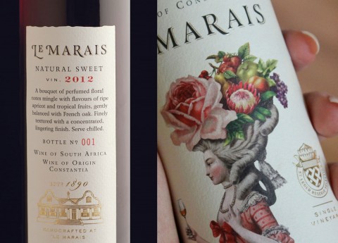
The beautiful illustration is really the hero of this piece. It gives visual clues to the dessert wine’s...
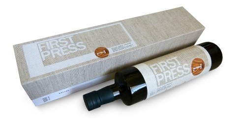
There are not too many things in life that define quality better than fine food (and of course fine...
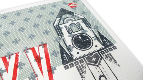
The design highlights of this piece? “Its Swissness. Annnd (hey “Portlandia” fans) we put a bird on it. –...
The ultimate lesson here was that additional steps might be tricky, but they are sometimes necessary to achieve the...
Despite the fact that many people actually prefer gift cards to shot-in-the-dark gifts chosen by others, they’re still somehow...
When designing our own business cards we wanted to make sure they were simple enough to stand the test...
Drawing on the brand aesthetics as well as the product’s attributes, I began to work around the concepts of...
The cards “provided something tactile for the face-to-face meeting of two professionals for the first time that could be...
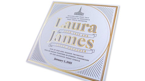
My favorite part about the piece is how the gold foil, warm gray ink, and blind impression work together...
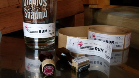
Few industries are as widely known for their creative packaging as the wine and spirits biz. And when you...
Few industries are as widely known for their creative packaging as the wine and spirits biz. And when you...
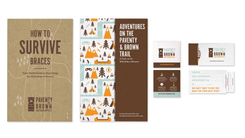
“Most of these print pieces were more than just marketing fluff pieces.” – Suzy Simmons, Co-Creative Director Getting braces...
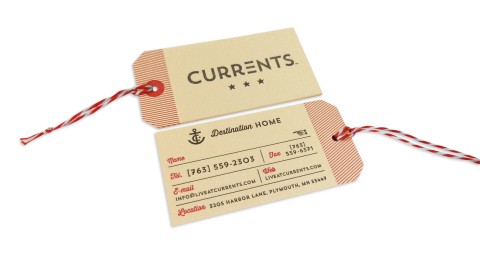
“A website is invaluable in the property management business, but the high quality of the design and the craft...
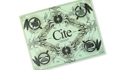
The issue is actually culled from online content on Cite’s blog, Offcite. The online readership drove the...
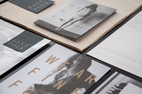
The sophisticated, beautiful look of this branding reminds everyone, ‘We ar Finefolk.’ – Ingred Sidie, Co-Creative Director “There...

