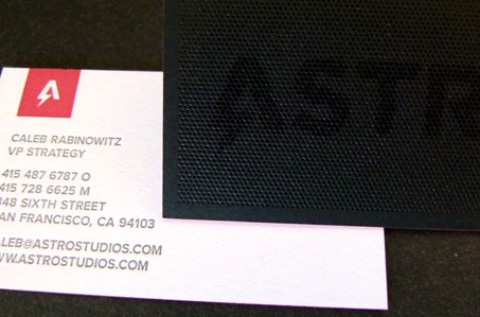
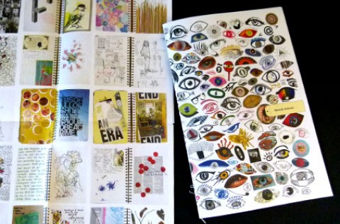
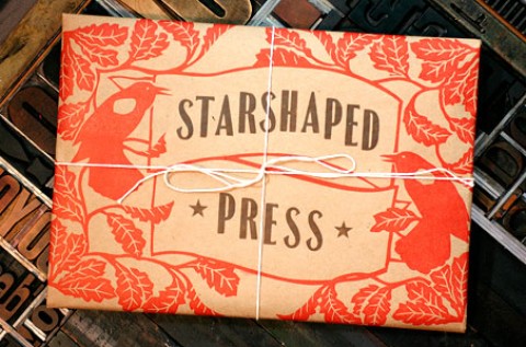
It’s yin meets yang. It’s all business meets let’s party! It’s a business card to covet. Designed by and...
Inspiration
There are so many reasons to love this promo – yummy textures, surprising popouts, images that appear to be...
When designed well, the small, simple pieces are often the ones we find most satisfying and most memorable. And...
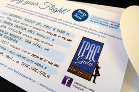
Taking flight with a 1960s Pan Am-inspired theme, this invitation for a nonprofit arts group showed ingenuity and finesse....
How would you elicit the feeling of elegance and glamour in a printed piece? The designers of this gala...
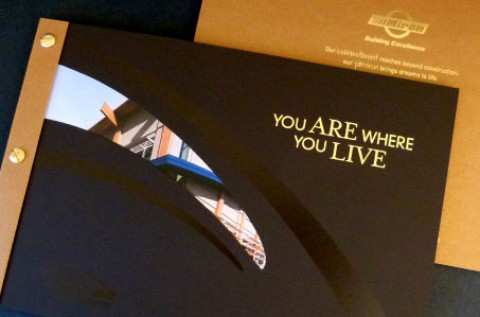
Wood, glass, nails, steel and mortar are building materials that can be assembled to construct a dwelling only limited...
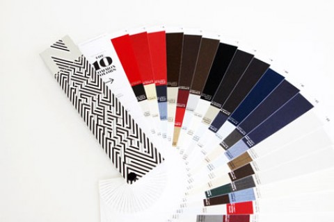
Packaging the Tools of a Perfect 10 “Unique, smart, useful, creative – the CLASSIC Papers Tool Kit of Color...
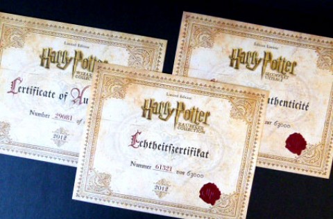
Fellow Muggles will definitely wish they had the design and print powers shown on these Harry Potter Certificates of...
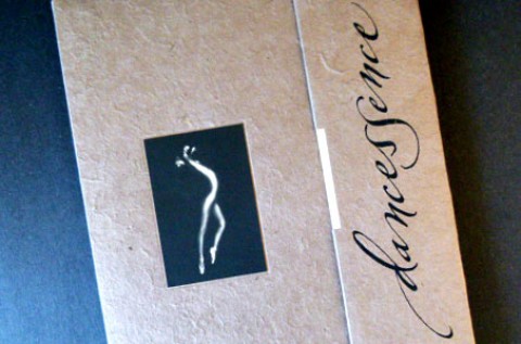
Dancessence embodies not only the emotional and physical essence of the dancers photographed, but of the very reason coffee...
I am roaring in love with this 1920s, Prohibition-inspired open house invitation from the design team at Fame Retail....
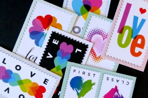
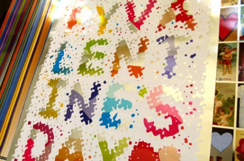
Michael Osborne was asked to create heart imagery for Moo.com’s Luxe Card product promotion. He did so in his...
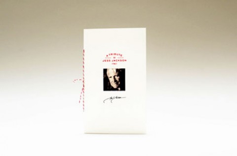
To elicit human feeling or heartfelt response is the hallmark of any great design. But when the piece is...
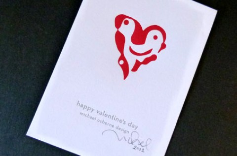
That Valentine’s Day continues to be one of Michael Osborne’s favorite holidays is on full display with this card...
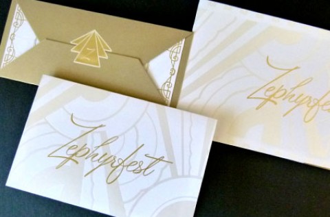
To evoke glamour and style for this fundraising event package, the designer chose an Art Deco motif. The concept...
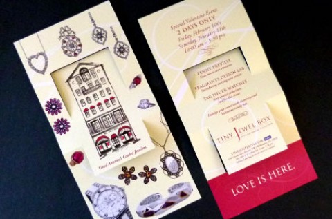
The superstar of this direct mail piece is definitely the fold – the swing fold to be exact. I...
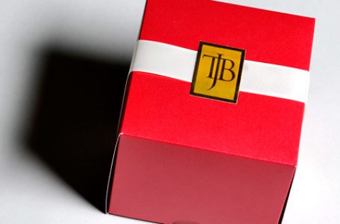
Dimensional direct mail, like this box, receives among the highest response rates. No surprise really as the box is...
Okay, just to be upfront, PaperSpecs was part of this project. In fact, if you became a PaperSpecs Pro...
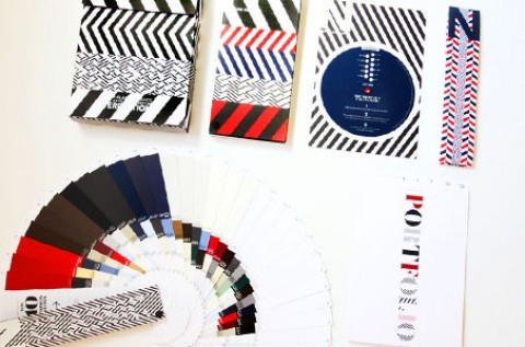
Neenah’s goal was to create a unique and unexpected tool for their selling organization. And they did just that...
Translucent sheets always draw my curiosity. Did the designer print on it? Was it used as a flysheet with...
Layering elements in a printed project is very much like layering clothes – some people know how to pull...
No, this is not a typo. Being a lover of the clever use of words, I’m immediately drawn to...
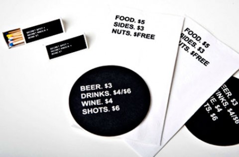
Assignment: design for the reopening of an old watering hole targeted at a locals-only crowd. Inspiration: nonsensical behavior, mysticism,...
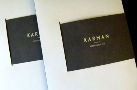
Inspired by the year the company was founded (1948), the designers of this capacity pocket folder honed in on...
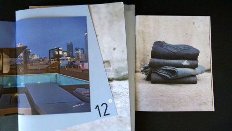
12 Degrees is an urban residence that is “slightly off” Queen Street in Toronto. The whole theme of being...
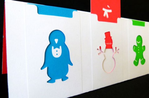
The designers of this holiday card found their inspiration from the fun and playful spirit of the children in...
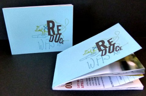
I have to admit that when I first opened this book about reducing waste, my initial reaction was, “Well,...
There are teachers so good at what they do, they manage to teach even those who are not their...
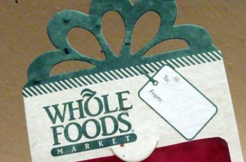
This gift card holder is all about the paper, which is a perfect choice for Whole Foods Market. The...
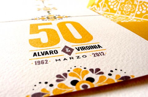
There are so many things to admire about these special invitations. The deep V-shaped envelope flaps, the coordinating envelope...
Seeing and touching wedding invitation samples is as important as the cake tastings… probably more important when you consider...

