If you feel like you’ve slipped into a routine of design, print, repeat, yawn, here are three special print effects that can wow the pickiest client, even as those techniques rekindle your own excitement for print design. These tips come to us courtesy of the eloquent Daniel Dejan, North American Print/Creative Manager for Sappi Fine Paper, and his PaperSpecs webinar Print’s Special Effects Magic. (PRO members, check out that webinar in its entirety here. Not a member? Why not begin your PRO membership today?)
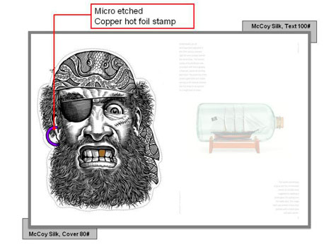
1. Thermography. Thermography has been around for a really long time; unfortunately it has also gotten a really bad rap. First of all, it is not the “poor man’s engraving.” It is a technique unto itself that is a whole lot of fun. For a start, you have this beautiful faux emboss that happens. Here’s how it works. It’s printed, the granules are attached to it, and it goes through a heat line, which inflates the little granules to create that raised surface with the pigment. Finally it goes through a cooling line. Thermography comes in every color and it’s also coordinated to the Pantone system. This beautiful illustration of the pirate shows you exactly that wonderful etching feel you get. It is quite raised so it gives you that scratch board or scrimshaw feel to it.
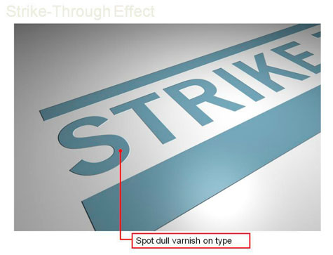
2. Strike Through. Everybody can have strike through in their arsenal. It can be done on a 6-color press, it can be done with any color. First we print the area, and then we lay down a density of dull varnish in a spot area. Keep in mind that when you make a dull area, you’re going to be adding little microscopic platelets. When they dry, a lot of them dry point up creating a topography, so you have peaks and valleys.
Now that we have that dull spot in very specific places, we’re going to flood the entire area with a thin gloss varnish. The gloss is going to drop down into the valleys and the dull is going to strike through – hence the name. So it can be varnish on varnish, aqueous on varnish, UV on varnish, aqueous on aqueous, UV on aqueous, or UV on UV, as long as the dull goes down first and the gloss goes down second.
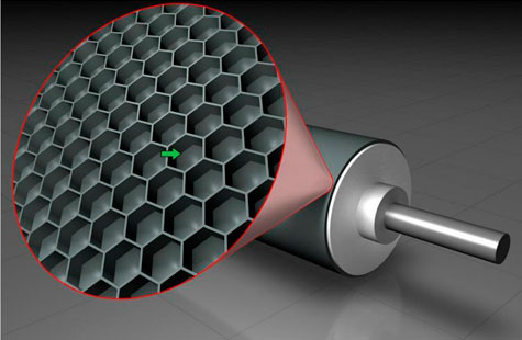
3. Reticulation. In many cases this is going to require an Anilox roller (below), which allows you to put a dull coat down. Then when you put another varnish on top, you play with the viscosity of that second varnish.
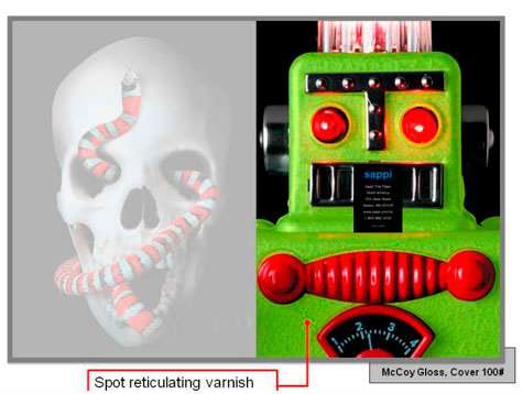
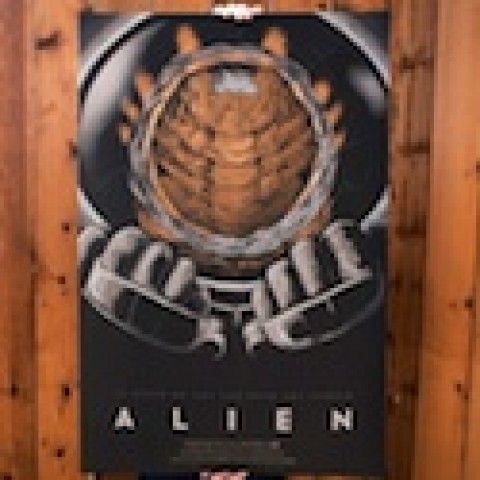
It doesn’t dry smoothly because it’s been thinned out. With the roller that we use to put on that gloss coating, we can actually create these amazing textures on press. We’re going to flood the area with dull, or in our case we did a spot of dull underneath the snake or underneath the robot. And then we overprinted with this gloss that has been thinned out. We play with the viscosity, laying it down with the Anilox roller. It can be a very, very fine finish like sand. It can also have a little coarser feel so it has a little more texture.
….


