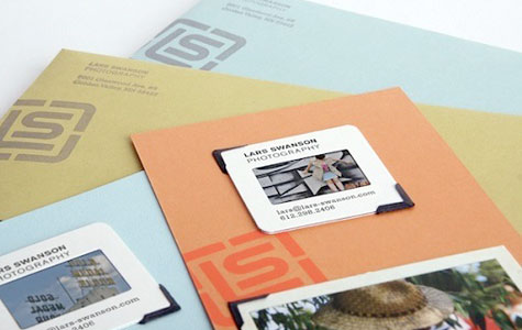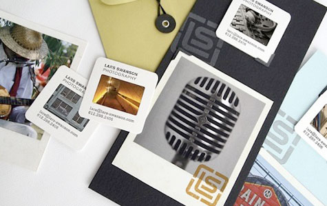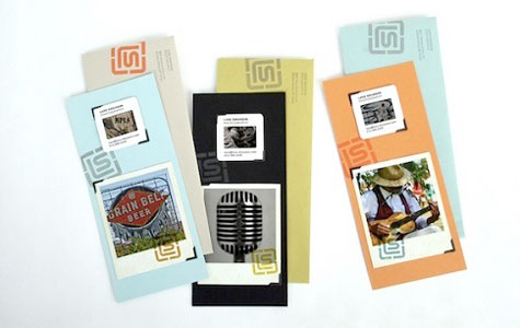
Inspired by his extremely limited budget, Swanson worked with designer Samuel Soulek’s Soulseven studio to come up with something perfectly obvious in hindsight: 35mm slides of Swanson’s work as business cards and mailers.
Customized with little more than handwriting and rubber stamps, each slide is unique, easy to carry, and unforgettable. Right away you realize that this is the one medium that hasn’t been used repeatedly, cannot be duplicated digitally, and really stands out.
Which got us to thinking: Can you imagine how effective this could be if you combined it with some beautiful, pleasing-to-the-touch paper? Create a paper housing that you can use to sandwich the slide – beautiful.
And it could work for just about any client. Promoting a museum? Each card contains a different item from the collection. A hotel? Different amenities are featured.
Best of all, what an exciting way for designers to promote themselves. I’d certainly rather look at an annual report you’ve designed as a slide than in print – I can always have a quick glance at it in detail in your online portfolio. And your choice of paper for the cards will tell me much more about your ability to create a great paper piece than another ho-hum, seen it before business card.

