There are no two ways about it – product packaging is the “prime time” of design. Nowhere else is design held so directly responsible for the ultimate success or failure of the product it’s selling. And nowhere else are designers as greatly challenged as when designing three-dimensional packaging.
“It’s really part of storytelling,” says Kathrin Blatter, co-founder of San Francisco-based design agency Un-, who shared her rich packaging experience back in November 2012 in the PaperSpecs webinar “Packaging Panache”. The following five points are taken from that presentation. (PaperSpecs PRO members can check out the recording of that info-packed webinar here.)
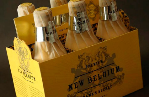
1) For client presentations, invest the time and money in actual 3D mockups of your packaging. Three-dimensional renderings on a sheet of paper simply don’t cut it anymore, especially at a time when true 3D printing is absolutely everywhere. “Packaging is about us taking something into our hands and looking at it and seeing how it actually functions – how you’d actually open a box, how you remove the wrapper from this bottle, and really just turning it around and looking at all the sides,” Blatter reminds us. The packaging is “an experience, and it’s part of the product.”
2) Tailor your design and choice of materials to whether they’re for a high-end or low-end product. Of course you’d never try to sell a luxury item with cheap materials, but the opposite can be equally problematic. “I actually once did a project like that,” says Blatter. “It was dessert for Safeway… .It was supposed to be dessert that’s really quite high-end. However, my design was still really way nicer than it should have been. And the design firm then did a focus group and people looked at it and they basically said, ‘No, this is way too expensive. I would never actually buy this at Safeway.’ So the design got scrapped and they used a different one.”
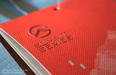
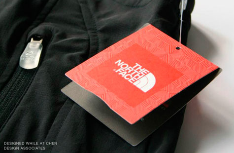
For high-end items: “Dark stock is often something that works really well, and then certain finishes work extremely well, too. So you can use gloss varnish, for example. Something like that can work really nice on a matte stock or, of course, some foil. Metallic foils, they just really make things pop. And then details—those are quite important. If you have a lot of detail, something becomes automatically high-end.”
For the lower-end: “By just using a specific kraft paper that has a really nice finish—maybe it’s a little smoother—it can become really nice and very friendly. And with a minimal design approach, it can work quite beautifully.”
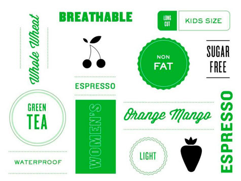
3) Make your packaging functional. This means ensuring that the design is a clean one, and communicates things such as “non fat” to the consumer in a manner that avoids confusion. Work with your client to create a “hierarchy” of information that needs to be relayed – is it “non fat” that has to be conveyed first, or “orange mango flavored” that’s first? Deciding these things at the planning stage will save everyone headaches later on.
4) Get your dielines right. “I usually start out with a book and a CD,” says Blatter. “The book really holds patterns and you can get any kind of book, really. The main thing that I want from them is the pattern. And I start out that way and then adjust them to whatever product I need to package. The patterns are not perfect. They’re not done at this point at all, but they’re a good starting point…
“So we have to adjust each dieline because in some places you actually have to cut out some things. In some places you have to make one side bigger, in some places you have to make it smaller. That all depends on the thickness of the paper or cardboard that you are working with.”
5) Make sustainability part of your plan. Even if you’re not hearing a lot about this from your client, using sustainable materials can only enhance the stature of your design. “Approach every project with the notion of creating or using the ‘less is more’ approach,” says Blatter. “And at that point, it automatically creates a good customer experience when they have a really nice paper or cardboard or any other fiber-based packaging material.”
………………..


