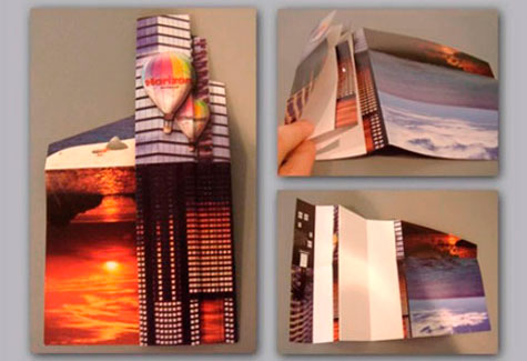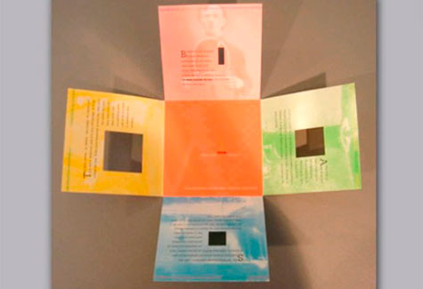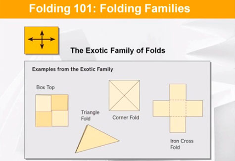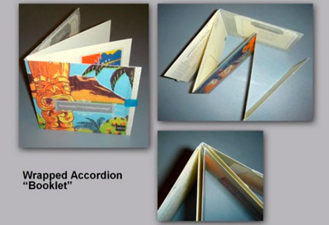
Print design is a wide and diverse field – there aren’t a lot of people whose names are synonymous with any one aspect of it. In fact, you could probably fit those who are in your family car and still have room left over for the driver. One of those people: Foldfactory.com’s Chief Folding Fanatic Trish Witkowski.
In a classic PaperSpecs webinar, Beyond the Tri-fold, she took us on a tour of some of her favorite folds. Along the way, she also revealed the following steps for ensuring that your next fold-related project is the very best it can be. (PRO members, you can check out a recording of that classic webinar here.) – ed.
….
1. Start with a clear message, strong imagery and a folding style that compliments that message. “It’s a thoughtful process. You don’t just say, ‘Gosh, I haven’t done a roll fold in a while, so that’s what I’ll do’ and then just flow your text from panel to panel. We’ve probably all seen a super-cool fold that gets in the way of a message as well. You know, the one you get in the mail and you look at it and say, ‘Wow, that’s awesome, but what do they want from me and where do I start reading?’ It really requires thought and planning to ensure success.”
2. Don’t work backwards. “A lot of designers do this. I’m a designer myself – I know how hard it is to do the technical stuff first. But get the file right at the start rather than planning to go back and fix it later, because I think we all know that things change right up until the end. You finally get approval. Somebody needs the file that afternoon. And you do not have time to go back and be meticulous with your file. It’s really dangerous, so do it first…. Build your file to trim size, pull your bleeds past the edge, place your fold marks in guides, and use page layout software like InDesign or QuarkXPress – don’t design in Word or PowerPoint, and Illustrator really wasn’t made for page layouts, either.”
3. Don’t do weird things with your files. “Your printer is going to have to modify your file dramatically if you send them a funky, confusing file, and that’s really where the miscommunication begins. So a couple basic guidelines: Don’t float your layout on a larger sheet with crop marks, OK? You’re always going to want to build your file to trim size, and you’re going to pull your bleeds past the edge. If you float it, then they have to make a new file. They’re just going to put it onto a file built to trim size. I mean that’s just the way it goes, so you’re just going to get charged for that. Also, don’t send two files: one for Side A and another for Side B. Send one two-page file, that’s the way it should be. And one page if it’s only a one-sided piece.”
4. Choose wisely when it comes to paper. “Know who you’re designing for and where your piece will be used. There is a big difference in what kind of paper and folding style you might want to use if your audience is 65 and older, or if you’re designing for teenagers. Also, if you’re in doubt, order a paper dummy. You may not need one for everything, but why guess? Sometimes you need to see and feel what the folding style will look like in a couple of different weights and finishes to make that final choice.”
5. Consider your mailing options carefully. “Stay in the letter-size mailing category if you’re designing for direct mail. Make sure you follow the USPS aspect ratios as well or it doesn’t count. Have a paper dummy made and weigh it. The USPS is unforgiving of errors, no matter how small. If you’re slightly over or under size or weight, you lose. Is it going into an envelope? Certain folding styles are more problematic for auto-insertion, so if you’re having stuff automatically stuffed into an envelope, the accordion fold in particular is problematic for auto-insertion, so ask your printer before you make the final choice because it could really affect your pricing.”
6. Create a mockup of your folded piece and pass it around. “A gate fold has two panels that fold in toward each other and you could have a critical marketing message on one of the fold-in panels and it could be really effective. But on a roll fold, a lot of people roll them right open immediately, so if you put critical information on this interior right panel, it may totally go unnoticed. If somebody’s opening it right out, they’re looking at the middle. So interior left or right would be a better choice. Watch people open it and make sure that they’re reading it the way you want them to, especially for your most critical information.”
7. Beware of color breaks and heavy ink coverage at the folds. “Beware doesn’t mean not to do it, it just means proceed with caution. Now if you’re putting critical color breaks at the fold, you’d better be sure that your fold placement is accurate. Also know that if you have heavy ink coverage across the folds, you may need to score to prevent cracking. Have you ever seen the black, solid ink covered brochure that has the white crack on the fold? Remember certain times you just don’t cheap out on that because that will be really, really noticeable.”
8. Pay attention to your proofs. “Remember that the proof is indicative of what you’ll get. Even though they’re often hand trimmed and hand folded, they should be right. Don’t expect that the folds will be in the right place when the job is done for real and sign off on it anyway. If you choose to approve by PDF instead, also know that you may not be seeing an error in a fold placement. I always mock up my own fold, make sure it looks right, then I send it along. Communicate to your printer how important it is to you that the folds are at the color breaks.”
……………


