 Sure, companies continue to claim they can barely come up with the quarter for the gas meter these days…yet they sure have no problem coming up with the money to change their logos. Oddly, the results of these corporate facelifts suggest something that once would’ve been anathema to us designers: logos just aren’t that important anymore.
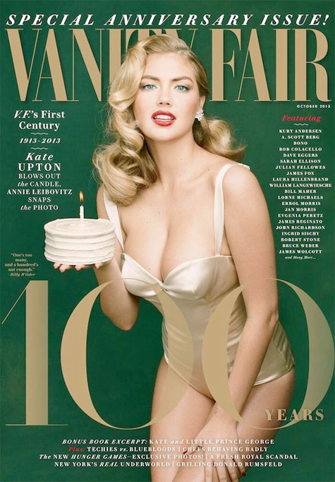
This month, class act Vanity Fair celebrated its centennial by tweaking its nameplate, moving from its blocky sans serif typeface to a serif version. Other new logos this month: Microsoft’s Bing search engine, NBC’s “Today” show and, of course, that of the anti-Google: Yahoo.

Naturally, people have had a go at the last for being as silly looking as the one it replaces, even if – or because – Yahoo CEO Marissa Mayer is taking credit for most of the design work. And many still need to be reminded that Bing even exists. Yet if we add the recent brouhaha over the new identity dreamed up for Colorado last month, we find a very interesting cross sampling of properties, all sending us the same message: The public doesn’t like change, but that certainly doesn’t mean much to your bottom line. Those who want free email will still go to Yahoo, skiers will flock to Colorado, and readers looking for erudite writing with a dash of glamor will grab a copy of Vanity Fair. And Bing?…Is still Bing.


