Confidently you place the first pages before them…and watch their faces pucker with incomprehension. “You’ve given me the wrong file,” the client huffs, clearly annoyed. “This one’s not in English.” And once again you prepare for the explanation without end: the “Lorem Ipsum speech.”
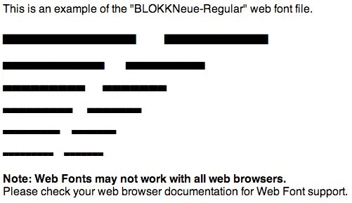
Determined to put an end to this time-wasting confusion, Norwegian advertising firm Dinamo Kommunikasjon developed a free downloadable typeface called BLOKK that replaces the Latin placeholder text with actual blocks – black rectangular boxes that mimic text on a page.
While not a perfect representation of what a design will look like in overall page tone – dense black rectangles are bound to make a page feel “heavier” than it will with much airier text – it could be an interesting way of holding down the concrete thinking of some clients long enough for designers to whip up a proper sample, complete with the client’s text.

