Around the halls of PaperSpecs Towers, no other artist sends our hearts to the rafters faster than Salt Lake City’s Kevin Cantrell. Perhaps it’s because he appreciates that typography is an art form. Perhaps it’s because each engraved print he creates carries with it the spark of the divine. Maybe it’s just because we know a genius when we see one. (PayPal payments to the usual address, Kevin 😉
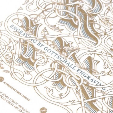
As Cantrell recently joined the handful of design professionals invited by Neenah to create a print for their Beauty of Engraving series, we thought we’d take a moment to look back at some of our coverage of the master.
Let There Be Light & Type
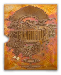
Two years ago during a Christmas break from his full-time job as art director at Hint Creative in Salt Lake City, he decided he wanted to acquire a new skill: lettering.
“I’ve done lettering before and have a good comprehension of the basics of typography, but I wanted to start an experimental project that would push my abilities to a new level,” says Cantrell.
[youtube=https://www.youtube.com/watch?v=9lC_A1E-6bU]
Luminares Poster
Creation … Genesis I … God said, “Let there be light.” This is lofty inspiration for a promotional piece. The beautiful result? Creation … Gruppo Cordenons … “Let There Be Lights” poster.
This group of humble design servants sought to bring forth the essence of early dawn through a delicate blend of paper and production technique. Hot stamping required that the plate be heated to 400 degrees (with special attention to making sure the paper did not stick to said plate).
[youtube=https://www.youtube.com/watch?v=DwDYRh-38mE]
Águas Poster
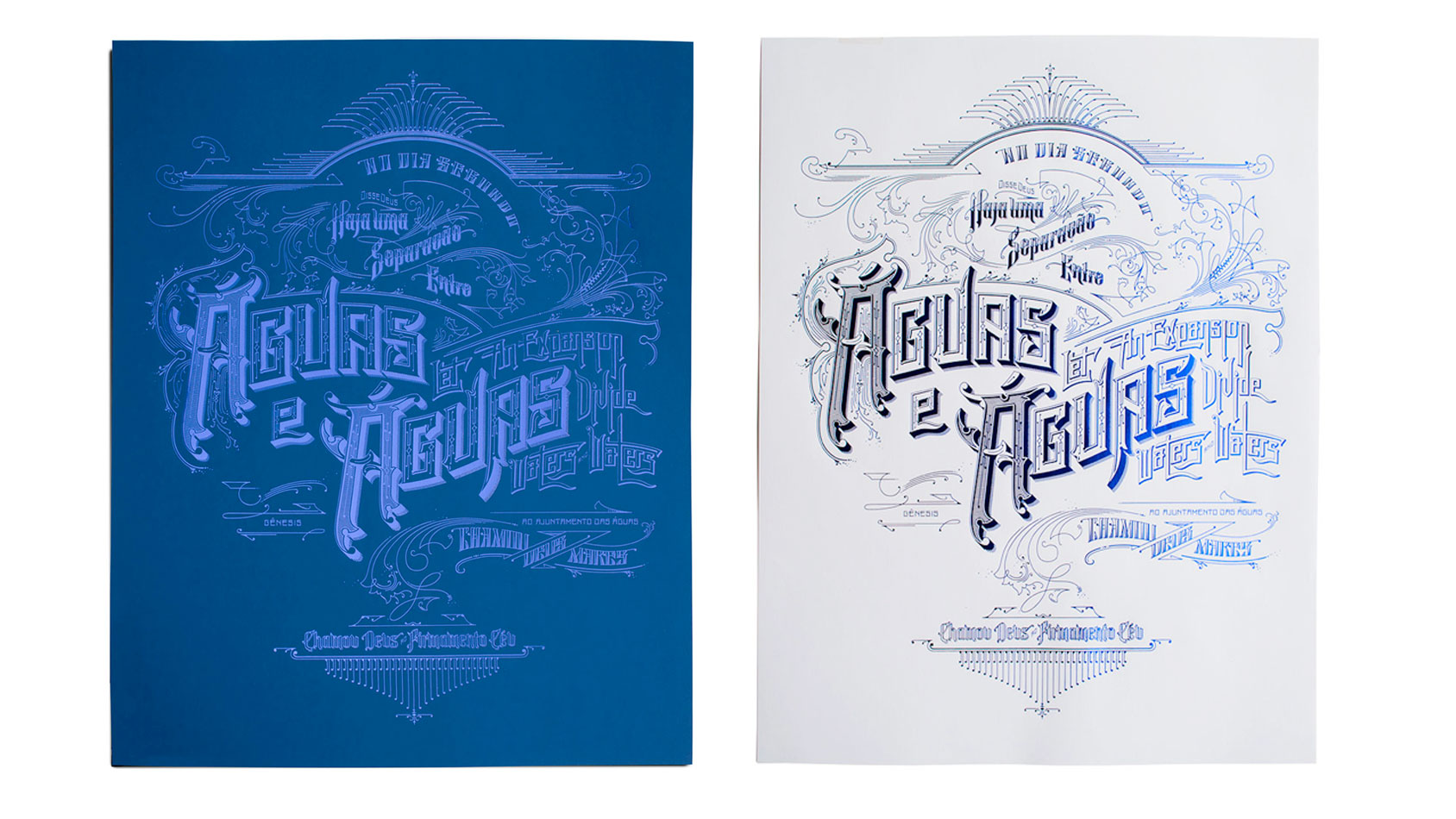
Genesis tells us that God took seven days creating the world, so you might expect that a follow-up to the Luminares Poster would involve a set of seven. “And so it came to pass,” we’re happy to report! This promotional piece was the second in Gruppo Cordenons’ “7 Days” series.
While the same type of gorgeous lettering and ornaments adorn this piece, the Águas poster is printed (foil stamped) on Plike this time. Rainbow foil, metallic blue foil and clear foil – all beautifully interpret the concept of water. With the rainbow foil, the typography changes colors at various angles, connoting the play of light as it reflects off water.
Terra Poster
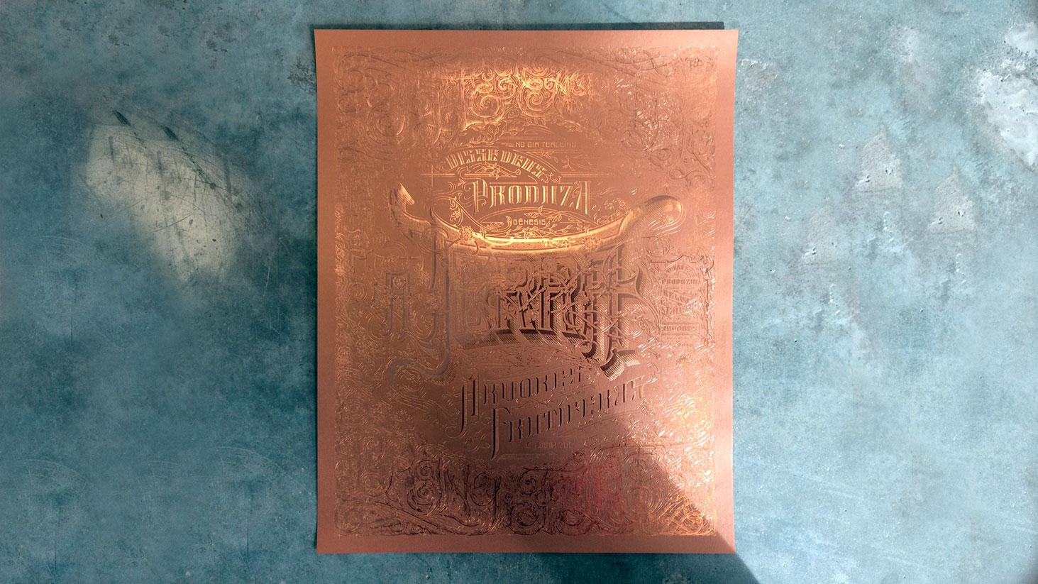
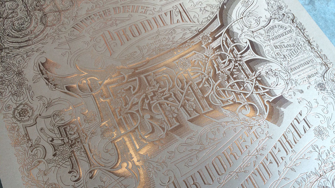
Kevin Cantrell is back with another exquisitely intricate design in the “7 Days Series” of posters for client Neenah Paper. Design, paper and production come together in high style and impeccable quality.
Entitled Terra, the design is rendered in 14 versions – foil stamped in various combinations of one color (Metallic Green, Copper or Brown) on one paper (Neenah Stardream Copper, Neenah Wild, Plike White, Plike Brown, Neenah Kraft, or Esse Espresso).
Law Office of Matthew Messina Identity
If I asked you to imagine an identity suite for a law office – and I’m talking all the pieces: letterhead, #10 envelope, business card, and notecards – this is likely not what you’d picture. In fact, it’s so atypical, I’m thinking the design team or the client is a risk-taker. Of course, the real story is much more interesting.
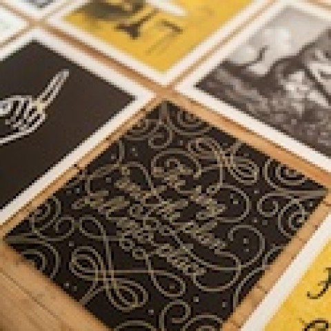
Kevin Cantrell Design used the client’s lineage, which goes back to Utah’s pioneer days, as inspiration. The wonderful hand-drawn letterforms imbue the pieces with a genuineness and authenticity reminiscent of this 18th century heritage. Even the notecards remind me of old bank notes or insurance notes from the time period.
[youtube=https://www.youtube.com/watch?v=e1tTneEm8Gs]
A Timely Use of a Timeless Art
Typography becomes something extraordinary once you open up the possibility of engraving. That, along with the fact that it is no longer relegated to being just the go-to print process for conservative corporate stationery, provides an opportunity to create something really special, really unique.
Just ask Kevin Cantrell, art director, designer and letterer working at Hint Creative based in Salt Lake City, and curator of the current issue of BOE.
“On a smaller scale, engraving is to a designer what a mural is to Leonardo; it adds a dimensionality that enlivens, aggrandizes, and perpetuates a designer’s vision. Typography is born into a breathing entity once augmented by the engraving process. The finished product thus becomes the very effigy of a designer. Nothing can replicate the precision, craftsmanship, and authenticity it brings. When I begin any project, I always look for an excuse to engrave and begin with that vision in sight. On a printed piece, if you’re going to sell any vision to the client, sell them the vision of engraving: a vision of perpetuity.”

