Hip Baby
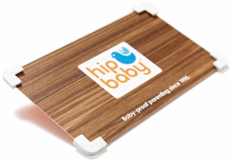
While we’re a tad worried about the similarity of their icon to that of a certain social media company’s, we love what baby-clothing store Hip Baby has done with its business cards. Nothing all that unique about the way it was printed, mind you, but check out the protective foam bumpers on the corners. The tagline: “Baby-proof parenting since 1995.” Design courtesy of Vancouver’s Rethink.
New York Opthalmology
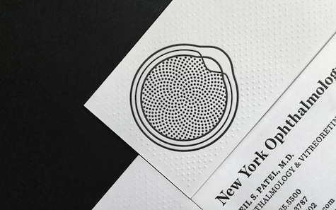
Seldom have we seen such delicate work invested in a doctor’s business card – designer Dain Gordon has done the profession proud. Blind embossing of a card that was duplexed afterward – Neenah Classic Crest Solar White 110 Cover (x2) – really makes this card for New York Opthalmology a treat for the eyes and the fingertips. More photos at UnderConsideration. (And more Classic Crest creations can be found here.)
One Day Journal
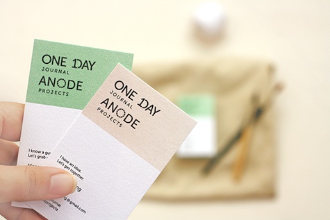
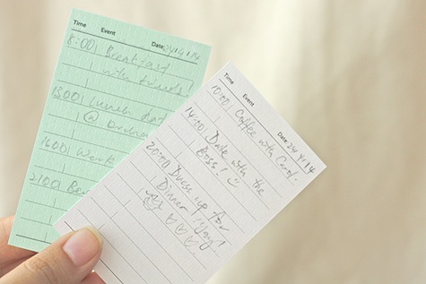
Singapore indie magazine One Day Journal is dedicated to encouraging people to stop and smell the roses, and really appreciate the brief happy moments in life. Malaysian design studio ForReal came up with cards that feature contact details and “appreciate the small things” phrases (e.g., “I know a guy. Let’s grab a coffee”) on the front. On the back: several lines upon which you can note down your day’s schedule. Or better yet, use it to note down all the times you did something to make the most of the moment 🙂

