We’re hitting all the business card bases on Cool Cards this week. We marvel at how slick some real estate agents’ cards have become, discover that at least one social media site has found a new use for business cards altogether, and have ourselves a moment of quiet envy over a little letterpress number with a wood backing. (Previous Cool Cards of the Week can be found right here.)
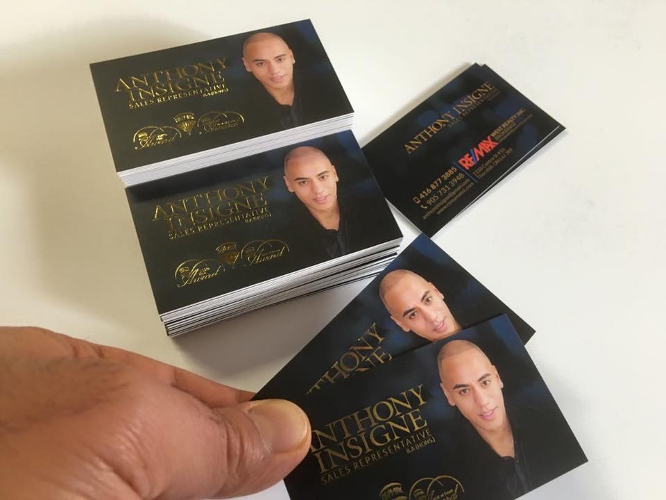
Real Estate Agent’s Business Card
Maybe we’ve just been looking in the wrong parts of town, but we can’t remember ever having received an estate agent’s business card that broke from the age-old formula of thumbnail photo on a boringly templated bit of card stock. RE/MAX’s Anthony Insigne clearly understands that presentation is everything, hence this 30 pt. matte beauty complete with gold foil stamping, printed by Toronto’s Sweet Print. (Judging by some of their other work, they seem to specialize in making people in this profession look great on paper.)
TinderMe Cards
Granted these cards are for “business” of another kind, but they still seem pretty helpful if you’re more of a paper person and you’re trying your hand at the Tinder scene. Created by Dries Depoorter & Ward Oosterlijnck, TinderMe allows you to print these cards at home or through your favorite print service, and have them ready for when you want to “flirt” (their words). They include your name, job title, and a QR code that recipients can scan to access your Tinder profile. While it seems to us there must be a more direct means of swapping info via smartphone, there’s a certain charm to the idea of handing a potential date a business card that cuts right to the chase. If nothing else, it will help you determine if your potential lover is a paper lover.
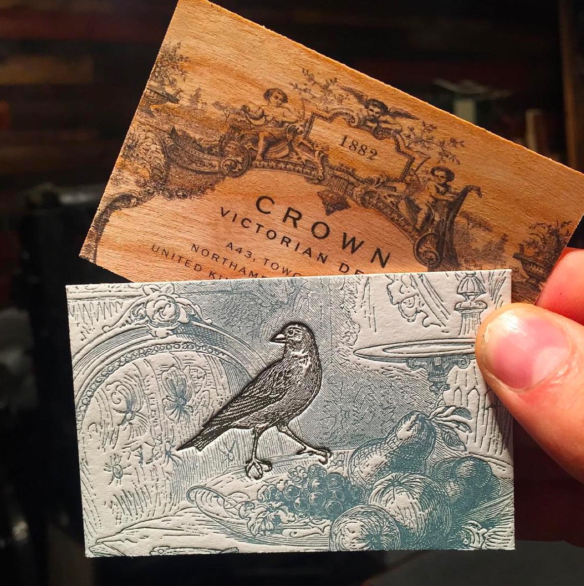
Letterpress & Wood Business Card
Jukebox Printing continues to be one of the go-to places for cards that captivate. Often that means fun with foil or debossing, but this piece stuns in another way. Described by the company as “detailed vintage style letterpress on a 2 ply cotton stock with Cherry Wood backing”…let’s just let those words seep into the ol’ brain, shall we? Usually any one of those features would be enough to please us, but wow! And the proof of gorgeousness, of course, is all in the viewing.





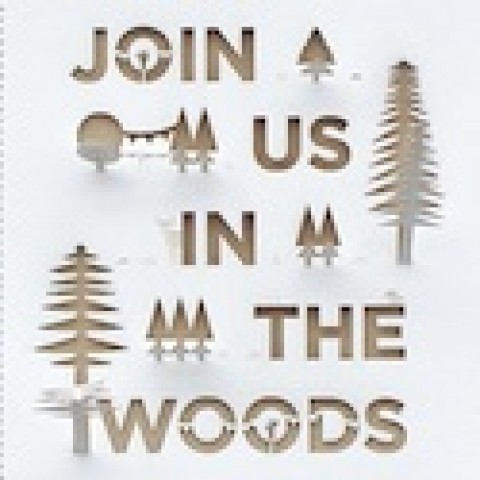


Wood business cards are elegant and minimalistic as they are, but adding more negative space by cutting out letters, logos, or other artwork can really help to say more by using less. These Nike wood cut out business cards are simple, but they get the point across, and they sure don’t look like their competitors’ cards!