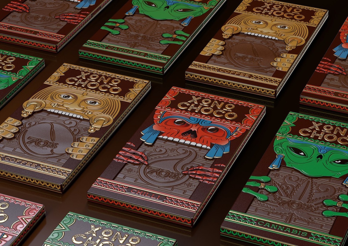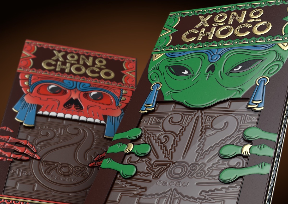
Chocolate is probably second only to that other delightful vice, alcohol, when it comes to the quality of packaging design that it inspires. Take these two fantastic examples, starting off with this concept packaging for the Aztec-themed Russian confection Xoconochco. Sadly, this being the work of Brand Brothers Russia for the Russian market, there seems to be very little information in English regarding these beautiful mockups. Aside from the brilliant die cuts and use of foil stamping, we really love the imperfections in the foiling of the logo, suggesting something very ancient indeed.
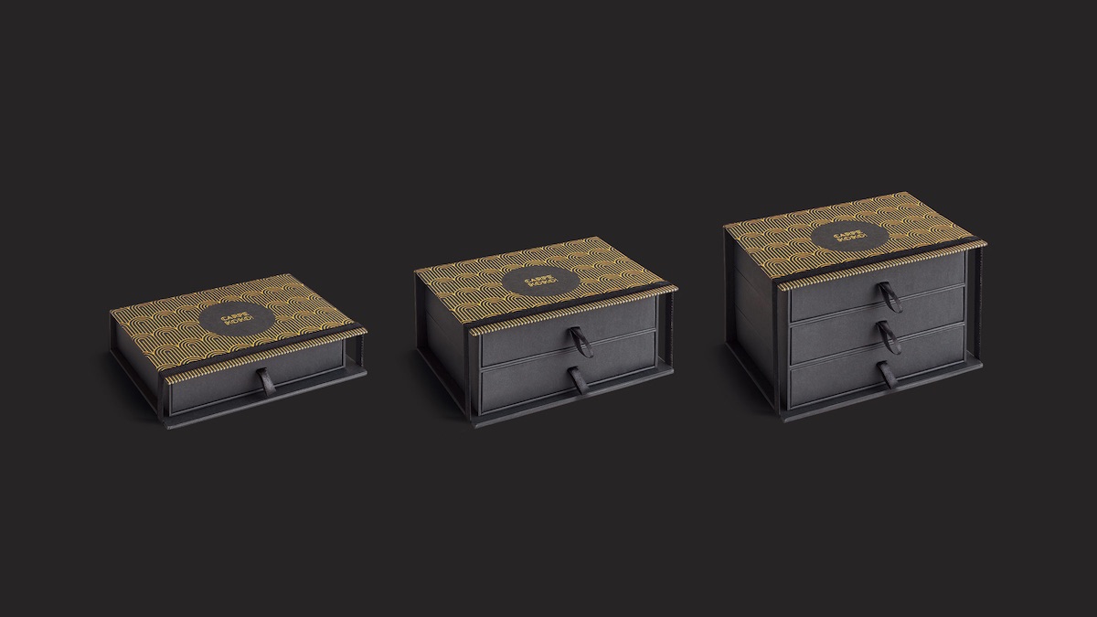
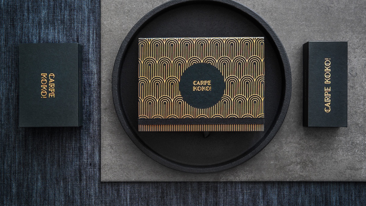
A more traditional but no less eye-catching take on packaging from Australia’s Carpe Koko (which also came up with the design) finds its inspiration in the Art Deco era with a classy drawer system that wouldn’t look out of place on a 1920s makeup table.
This is another great example of how gold foil can bring a simple design to vivid life.
So classy and well thought out are these boxes, the only change we’d make here would be in getting rid of the “!” This piece of punctuation, horribly abused in the social media age, should really only be used if one is on fire or about to come into a great deal of money. (Knowing our luck, both events would happen simultaneously.)
Discover more Cool Packaging right here!

