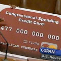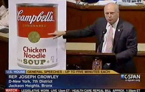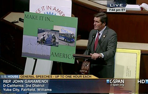
Last November, C-SPAN producer Bill Gray launched the blog after reading a Huffington Post piece that casually mentioned that somebody should document some of the ridiculous visual aids members of Congress use to illustrate their arguments on the House and Senate floors.
While a recent FastCoDesign piece dismissed it as a collection of “delightful non sequiturs” or “proof that some of our congress people are indeed off their rockers,” the blog says something rather profound about design in this country.
When arguing for or against bills that determine the disbursement of trillions of dollars each year, lawmakers – who themselves are granted large expense allowances – are content for staffers untrained in design to bang out a chart or graphic. And if it’s good enough for the people who run the country…


