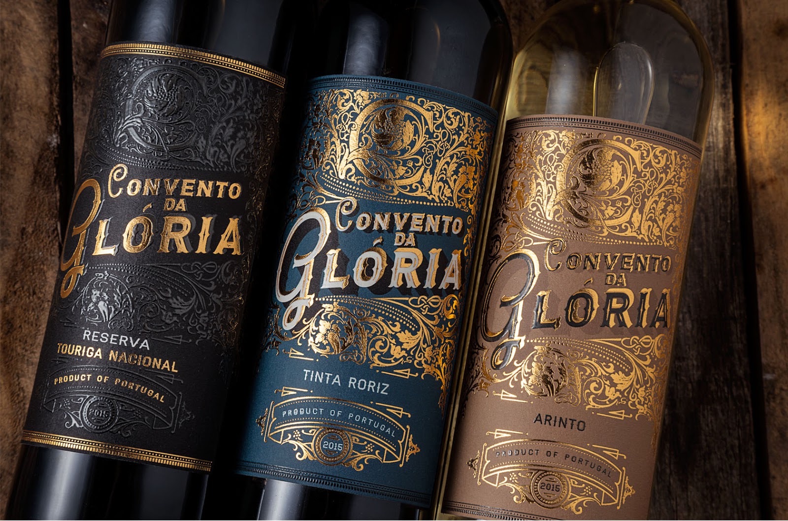
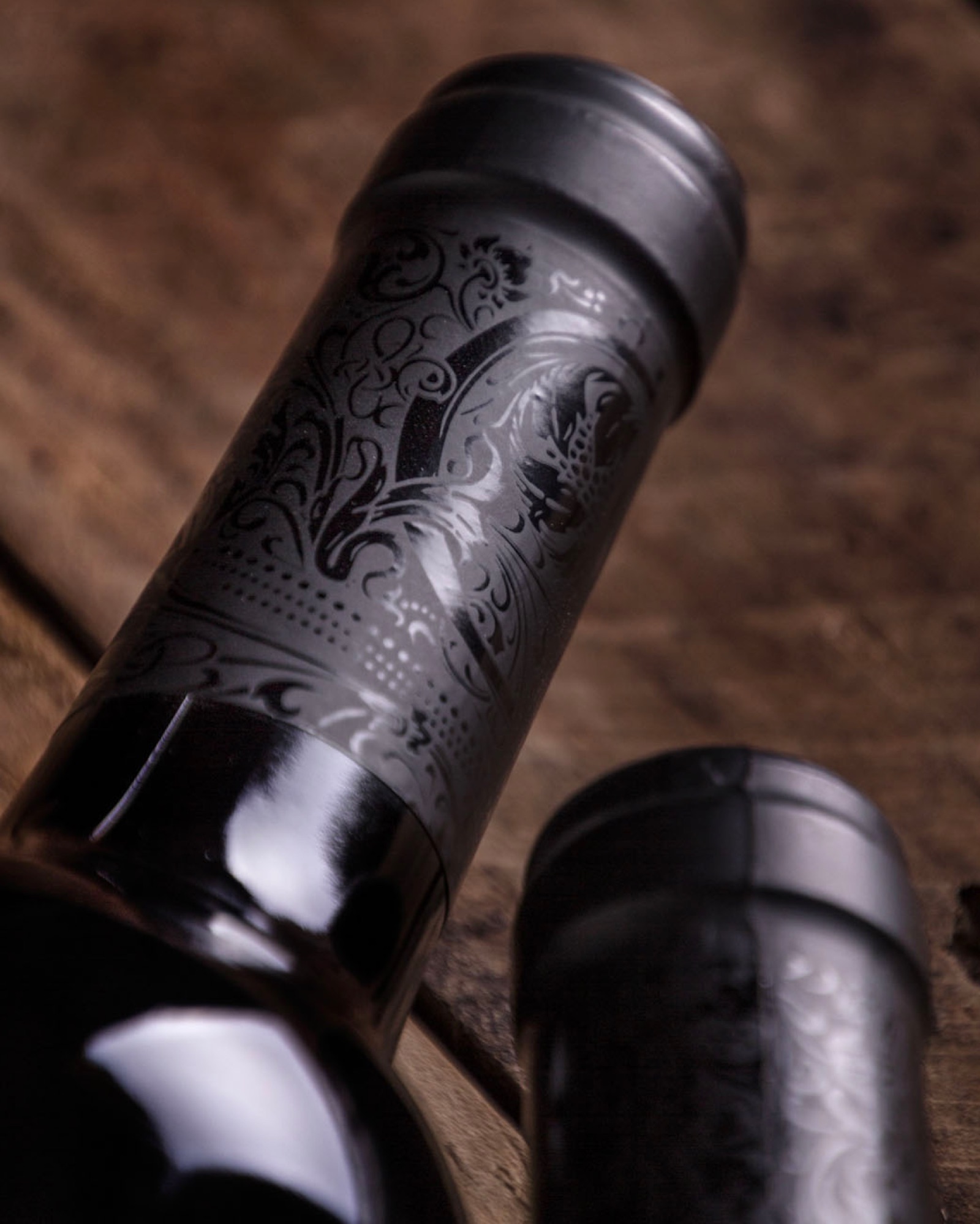
A fascinating transformation has taken place over the last few centuries: As books have grown less ornate, wine and spirit labels have become more so. A medieval monk eager to see this era’s best examples of the hand-tooled and illuminated look would do well to skip the local Barnes & Noble and lose himself instead in the wine aisle of the nearest supermarket. One can only imagine what our time-displaced friar would make of this label for Convento da Gloria wine designed by Portugal’s M&A Creative Agency. Quite frankly, this is one of those occasions where we spare not a moment’s thought to the elixir awaiting us inside the bottle, so captivated are we by the wine label’s exquisite design.
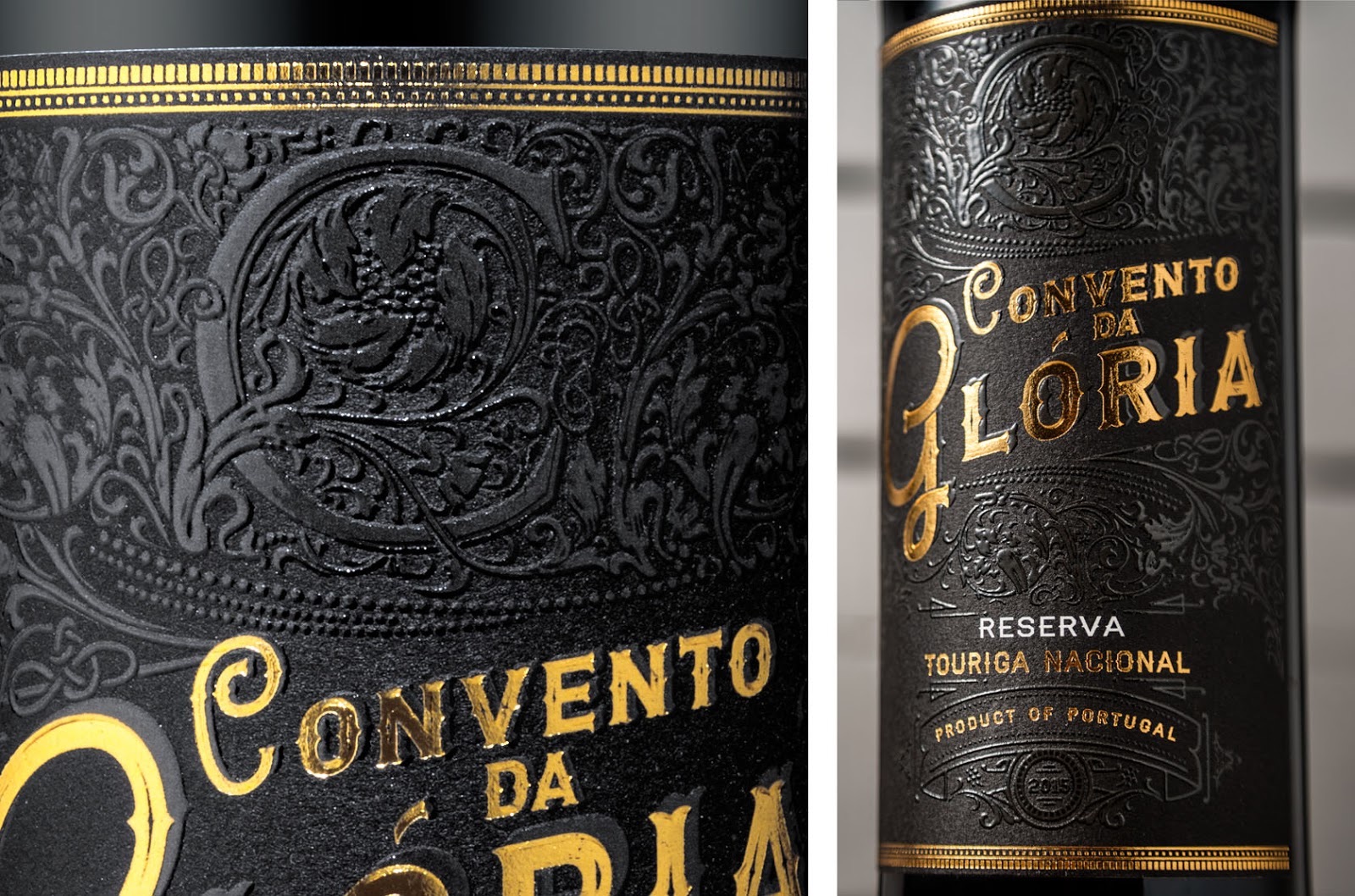
The level of embossing here is really quite unique, even without the teensiest lick of foil, in part because of expertly applied varnish that brings every little detail merrily to life .
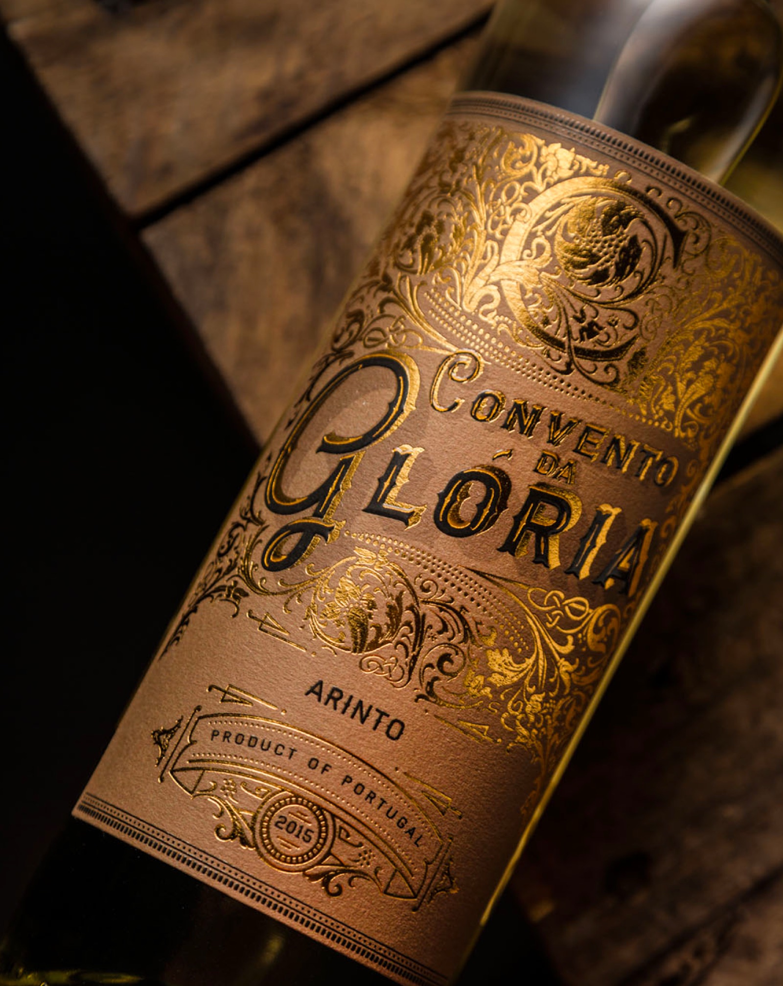
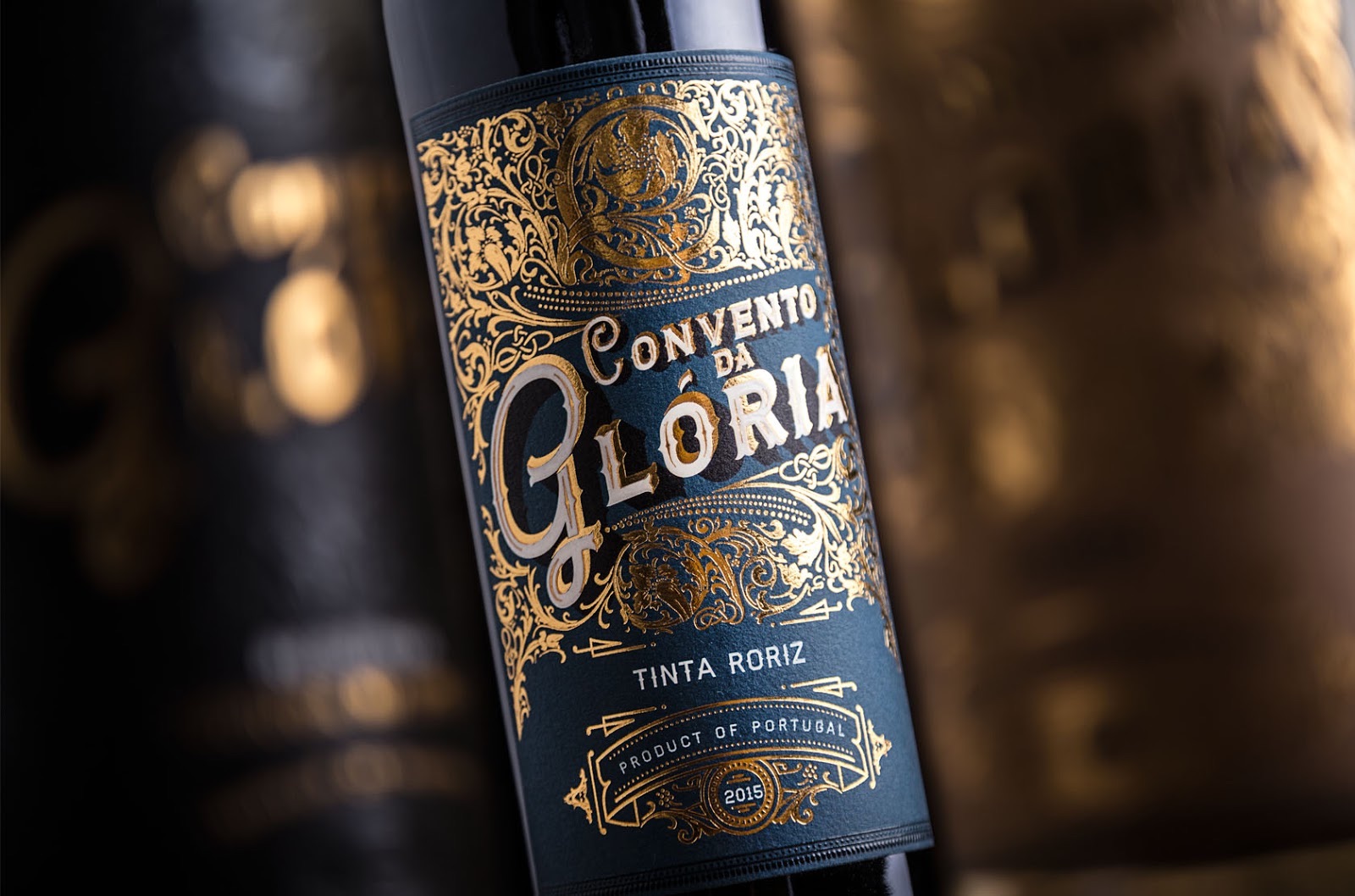
Yet to go on about the varnish and embossing alone is to ignore the obvious – we’re not fooling anyone here. The extravagant employment of glimmering gold foil is the reason we’re all here quietly panting.
What we have in this case is a stunning example of how a well-designed, beautifully executed wine label can transform any old bottle of plonk into something approaching treasured heirloom status – we’d gladly take a bottle of the Tinta Roriz over the family silver any day. (Sorry, Gran.)
Discover more Cool Packaging right here!

