The term “mixed bag” has been dragged through the mud over the years, as in “the party guests were a real mixed bag: the lovable Jeff and Julia were there, but that creepy guy from the bar was, too.” But believe us when we say this week’s “mixed bag” of designs is anything but negative. Join us as we do a little drooling over a design conference book, flip over a fashion designer’s portfolio, and discover a new way to understand color. (Previous Cool Designs of the Week can be found here.)
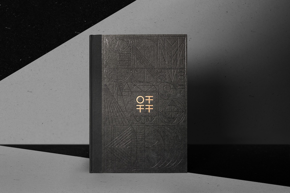
OFFF Festival Book Design
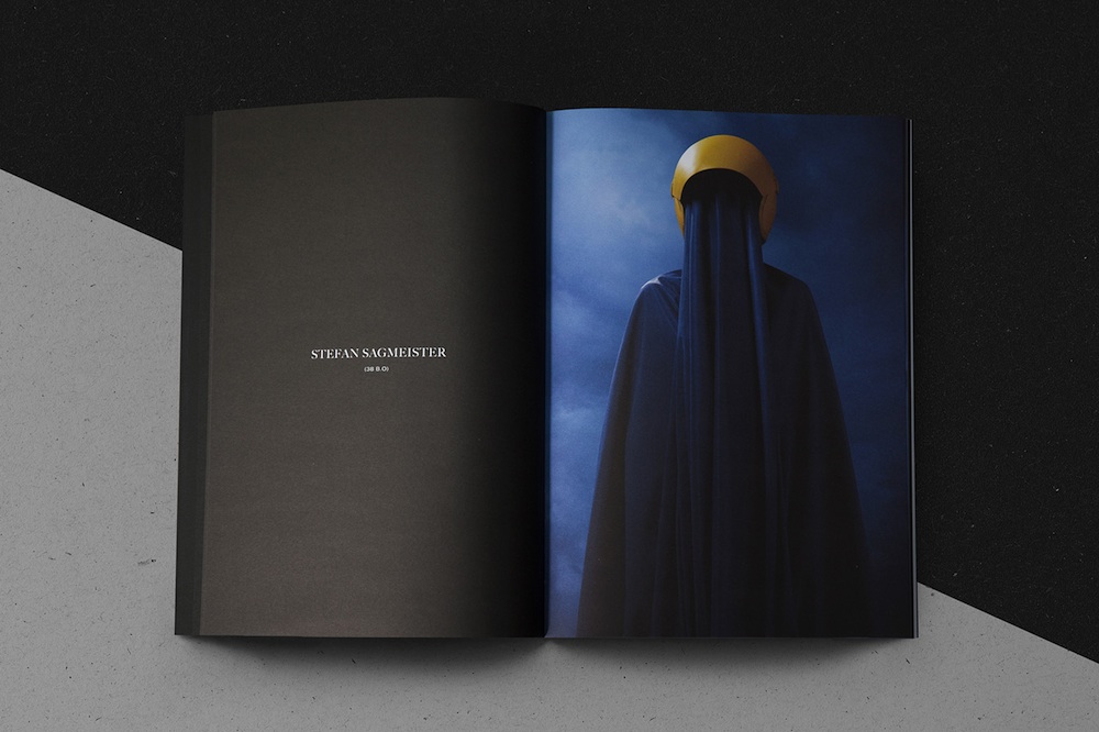
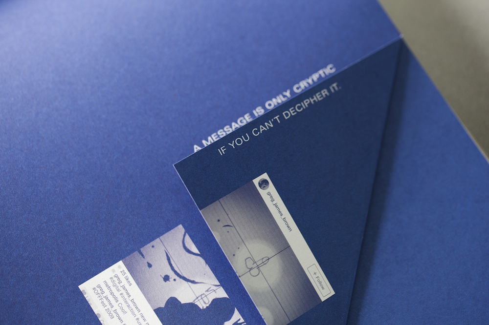
We’ve given up trying to keep track of all the different design events that take place in a given year. Yet if Barcelona design studio Vasava’s book celebrating that city’s OFFF festival is anything to go by, OFFF should be high up on our list of personal faves. Just look at this thing – you could spend a week poring over every delicious detail!
(Paper) Macbook Portfolio Design
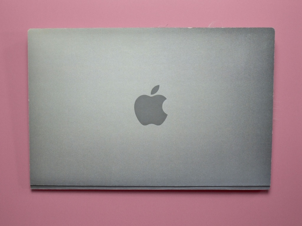
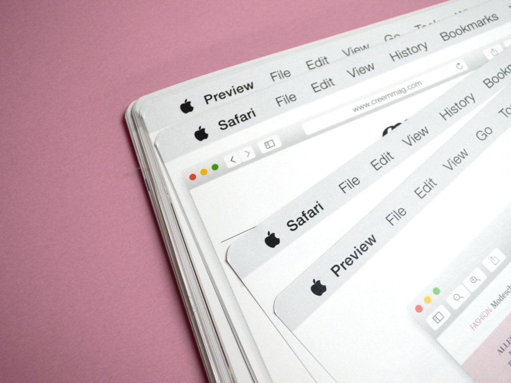
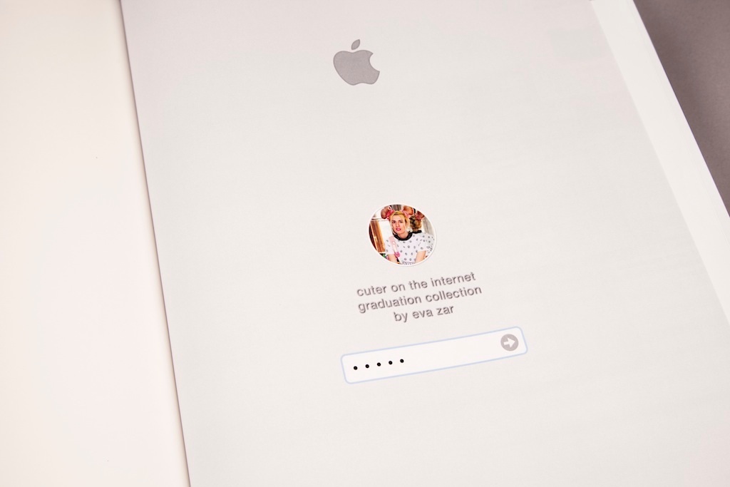
Young fashion designer/photographer Eva Zar gives us a great companion piece to the oft-done iPhone business card: a look book made to resemble a Macbook. While the photos of the project itself make it a little difficult to appreciate in full, we still see enough to intrigue: the familiar log-in page with password field, and menu-bar options at the top of each page. The finishing touch, of course, is the surreal pairing of the Macbook look with what appears to be an older hardback book.
BreakThroughColour Cards Design
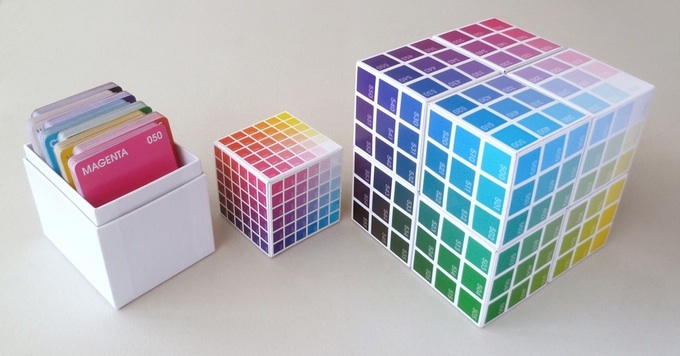
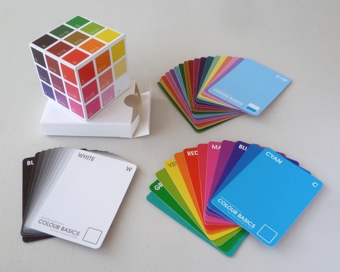
Love color but don’t always understand Pantone’s approach to explaining what differentiates one hue from another? Meet Tracy Holmes, a designer determined to come up with a better way to understand colors: her BreakThroughColour cards system.
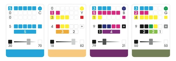
We’ve read through how this works on her Kickstarter page (successfully funded, by the way, with nearly a month still to go) but are still a little fuzzy on the details. That said, it’s clear that she’s put an awful lot of thought into this – even creating a three-dimensional color space in cube form (!) – to teach us how to understand color.
It will never replace the Pantone color system as a lingua franca between designers and printers, of course, and honestly, that doesn’t seem to be Holmes’ intent here. She’s merely given us some new tools to help us understand what makes Color X different from Color Y, and how the two are related. Pretty ambitious stuff!

