We’re dubbing this week’s Cool Designs of the Week “Fire Hose of Crazy” because that’s what you’re getting: three projects that threw in everything but the kitchen sink. We take a detour to “Sin City,” sell ourselves on living in a cube, and take a whirlwind tour of Singapore. And then we take a nap, because we ain’t as young as we used to be. (Previous Cool Designs of the Week can be found here.)
‘Sin City’ Ultimate Killer Edition Design
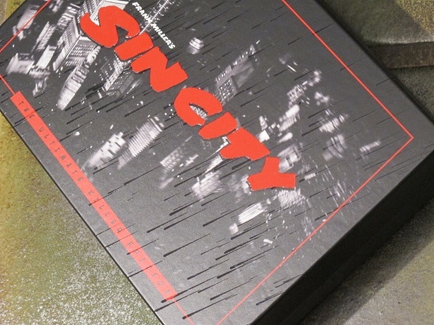
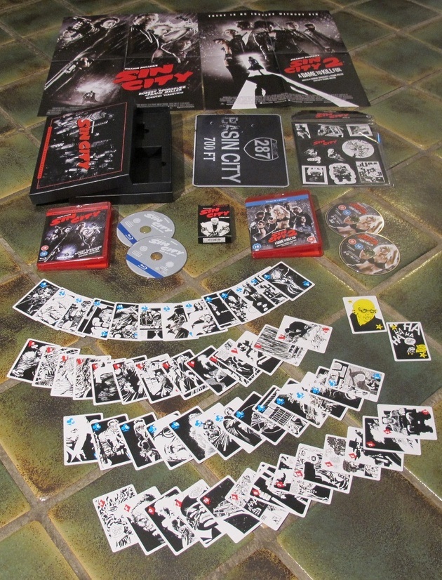
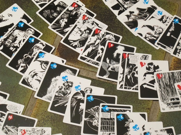
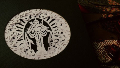
The 2005 flick ‘Sin City’ is a rough slog narratively but looks absolutely gorgeous thanks, in part, to it being based on a series of graphic novels. And this Blu-ray collection (containing both “Sin City” and its sequel) is an even greater triumph of style over substance. Open the gorgeous box with embossed rain on the cover and you’ll find folded posters for each film, two sheets of black-and-white fridge magnets (the movies and the comics were both monochrome), a metal highway exit sign for the city in which the action takes place…and a deck of 52 “Sin City” playing cards. Each card features a different illustration from “Sin City” comic creator Frank Miller. A cornucopia of noir violence never looked so good.
Hotel Daniel LoftCube Mailing Design
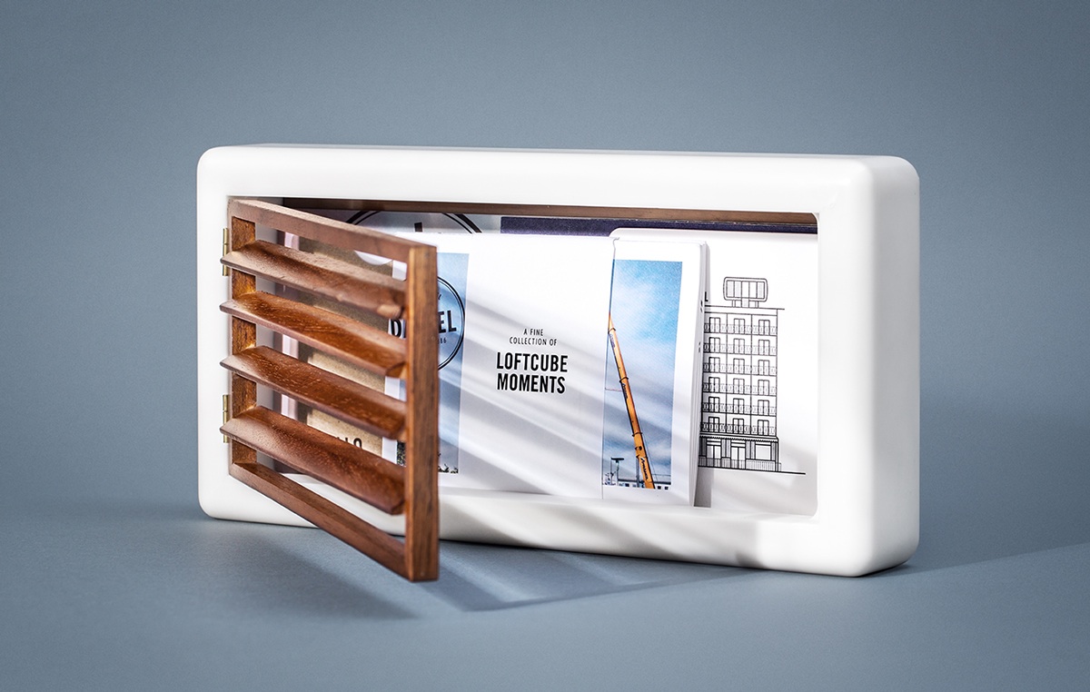
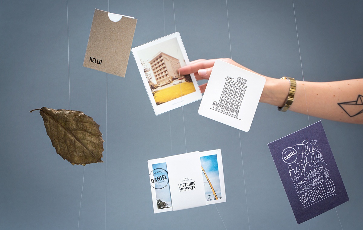
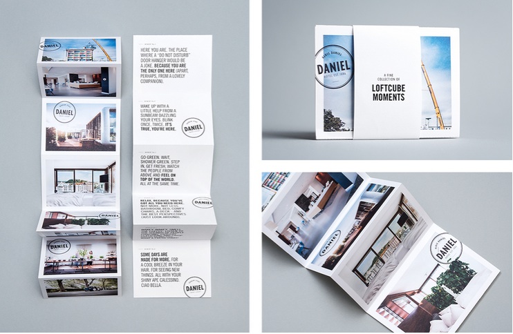
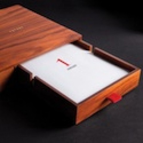
Apparently LoftCube is a thing. More helpfully, it’s a luxury prefab living space that companies can just sort of plonk atop their building creating an instant, environmentally friendly penthouse. Whatever. We’re more interested in the fantastic mailing that Moodley Brand Identity developed to let people know that the Hotel Daniel has installed one of these things on its own roof. Frankly, there’s no way to adequately describe all the different items they crammed into this box. Whet your appetite with the photos below, and then check many more here.
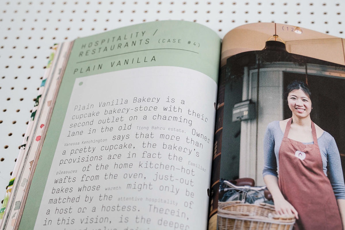
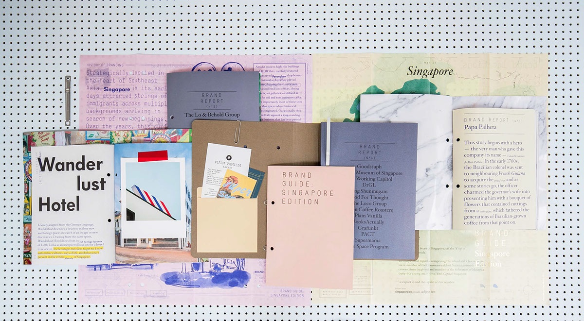
Brand Guide Singapore Design
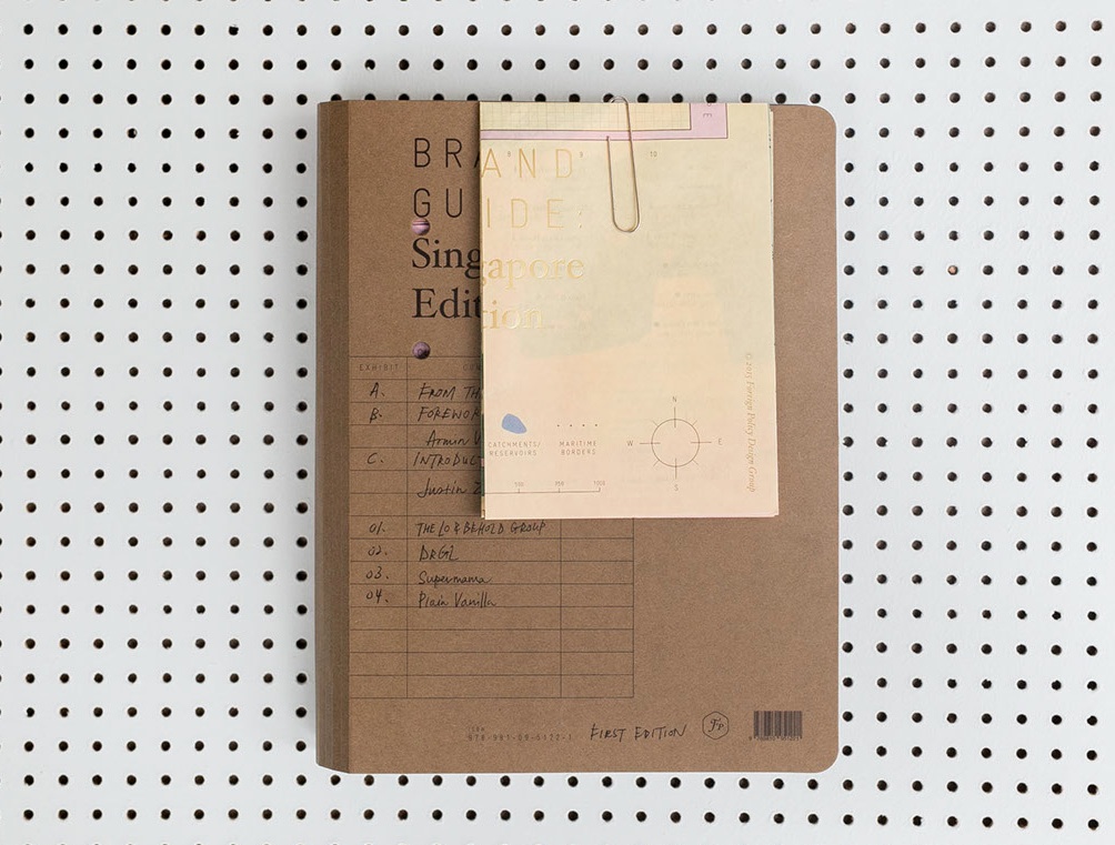
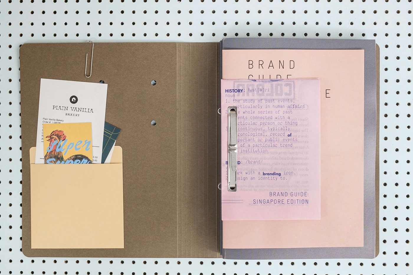
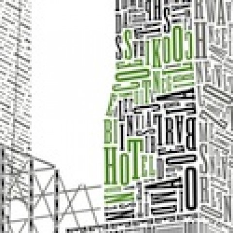
After the slick presentations of the first two pieces, this one comes as something of a palate cleanser. It’s particularly impressive in the way that it strikes you initially as something put together on the cheap and in a great rush, but gradually reveals itself to be a sort of cluster bomb of colors, typography and paper choices that somehow work as a cohesive whole, while still, obviously, constrained by budget. Fascinating.

