If great design is nourishment for the imagination, then great food packaging design is a gluttony of nourishment indeed. This time around we lose our cool to “the fresh maker,” our waistlines to a pasta company invitation, and our hearts to affectionate packaging for Japanese tea and Pocky. (Previous Cool Packaging of the Week can be found right here.)
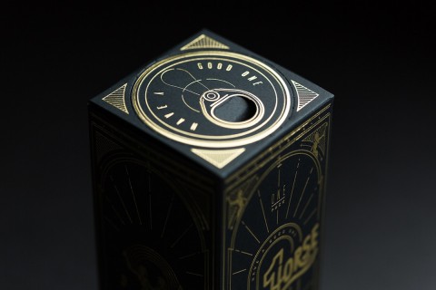
Mentos Packaging
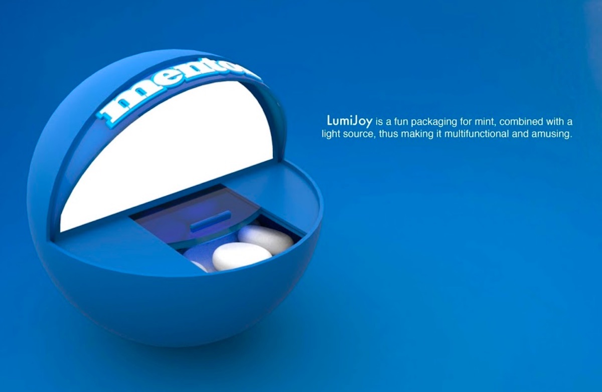
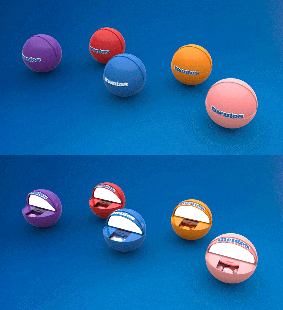
We try to keep our squeeing over student projects to a minimum here, but occasionally something comes along that just blows our socks off, and really how can you ignore blown socks? Loathe as we are to see another hunk of plastic escape into the world, the LumiJoy Mentos dispenser created by MIT Institute of Design Students Jehremy [sic] Harris & Aditi Soni makes us happy just looking at it. While even a cursory glance suggests that retrieving the candies would be more difficult from this package than from the traditional wrapper, this wouldn’t be the first time we put up with a bit of bother for gorgeous packaging. The little light that goes on when you open it is just icing on the, er, mint.
Pasta Company Invitation
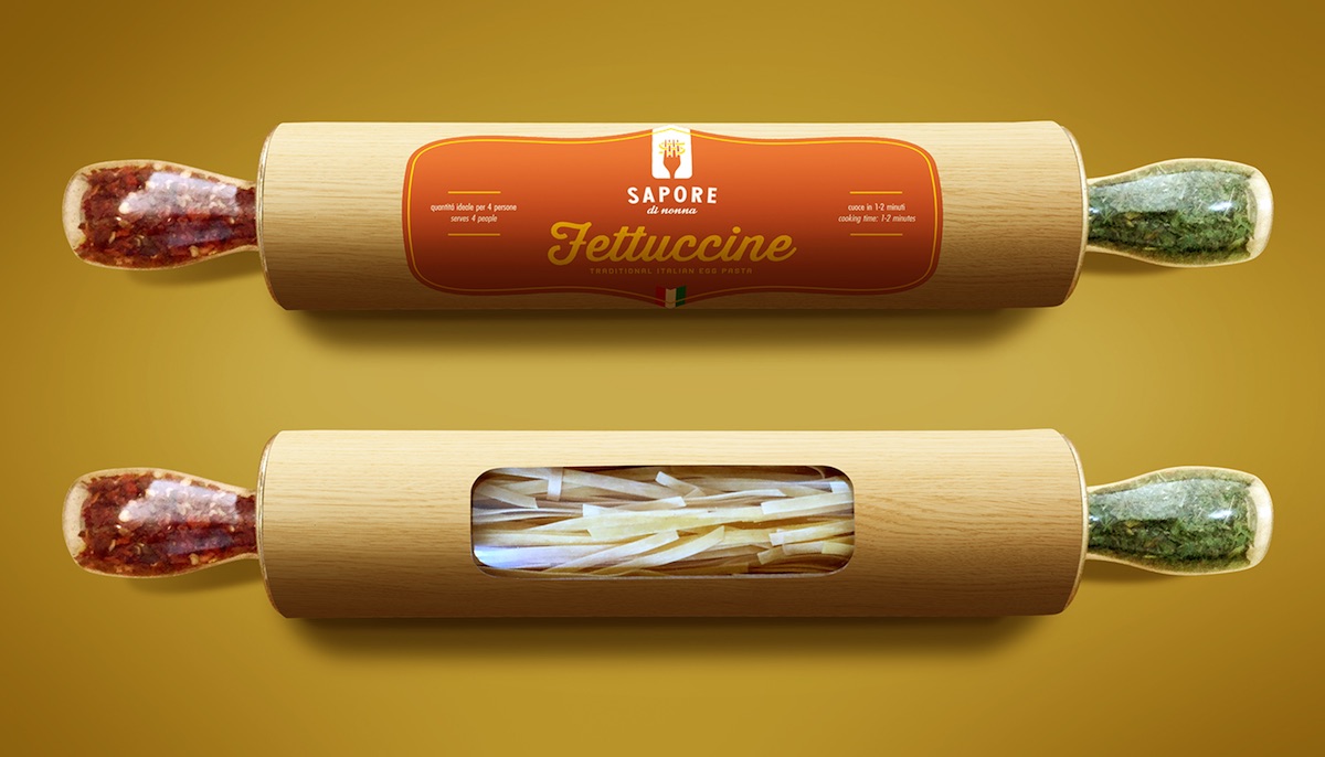
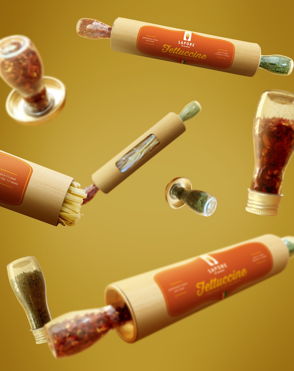
If you’re trying to get the public excited about a new handmade pasta, you can’t do much better than giving people a sample of the new product in packaging that reminds them of the craft involved in its making. Brazilian brand identity designer Breno Cardoso’s inventive invitation for Sapore Di Nonna’s launch party is straight out of the “Wish We’d Thought of That” files as it combines a windowed canister to hold the pasta sealed by two bottles – one containing basil, the other red pepper – on either end. All of which resembles a rolling pin, thereby reminding users that this pasta was made by hand. Simply brilliant.
Tea & Pocky Packaging
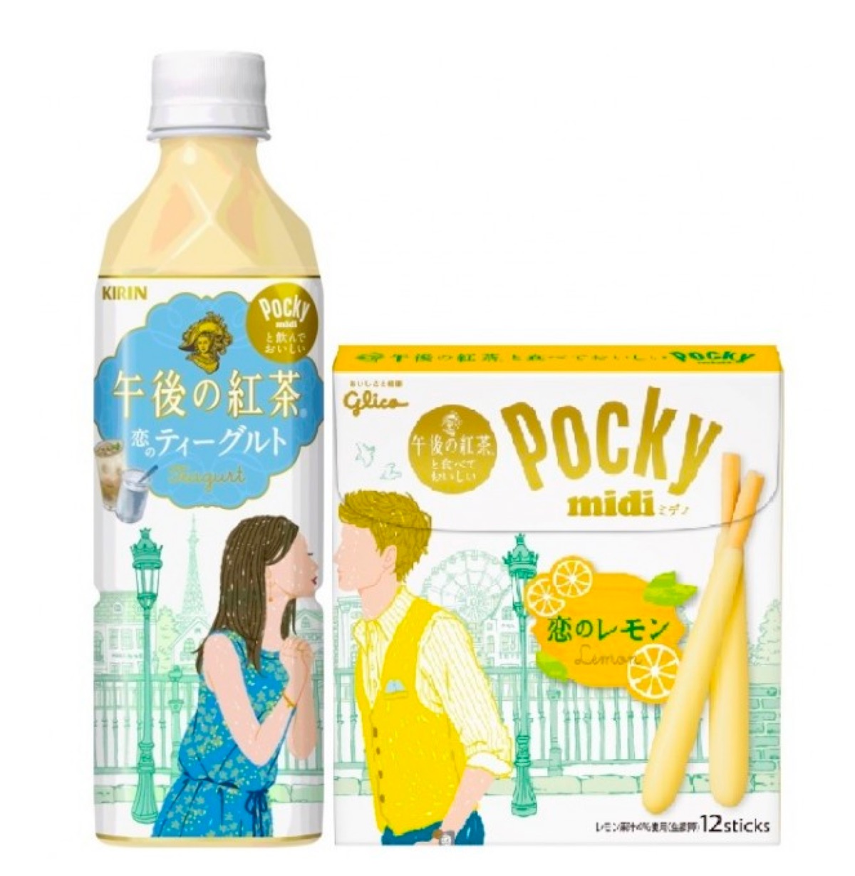
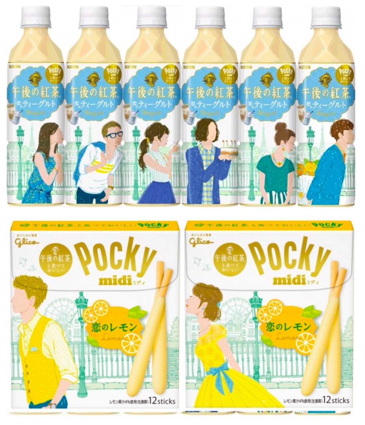
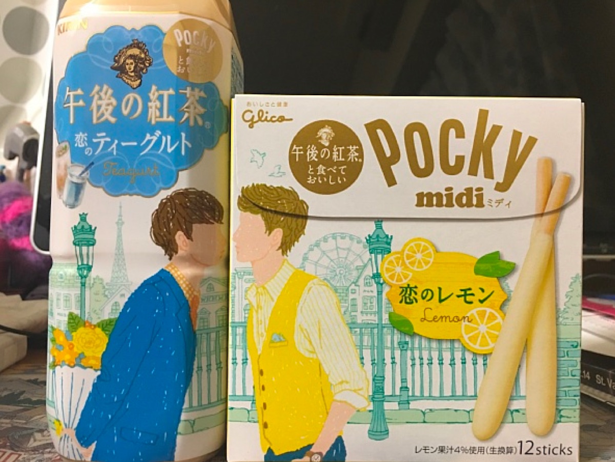
To market new flavors of tea and Pocky that were made to complement each other taste wise, their respective Japanese brands came up with joint packaging that did the same visually. And intentionally or otherwise, the campaign also picked up a little goodwill in that nation’s LGBT community since the packages don’t exclude same-sex pairings.

