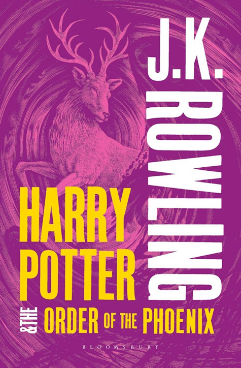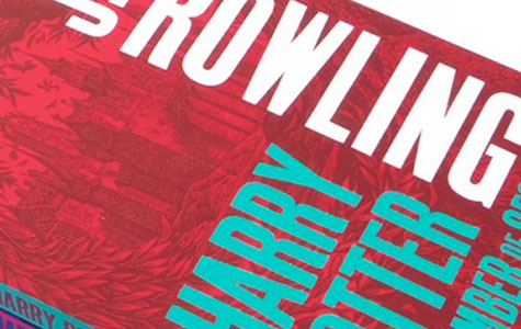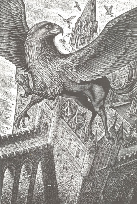
Illustrator Andrew Davidson hand-engraved each cover illustration on 9” x 7” English boxwood blocks, and then used them to print onto Japanese paper, he told Creative Review. “I wanted them to look as if they had come straight from the pages of a book taken from the library at Hogwarts [the boarding school for wizards where the books are set].”
Each cover illustration was then printed in two slightly contrasting colors, muting the intensity of the effect. Author J.K. Rowling’s name is now the most prominent text on the covers.
Says Webb&Webb cover designer James Webb, “We wanted to steer clear of using photographs of the characters, or the black and white imagery used on a lot of teen fiction.” The overall effect is modern… with just a hint of the Madison-Avenue Muggle about it.

