Every year, London’s Design Museum exhibits dozens of what it considers to be the previous year’s best examples of design in graphics, fashion, furniture, digital and product, before awards are bestowed on the best in each category. This year’s graphics entries (exhibiting at the museum March 20 – July 17) are pretty diverse. Here are some highlights:
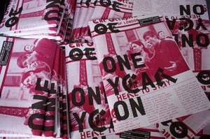
Occupied Times of London: This on-the-ground publication covering London’s “Occupy” movement might look like a ’90s-era zine at first glance, but a second reveals a penchant for arresting images and subtle digs at the establishment (e.g., printing on pink paper ala the Financial Times) bolstered by the use of PF Din Mono for the body text and Barnbrook’s VirusFonts for drop caps.
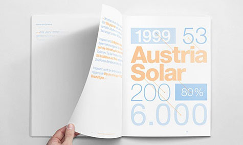
Austria Solar Annual Report: Design studio Serviceplan created the perfect report for a solar energy company – the words only appear on the pages when exposed to the sun.
[youtube=https://www.youtube.com/watch?v=vATSkM6Qf6Y]
Also nominated, the intriguing “Brighten the Corners” annual report that we featured back in September. It slips the dull text into one book, and fills the companion volume with explosions of color and light.

