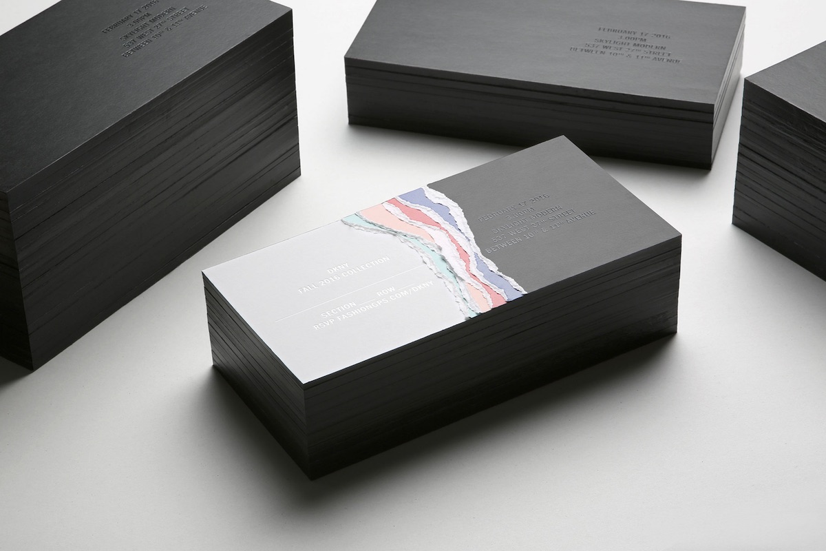
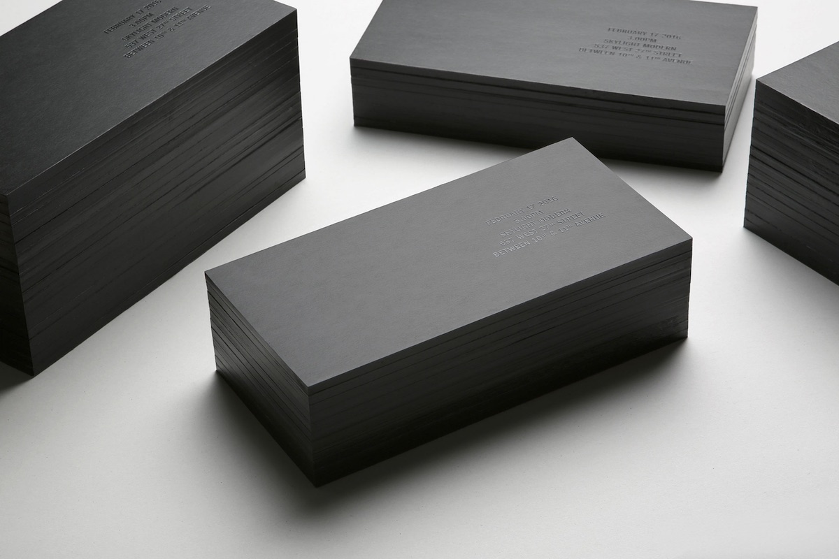
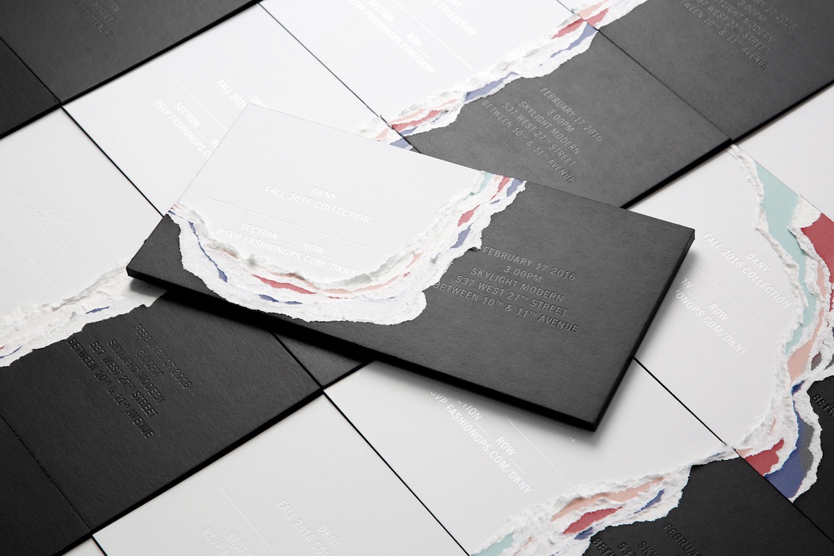
You could probably compose a fascinating dissertation on the subject of ripping and tearing in fashion design, from those strategically revealing rips in designer jeans to some of the more disturbing garment rendings on the catwalk. It reared it’s ragged head again in New York earlier this year at the DKNY Fall 2016 Collection show not only in the clothing itself, but in the invitations as well. These pleasingly chunky pieces began life as rather staid affairs as you can see below.
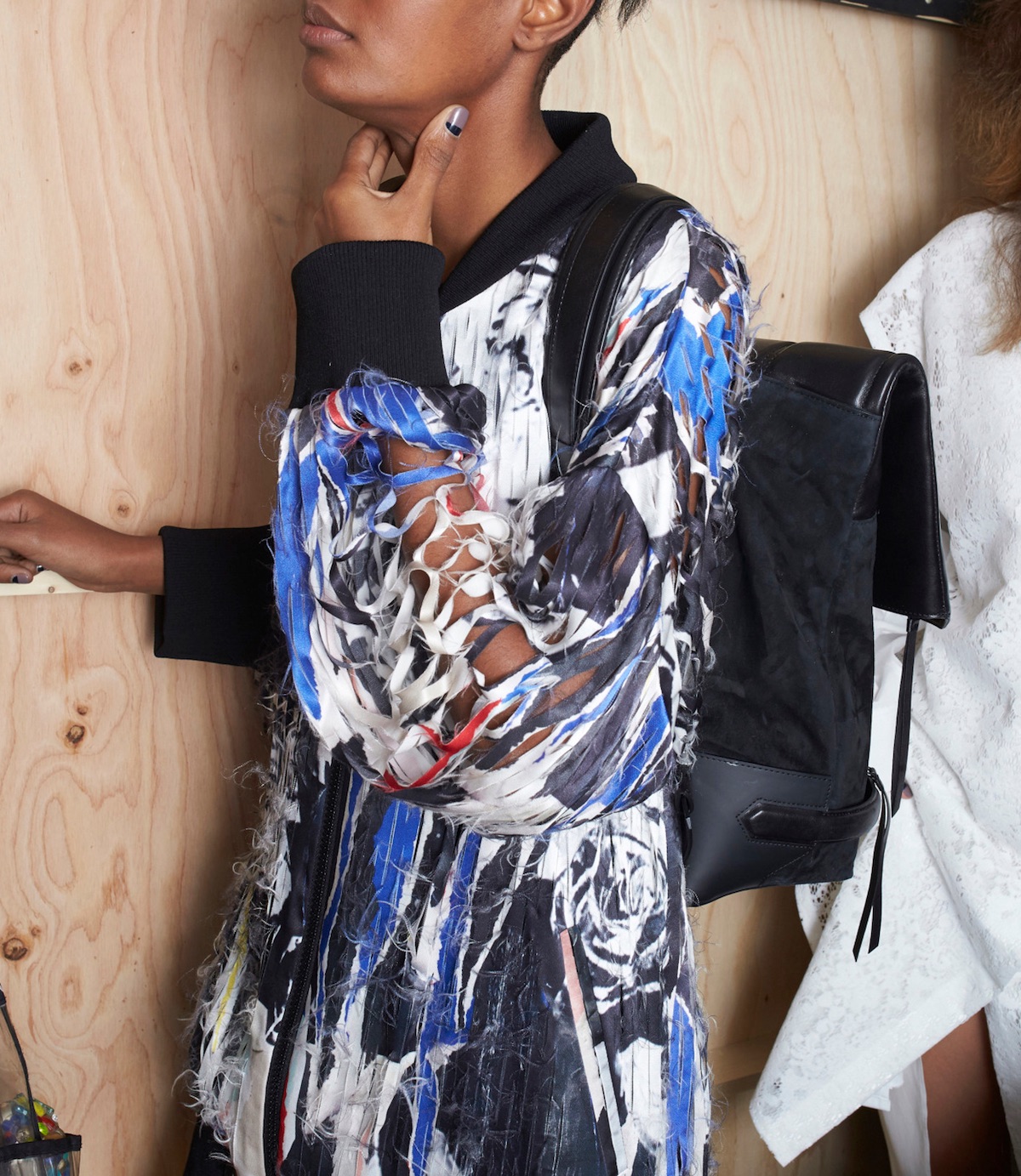
However, this was just the beginning. As London design and branding firm Commission explained, the design was “inspired by the collage pattern of torn billboards and rose motifs printed across silks and leathers in the new collection.” For those trying to picture what this looks like, we’ll spare you the trouble.
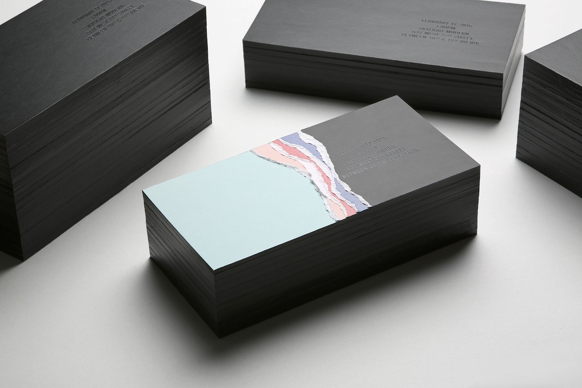
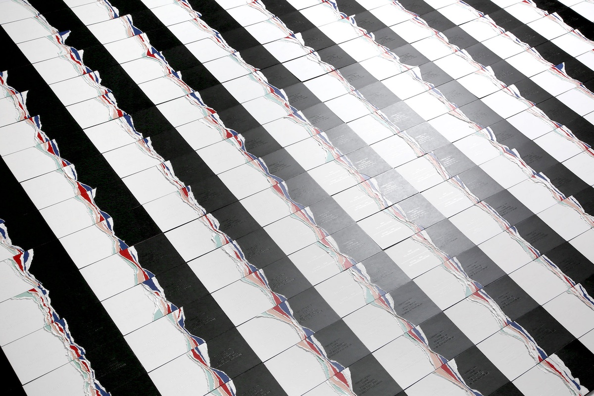
Yep… Anyway, 750 invitations were layered with different colored papers and bound before being torn by hand so that every single invitation was unique. So the progression was:
Then…
…with the row and section number of the invitation revealed beneath all of those colored sheets.
While on the one hand this all smacks of the high-end fashion world parodying itself once again, there is something deeply affecting about this technique. Not only does it create something unique, but it also offers a stark alternative to our overly perfect digital society that has yet to meet a corner that it doesn’t want to round off. We’re left with the paradox of a piece that gives every indication of being something that’s the product of the “maker movement” when in fact it belongs in another camp entirely – a “destructor movement”? Perhaps that’s not so surprising. As Graham Greene observed in his classic short story, “destruction is a form of creation.”
Discover more Cool Designs right here.





I love these! Indeed, in our digital polished world things like these invitations are a breath of fresh air!
Wow! this place is just amazing . I loved the digital invitations, its giving antique look. Keep updating more.