The golden throne. The silver carriage. The diamond belt. “Maharaja” was truly an amazing exhibition on the splendors of India’s royal courts.
Sparking my curiosity, naturally, I wanted to know more. The audio tour only covered a few of the highlights, but luckily there was the signage. Or maybe not so luckily.
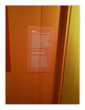
The walls of one exhibit room were painted a luscious orange (Dare I mention Tangerine Tango? 😉 ) The designer for the exhibit clearly had made an effort to blend the signage with the wall color… maybe too much of an effort.
On top of that, the small white type that was used simply did not provide enough contrast on the orange background.
What might have looked great on the computer monitor – and even in the bright 65-degree Kelvin lighting of a print shop – was simply not readable in the dimly lit exhibit area.
Read me if you can
Readability is one of my pet peeves – ok, so I have a few of these ;-). If it’s worth printing, it’s certainly worth doing in such a fashion that I can read it in the environment for which it is intended.
Jack Bredenfoerder stressed this point as well in our recent The Tactics of Color Strategy webinar: “Always, always look at your designed piece in the lighting in which it will be used.”
If it’s outdoors, open the window. If the intended use is in an office environment, look at it in various office settings.
And while you and I are talking … ALL CAPS are only intended for short headlines. Do not typeset whole paragraphs or pages with it. The same goes for reversed-out type. Keep it short and in high contrast to the background color.
And please, set narrow columns (around 50-70 characters) and add paragraph breaks here and there so the length of the copy doesn’t overwhelm me.
All caps, super-wide columns and reversed-out type might look incredibly artsy, but the only question that matters is: Can the intended user read it?
For my part, I gave up trying to decipher the pale text on the pale background in the exhibit. But then again, maybe I wasn’t supposed to read it in the first place ;-)!
P.S. In case you are in the San Francisco area, Maharaja is still a lovely exhibit to see and is running at the Asian Art Museum until April 8, 2012.

